HOME | DD
 wadifahtook — Temporary Main Page Image
Published: 2007-09-25 01:44:50 +0000 UTC; Views: 4229; Favourites: 116; Downloads: 24
Redirect to original
Description
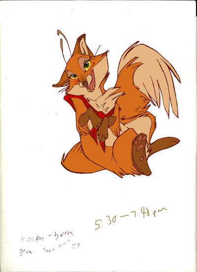
This won't be up for long. Just need some help. These are the flat colors, but I think I'll add some shading since it will be the main page image. Is it too awful? What could make it not suck so much?Related content


Comments: 63

Hm, I have to agree! Definitely something to look out for in future Daisy pictures, or this one if I redo it!
👍: 0 ⏩: 0

it doesnt suck
just be sure to rotate it clockwise a bit and it should look fine. I think because you're looking at it all cockeyed, its looking funny to you.
I tilted my laptop appropriately, and it looked good to me
")
 (Wink)")
👍: 0 ⏩: 1
*tilts head* Thanks hun, that does help. A tilting I shall go.
👍: 0 ⏩: 0

I don't know what to say that may help but it really looks cool.
👍: 0 ⏩: 1
That's helpful too! If a couple of people think it looks cool, that might mean that it may be salvageable.
👍: 0 ⏩: 0

what exactly is it you are having trouble with? the colour? the pose? the concept? Im not too familiar with your style, and am not an exceptionaly good artist, so Im not sure if my comments would help anyway lol.
there are a few parts that confuse me, but once again, im not sure if thats just your style. *is trying to be helpful*
👍: 0 ⏩: 1
Kind of all of the above, or more to the point, I'm not exactly sure what irks me about it! Style wise, the site is geared towards young children, so I'm using an UBERHAPPYCUTECARTOON style. ")
And what do you mean you aren't a good artist!?
👍: 0 ⏩: 1
Im more confused where the mouth meets face meets neck meets chest. ..try cell shading it as a tester. I think the main confusion is the angled chest fluff that jets out and the paws curling over it..that area looks quite 'busy' to me. I did wonder about the antenna lol but it makes sense now. also the nose looks slightly crooked..like shes not quite face on but yet face on. but just moreso that busy part around the chest. I adore the tail and hindleg poses.
👍: 0 ⏩: 1
Ugh, the nose! You should have seen the earlier version...it was seriously sliding off her face. XD It still looked off to me, and since it looks off to others, I'll be tweaking it for sure. Hopefully some shading will help smooth out some things. My eyes definitely get confused in her chest area, along her left tummy line, and where her tail pops out from behind her legs.
👍: 0 ⏩: 1
*nodds* sweet then I guess I helped a little, post the before-and-after tweeking shots just to line up and see if it still needs improving. thats what I do. Im glad that we could see the same issues in it, im sure you'll get it solved, sometimes we just need a wee breather...look at a bush or a cup of tea..then tackle it again
 (Smile)")
👍: 0 ⏩: 0

Well I think it's amazing and that you rock at life... so I don't know if I could tell you how to make it any better... XD
👍: 0 ⏩: 1
Haha, well just let me know if you think of anything!

👍: 0 ⏩: 0
<= Prev |