HOME | DD
 WarBandit — Enter The Matrix-Team Possible
Published: 2007-01-31 22:14:07 +0000 UTC; Views: 21555; Favourites: 535; Downloads: 1528
Redirect to original
Description
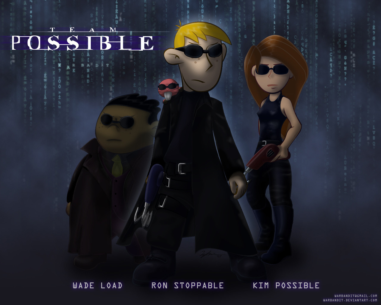
EDIT: Head and arm proportions slightly modified. You may not even notice.Please full view to get the full effect and shading! I slaaaaved over it... Thanks
")
It's Team Possible enters the Matrix! Of course, Ron is the chosen one, Neo, although Kim is the highly skilled Trinity, Wade's supergenius makes him Morpheus I guess, and Rufus can be Mouse or something...yeah.
")
Thought I'd stray from my usual cel shading style a bit and paint this one up using Photoshop again. All the matrixy effects also done in Photoshop.
Based off of the cover art for The Matrix DVD, one of my all time favourite movies. So if you recognize the poses, that's where they're from.
Kim Possible, Ron Stoppable, Wade Load, and Rufus © Bob Schooley, Mark McCorkle, Disney
The Matrix, Neo, Trinity, and Morpheus © The Wachowski Brothers, Warner Brothers
Related content


Comments: 73

I would've loved trying to pick out all those subliminal messages...

👍: 0 ⏩: 0


Man! You have no idea how angry this makes me! Great job by the way. But still! I totally did a pic like this a few weeks ago, and yours kicks my trash. I didn't post it yet, but now I'll have to just to show you... You know... That it's not as good... Great job.
👍: 0 ⏩: 0

Wow.. lovely job. I think Ron came out the best. I've always had a fondness for good Matrix parody pics.. (maybe I shoulddo a South Park one!)
Really nifty how you worked your name into the BG, btw. *hawk eyes*
👍: 0 ⏩: 0

Nice pic, i like it. Yay Rufus. You should be able to tell Rufus is my favorite character. And Wade Load? Thats nice. Is that a pun of Wide Load??
👍: 0 ⏩: 0

Ooh, nice! This is such a nice, dark scene and I like how you did your signature.
👍: 0 ⏩: 0

If I'm not mistaken, that says, "LOL, in what did you find inspiration [for this]?"
👍: 0 ⏩: 1

No, no "LOL", lol is like a taunt (I think), my laughs are only of "oh! how much curious".
👍: 0 ⏩: 0

Well, you have to decide what style you want.  (Smile)")
What I'm saying is that basically, with your current rendering style, the characters would look better if they had a slightly more realistic body length (relative to the show's) due to the reason that you're drawing them at realistic proportions with realistic curves already. Your current look isn't bad by any stretch, just that I think it might look better (it might not with what I suggested, ha! That's art.) IMO.
Now, if you are trying to do straight on curve like the show, look here: [link]
👍: 0 ⏩: 1

Lol, good point! Sorry to bother you further (by the way, I reeeeeally appreciate your critique!), but can you explain "curve on curve" vs "straight on curve"? I don't quite get what you mean by that...
And thanks for that link! It'll be very useful. Almost like that how to draw KP guide you made
Thank you again!
👍: 0 ⏩: 1
That link was to the official model sheets for season 1, season 3 had a different set.
Curve on curve means when you're drawing an arm, both sides of the arm are using curved lines and they're linked to more curved lines. Straight on curve is when one side of the arm is using a curve line with the other side being a straight line. They're linked to both curve or straight lines depending on design philosophy.
For example, one design philosophy is that all the lines facing inwards are straight, while all the lines facing outward are curved. This is used by a long of tv animation and game design right now.
👍: 0 ⏩: 1
And thank you again for the link to season 1
Ooooh, I see now. Thanks for the description of the two styles: I never noticed them before. Well, I think I'll stick to "curve-on-curve", though I'll practice with these model sheets anyway, and I'm gonna try shrinking head sizes. For some reason I have a nasty habit of drawing oversized heads
Anyway, thanks again for all your help
")
👍: 0 ⏩: 0
That looks good.
A little bit of opinion though, I think you're trying to fit your style into the design philosophy. As in, maintaining the body proportions of the original show but using your line style (which is more comic-ish). That works sometimes, but I don't think this is working to what you want. It seems you're stuck between trying to be like the show style yet maintaining your own style; and that's causing some problems. Such as in the Ron and Kim drawing, their arms are too wide for the body proportions. Same here, Ron's arms are too short and all of their heads look too big.
I ran into that problem as well when I first started drawing KP art (I was drawing the bodies too long.) You should have seen the discussion on RS.net over how high her butt is suppose to be relative to her body length. I solved that by going more with the show's style since it's easier.
In this case, I would actually try out a head to body ratio of 1 to 41/2 - 5 and see. Kinda like what lionkyu uses. Basically, keep the coloring but change the proportions a bit and I think your style will look great.
Anyway, just my opinion. Now if you're actually aiming to be exactly like the show...well, that's a whole 'nother topic.
👍: 0 ⏩: 1
Hmm, you really think so? I very much appreciate that you took the time to write me this constructive criticism. As a new KP artist, I'm still trying to get a hang of the proportions...looks like I have quite a ways to go ")
I'm slightly confused by your advice. Do you mean that I should aim to be more towards the show, or aim to be more realistic? The shows proportions are definitely not realistic
Thanks once again for taking the time to help me out! As an artist that I pratically idolize, I really appreciate it
👍: 0 ⏩: 0

Then Agent Smith could be... Dr. Drakken?! How about Shego?
👍: 0 ⏩: 0


Interesting. And the names KINDA fit the actual movie too. LOL
Very nice cell shade effect. I envy your cell shading~.
👍: 0 ⏩: 0

I think this style of coloring suits the pic, great work as always!
👍: 0 ⏩: 0
<= Prev |