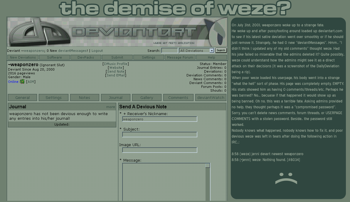
HOME | DD
 weaponzero — Weze Devart Button 03

Published: 2002-07-26 14:27:36 +0000 UTC; Views: 638; Favourites: 3; Downloads: 40
Redirect to original
Description
This is the 3rd design. No animation, no stupid blocks, no fella or pixelated DA logojust pure unadultered DA fun.
Related content


Comments: 16

easily the best out of all the winning buttons. awesome indeed.
👍: 0 ⏩: 0

very nice work
good font, and a great composition. superbe
👍: 0 ⏩: 0


yeah looks really good!
and no stupid animations as you said...
will look great on every page *as attila said*
👍: 0 ⏩: 0


yea I agree with attila this is nice realy stands out
👍: 0 ⏩: 0

Looks great. Animation would look good, but in this case; it looks awesome anyway. Seems like static is more original these days anyway
👍: 0 ⏩: 0

I respectfully disagree with last comment...
And I think we have a winner here.
👍: 0 ⏩: 0

animation.. is.. the root.. of all.. EVIL!*@#^(&!
👍: 0 ⏩: 0

Looks good weze, but I think to really get a shot at winning it you'll have to animate one of your buttons.
👍: 0 ⏩: 0


very good work..the font is brillaint and the way the text flows i htink u showed deffinalty win this contest ncie one
👍: 0 ⏩: 0

from the few i've commented, this is one of the best, it's different from all the usual ones with the logo etc, well done
👍: 0 ⏩: 0


Now THIS is a good looking button. It's simple.. yet prominent... and would probably stand out on ANY page. Great job Wezemus Maximus
👍: 0 ⏩: 0