HOME | DD
 weaponzero — weze deviantART button 02

Published: 2002-07-13 20:53:23 +0000 UTC; Views: 502; Favourites: 2; Downloads: 52
Redirect to original
Description
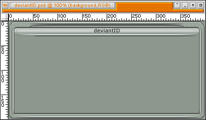
A little different than my previous button. I guess more eyecatching/button-like/animated/confusi ng. I still like the other one better. I hate animation. A lot.Related content


Comments: 11

You're a whore! A DA WHORE! hahahhaha
DA owns j0o ass and you know it!
👍: 0 ⏩: 0


looks awesome how it is to me.. THIS HAS MY VOTE!! good job weze
👍: 0 ⏩: 0

i like it how it stands. maybe give the people more options when picking out a button
👍: 0 ⏩: 0

I'm in agreeance with jark on this one, something that brings attention to the name, not away from it. But it's still a solid link button if you ask me.
👍: 0 ⏩: 0

I agree with jark; or perhaps you could use a kind of random change in colour of pixels in the text, giving a kind of weird, 3d-esk feel.
👍: 0 ⏩: 0

this is cool. maybe, if you want to animate it, do something with the lettering. like, maybe make a "wave" motion from left to right where a darker, or lighter, shade of color kinda "surfs" to the right of the text. know what i mean?
👍: 0 ⏩: 0


If not for the animation, I'd start using this button right away.. It's pretty slick. I'd suggest trying something different in terms of animation.
👍: 0 ⏩: 0

the animation is like a big hand that slaps the viewer into paying attention! looking cool...
👍: 0 ⏩: 0
