HOME | DD

white-arrow — C A R T H A C O

Published: 2003-03-26 17:46:21 +0000 UTC; Views: 5445; Favourites: 30; Downloads: 525
Redirect to original
Description 
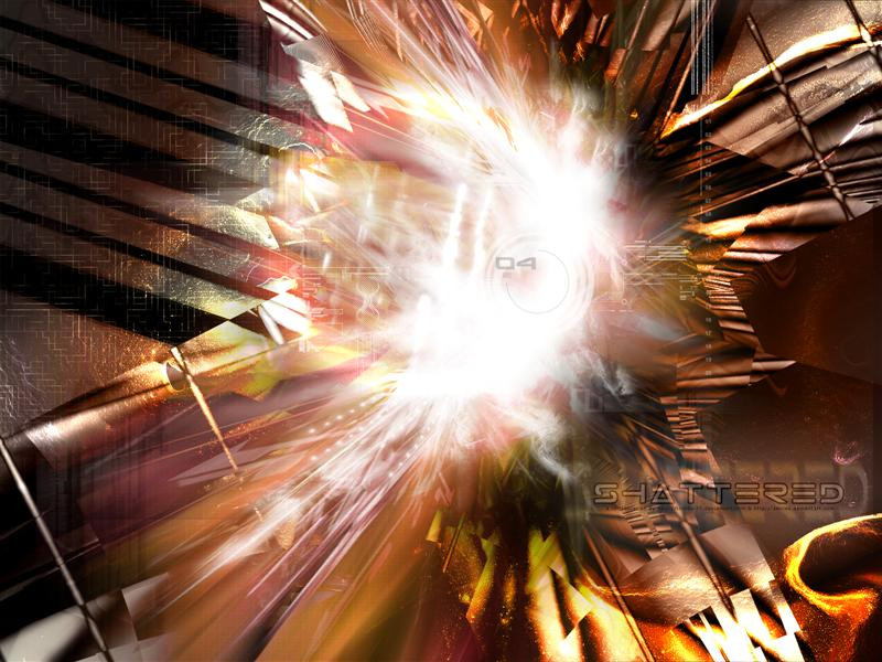
This is collab between ~eightball and me ( ~white-arrow )
Eightball made the brush job and i did the render and the typo. It was fun doing this and i enjoyed it.
Hope you like it..

Apps:
PSP7
PS7
3dsmax4

Check out ~eightball gallery he is really good...

Hope you like this...
Feedback is allways welcome and appreciated..

Enjoy
Related content
Comments: 48

garfield101 [2003-04-24 01:33:49 +0000 UTC]

really geat wish i could something like this. Hmm. i like the arrow from the center and the color. Great.

👍: 0 ⏩: 0

scotto [2003-04-12 19:27:58 +0000 UTC]

Fantastic work man, I never managed to do anything near this good when I had 3d max, I know how difficult this stuff is....


👍: 0 ⏩: 0

arpad [2003-04-01 04:15:28 +0000 UTC]

Cool PS work

👍: 0 ⏩: 0

shirosynth [2003-03-28 14:55:01 +0000 UTC]

awesome thats my new desktop

+favs too, you deserve it.

👍: 0 ⏩: 0

shadow-law [2003-03-28 08:50:52 +0000 UTC]

me thinks its an ultra ass kicker. gj man your improving!

👍: 0 ⏩: 0

e-ink [2003-03-28 01:41:56 +0000 UTC]

wow!!!looking good loving the 2d work and the render

👍: 0 ⏩: 0

saiyansupreme [2003-03-27 19:19:21 +0000 UTC]

awesome!!!
greath lightning

👍: 0 ⏩: 0

r-on3 [2003-03-27 17:17:58 +0000 UTC]

Great 2d work
Great render
So that's a

👍: 0 ⏩: 0

alphakx [2003-03-27 16:02:09 +0000 UTC]

Excellent work! That's really nice!

👍: 0 ⏩: 0

sim83 [2003-03-27 15:01:44 +0000 UTC]

Very nice! I love the color!

👍: 0 ⏩: 0

depex [2003-03-27 14:08:14 +0000 UTC]

stunning colors great

👍: 0 ⏩: 0

prashtyuc [2003-03-27 10:55:20 +0000 UTC]

mimic movie theme rulz

👍: 0 ⏩: 0

vediant [2003-03-27 08:45:01 +0000 UTC]

damn u!!
j/k...u've improved like #@$! AAAH!
grrrrr....
this is goooddd...

👍: 0 ⏩: 0

atomical [2003-03-27 05:32:23 +0000 UTC]

ive been workin on a piece similar to this.. hope mines as good

👍: 0 ⏩: 0

darkevil [2003-03-27 04:29:08 +0000 UTC]

Oh very nice ! ^^

👍: 0 ⏩: 0

mooiamacow [2003-03-27 04:06:13 +0000 UTC]

.... all i can say is good job man... it's to good

👍: 0 ⏩: 0

joe118395 [2003-03-27 03:24:04 +0000 UTC]

Wow really nice, i really like the sublte designs along the side and not to excessive.

👍: 0 ⏩: 0

bloodpixel [2003-03-27 00:51:25 +0000 UTC]

awesome light/focal point dude
exellent work

👍: 0 ⏩: 0

alphaaffinity [2003-03-26 23:57:57 +0000 UTC]

Sweet color, the incomplete circles are really cool. Looks like a huge explosion/beam...really fun to look at Nice typo work, hope to see more of your guys' stuff in the future

👍: 0 ⏩: 0

mrnobody [2003-03-26 22:53:13 +0000 UTC]

Damn good work guys, i love the color.

👍: 0 ⏩: 0

paradoxxx [2003-03-26 22:49:06 +0000 UTC]

Amazing job man! I like! keep up the amazing work.

👍: 0 ⏩: 0

p0ngi5fu [2003-03-26 22:09:11 +0000 UTC]

nice dude great work =]

👍: 0 ⏩: 0

activesage [2003-03-26 21:45:13 +0000 UTC]

Nice Job

👍: 0 ⏩: 0

aop [2003-03-26 21:38:11 +0000 UTC]

Colors are nice, typo too, but it is only on one side. The render is not so good. Light is good, but the brushing style could be better. I miss details. I do not know how you came on that name, it is Carthago.

👍: 0 ⏩: 0

darezy [2003-03-26 21:33:02 +0000 UTC]

awesome....AWESOME!!...greay job!!

👍: 0 ⏩: 0

ass-itch [2003-03-26 21:13:47 +0000 UTC]

siisti!

👍: 0 ⏩: 0

brayk [2003-03-26 21:12:12 +0000 UTC]

pretty neat! good work.

👍: 0 ⏩: 0

outlawdanger [2003-03-26 20:52:34 +0000 UTC]

very nice

👍: 0 ⏩: 0

darulian [2003-03-26 20:47:43 +0000 UTC]

Seems pretty good but the quality suchs. The render is ok. But i think that circle in de middle is not good in this image. It doesnt fit in this concept. The typo is allright. Maybe some more color variation.........

👍: 0 ⏩: 0

vylium [2003-03-26 20:10:41 +0000 UTC]

Bad bad quality.. jaggies
The rbush si ncie kinda simple
i liek the flow and lightning,, color could be mixed..
Nice typography

👍: 0 ⏩: 0

tuxie [2003-03-26 20:07:09 +0000 UTC]

great render and lightning

👍: 0 ⏩: 0

sushiix [2003-03-26 19:44:57 +0000 UTC]

FREAKIN A THATS FREAKIN AWESOME!!!!!

👍: 0 ⏩: 0

ag-plus [2003-03-26 19:12:41 +0000 UTC]

awesome work, both of you
the lighting was very well done
great job, keep it up!

👍: 0 ⏩: 0

dj-hack [2003-03-26 19:09:46 +0000 UTC]

nice lighting.

👍: 0 ⏩: 0

magnadragon [2003-03-26 18:42:27 +0000 UTC]

woha! good work!

👍: 0 ⏩: 0

Deleted-X [2003-03-26 18:41:11 +0000 UTC]

looks good.

👍: 0 ⏩: 0

Dominic-vd-Ruit [2003-03-26 18:40:12 +0000 UTC]

Very nice, very nice. Great work! Nice color too

👍: 0 ⏩: 0

beatone [2003-03-26 18:39:55 +0000 UTC]

Very nice!
One of the best pics in the abstract section I have seen in a long time!
It fits just right there!

👍: 0 ⏩: 0

ephix [2003-03-26 18:33:24 +0000 UTC]

wow, looks great
good work

👍: 0 ⏩: 0

yingjow [2003-03-26 18:29:04 +0000 UTC]

yo, it lookz damn good !!!

👍: 0 ⏩: 0

quickjohnson [2003-03-26 18:26:11 +0000 UTC]

Damnnation... this freak'n rocks... +fav

👍: 0 ⏩: 0

corail [2003-03-26 18:08:37 +0000 UTC]

awsome!

👍: 0 ⏩: 0

structism [2003-03-26 17:52:53 +0000 UTC]

nice,but much jaggies properly because sharpen.
the brush is nice,render could been better.
but Timo this is your best typo image gj

👍: 0 ⏩: 0

lambros [2003-03-26 17:49:23 +0000 UTC]

Again a very impressive picture. I think it's worth a DA print.
But i think it's kind of contentless...with a deeper sense this would be great.

👍: 0 ⏩: 0

lethium [2003-03-26 17:49:13 +0000 UTC]

I like I like. nice job

👍: 0 ⏩: 0

mindgamez-420 [2003-03-26 17:48:33 +0000 UTC]

ohhhhhhhhhh very nice i like it.

👍: 0 ⏩: 0

solidtransient [2003-03-26 17:48:11 +0000 UTC]

I've got to say that I love this. +favs

👍: 0 ⏩: 0

eightball [2003-03-26 17:48:08 +0000 UTC]

You did a damn good job on the typo mate..! And the render rocks!!

Great working with ya..

👍: 0 ⏩: 0