HOME | DD
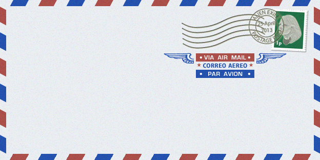
 willBook — Mail Icon
by-nc
willBook — Mail Icon
by-nc
Published: 2007-02-22 07:25:57 +0000 UTC; Views: 9656; Favourites: 14; Downloads: 2512
Redirect to original
Description
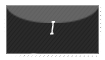
I know that the envelope thing is kind of over done for email icons. (I think that that might be part of the reason that Apple went with a stamp) however, since then I don't remember seeing any icons for apple mail that weren't a stamp of some kind. I thought that the badge gave more opportunity for the icon than was really being used. I realize that the number is a bit off center, maybe someday I'll try to find a way to fix that without it messing things up, but to be honest it makes it more realistic almost.Related content


Comments: 4

👍: 0 ⏩: 0


I think this is the greatest mail icon for mail i ever saw, and now with the new Leopard i was wandering if you plan to update it with bigger resolution and the four different sizes for the badges.
And I'm totally agre about the badge looks more realistic on your way.
Thanks very very much
👍: 0 ⏩: 0

 (Smile)")