HOME | DD
 Wnison — Spring Memories

Published: 2012-08-07 10:41:06 +0000 UTC; Views: 15769; Favourites: 1551; Downloads: 0
Redirect to original
Description
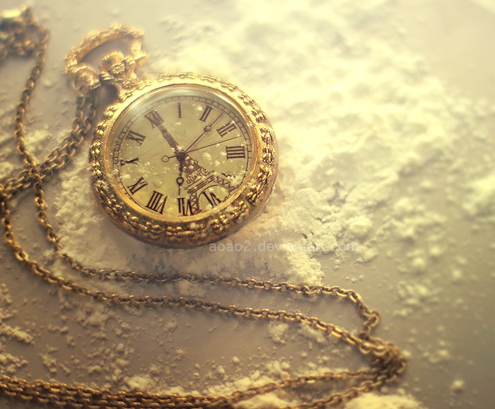
Oh! The Spring... I miss the Spring in these hot days...But time can not be given back. At least we keep our memories in photos

▼ More:
» Follow me on Facebook and Instagram for more photos!
Facebook | Twitter | Instagram
Copyright © wnison.deviantart.com
Do not reproduce, copy, edit, publish, transmit or upload in any way without my written permission.
Related content


Comments: 178


This work makes me happy, it bring me at the spring time!
👍: 0 ⏩: 1


Did you know there's a group on DA for pocketwatches? I'm sure they'd welcome this  (Smile)")
👍: 0 ⏩: 1

Thanks for the notice! I will check some out.
👍: 0 ⏩: 0


")


Its gorgeous!
It seems vintage but timeless. Soft light, beautiful flowers...Perfect!
👍: 0 ⏩: 1


can i buy it from somewhere or is it the only one of it's kind.
👍: 0 ⏩: 0

Very nice.
The outdoors setup, the "old-timey" watch with Roman numerals, and the filter make it look like a really nice, treasured old photo.
As of the present time, I work part-time at a photography studio and a lot of my work consists of editing. The reason I ask is just because I'm curious what filters/actions you used (assuming the "visual/color style" was done in Photoshop or some other editing program). Was it "Vintage" or something?
Regardless, it's very nice.
👍: 0 ⏩: 1
Thank you very much!
I can't tell you every detail of the edit but yes, I used Photoshop and mainly I started with Selective Color to increase the amount of brown and yellow and to remove some blue, after I fixed the colors with Color Balance, then some touches at the yellow again with Channel Mixer, after 10% of Warm Filter, then I increased the contrast, the brightness and after few more little touches with Levels I finalized all the edit with the Curves on Red and Blue and a bit of Color Balance on Highlights (:
👍: 0 ⏩: 1

 (Wink)")

wow... thats ..hm..i have no words.. its great!
👍: 0 ⏩: 1
| Next =>