HOME | DD
 xormak — Gaster

#rib #scarf #tale #under #undertale #cave #cavern #coat #lightrays #ribcage #ribs #skeleton #skull #gaster #xormak #undertalegaster #undertale_gaster #gaster_undertale #gasterundertale
Published: 2016-02-05 03:54:54 +0000 UTC; Views: 1624; Favourites: 102; Downloads: 0
Redirect to original
Description
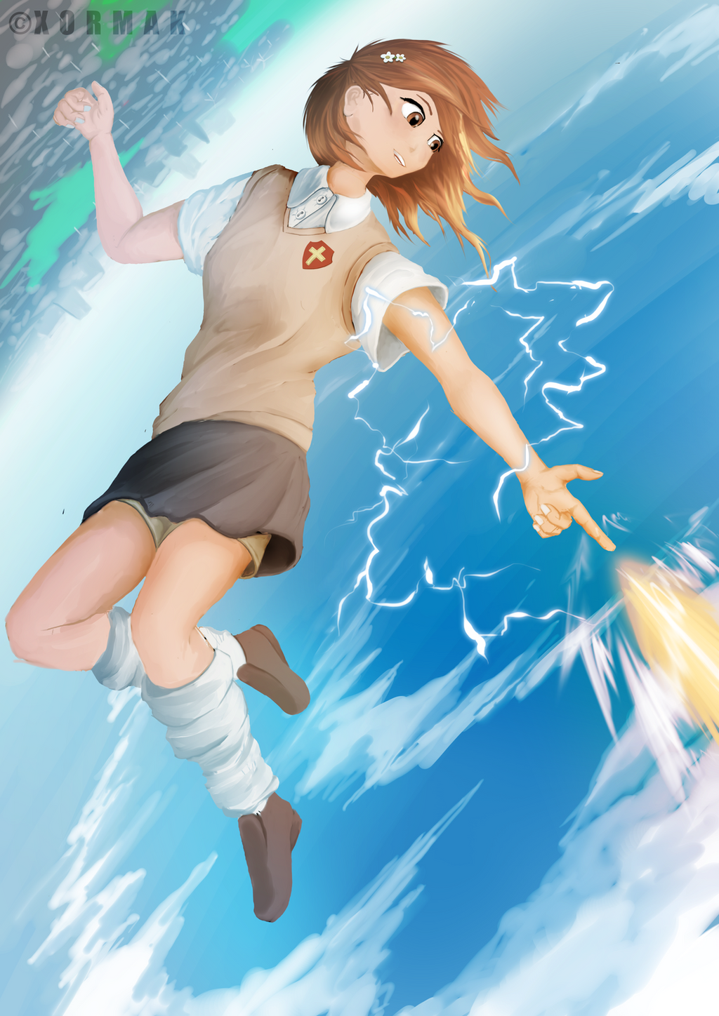
This was pretty fun to do had an awesome time Streaming it on picarto.tv/Xormak")
Related content


Comments: 6

Overall
Vision

Originality
Technique
Impact
Greetings.
First, your scores: I have your Vision set quite high, as your image is well done and has good impact, and speaks not only of Gaster's search for freedom, but possibly also his driving goal of setting all Monsters free - daylight is the very symbol of liberty for such beings. And Gaster could be said to have lost his life (as we know it) to his efforts, so the image takes on a saintly aspect.
I have your Originality set somewhat lower, as the overall image elements are slightly limited, and Gaster is singular in the image, with no other complex indications of circumstance or concept, including Gaster's own visual design.
Your Technique is set quite high, as I can see that you've made a painterly use of your digital media, with various sorts of textures, layers, and lighting, including contrasting textiles, rock, and subtle cave depth.
The Impact is also set reasonably high for the same reasons as Vision. You've not only made an image that easily resonates with the subtext of Undertale, but it's immediate visual impact is clear in your choice of palette.
Now, onto a visual breakdown:
The first thing that impacts me about your work is your heavy use of contrasting purple and yellow hues - you've used them effectively in the primary lighting, veering to oranges again for the faded distant cave structure, and then back again into heavy violet hues for the farthest structures.
Second, your primary image elements and lines are the spread of light and Gaster's figure, and the surrounding frame of rock.
Let's start with the light column. It provides the strongest single source of illumination, and supplies the colourization effects on the surrounding rocks. The first thing I notice is that the spire of rock in the upper left corner interacts strongly with the light both on the fore and rear side of the spire tip. this strong tint also provides the only contrast to Gaster's hue of bone - one I find that detracts from his personal impact in the overall hues of the image. While the rock spike does add more detail to the top left area, you could have brought the overall visual one step farther by having it cast a shadow onto Gaster, or near Gaster.
The strong yellow hues are also blended into the background. Is this just a choice of style, or do you mean to imply atmospheric dust? Your rendering of the background caves and textures is mostly blotted out by the light, but the soft gradients of dust or suspended particles might have added a slight third element to the visuals. You could have also used it to better add that sense of labyrinthine and confined nature which Monsters suffer in the underground.
The rock texture varies a little in application from the top right ceiling, versus the main mass seen behind Gaster. Personally, I feel the rougher texture of your top technique is stronger for use in the stone texture, as it would contrast the smooth flow of his robes better.
Speaking of Gaster, the flow in his robes, along with the spire of rock and the vine or root in the top right ceiling create a good, circular 'frame' for the image. I have little overall skill in rendering cloth or textiles, so my ability to provide proper feedback there might be limited.
You make use of plenty of rounded forms in the flow of the cloth; the overall placement of it makes it seem lifted on drafts, or to be moving with Gaster's own motion. My impression is that it's a lighter form of fabric, as it traces some of his details rather sharply. This does well in both giving mass and volume to Gaster, and also letting through some details, such as his ribcage.
However, your rendering of fabric folds is rather limited. There are a few key areas: the piling and presumed twisting of fabric around his scarf, the compression at the elbow of his upheld hand, and the drapery settling onto his lower body and lowered arm.
About these areas: the fabric of his scarf could use some twists around the 'collar' area of it. The cloth could also have some gravity around it's lower segments so as to suggest more form. The folds at his elbow could use more of the 'compression' type folds, which would still twist a little with his upward motion, providing that type of fold and visual detail overall. Lastly, though I don't know of your overall treatment of Gaster's figure in the image, the latter mention of gravity and drapery could use the detail of his underlying body structure and areas of motion or pose in his arm; his overall set of figure is mostly lost in the smooth flow of the fabric. While that's fine, indicating his underlying body structure would give his figure more dimension, and the visual more details.
Finally, my only issue with the set of the lower cloth and drapery in the image is that the section of rock just under his elbow is slightly too bright in relation to the light on his clothing; this makes the rock seem to have to come forward of his robes. Balancing the hues there would be tricky, at best, especially given his robes' velvety appearance.
Onto Gaster's skeleton or self: first, I know how difficult it can be to depict bone and structure with proper form. They are very complex surfaces overall, and recalling anything from scratch is a real exercise. That, and Gaster's overall form is something that can be treated with many potential styles.
You have his skull facing at an upward and outward angle; this is difficult to do, and I commend you for going there with this depiction. However, using his lower jaw as a set for the correctness of the rest of his cranium, it causes his eye orbitals and the other details to seem skewed in their angle. This is, at best, a difficult thing to do correctly without some form of reference or aid.
I do like how you've exaggerated the rift in his skull; though it's not placed correctly as to his canon appearance, the stereotypical zig-zag fracture works nicely in your image and adds some texture to the otherwise smooth expanse of his cranium.
His neck bones are rather simplified, but an appeal of the cervical vertebrae is their spinal processes and finer textures. While your depiction of his spine as just a simplified cylinder does work, a touch of detail to bridge his face to the complexity of his ribcage might be a good detail to bear in mind.
Lastly, his upheld hand: the ulna and radius appear rather thick. The ulna is on the pinky-side, and is a more slender and stable bone; the thicker fan of the radius occupies the rest of the wrist, and rotates around that. The overall wrist is about 3/4 the width of the overall hand structure. Pay attention to the facing of the palm, and how that'd work with the angle of the radius and ulna - in some cases and views, the radius appears to cross over the ulna in the visual, which can be a neat effect and sense of motion.
My only issue with the overall hand structure is that Gaster is missing his characteristic 'holes through the palms,' but that's okay. (Still, I find it's a neat, rather sci-fi/fantasy difference which I like about his character design.) And second, his hand is outheld smoothly - and while still a good visual, is rather flat; adding some overlap of his fingers and bones would also enhance the depth and life of his pose.
In closing, thank you for sharing your work! Though I haven't had a chance to watch your stream of this, I see that fellow fans enjoyed it immensely. I hope the critique has been helpful. e.deviantart.net/emoticons/n/n… " width="15" height="15" alt="

👍: 0 ⏩: 0


Vision
Originality
Impact
this is really well done
the textures you added are done perfectly and give this piece an awesome feel to it
the skeleton is done very well but i think you could have put a little more detail into the spine( i don't know anatomy but there's something missing from it )
i like the foreground but the background is lacking
maybe add something like the cave wall with more cracks or textures in it(assuming that's what the characters standing in) or maybe the cave continuing further away getting darker and darker
again a very wonderful piece
i ran out of words so theses are just fillers
👍: 0 ⏩: 0


I really liked watching this during stream. Fantastic work Xor!
👍: 0 ⏩: 0

The apprentice has become the master. Great lighting, pose and attitude. Well done
 (Smile)")
👍: 0 ⏩: 0