HOME | DD
 XtrDesign — Business Card
by-nc-nd
XtrDesign — Business Card
by-nc-nd
Published: 2007-09-17 02:35:06 +0000 UTC; Views: 223662; Favourites: 640; Downloads: 51443
Redirect to original
Description
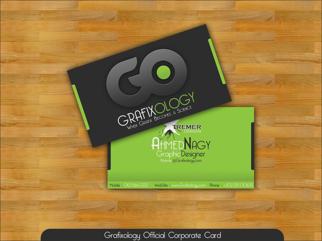
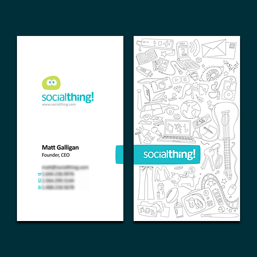
Ok, This is Grafixology's Business Card design") .. took a long time to feel NEAR the Satisfication .. but still not really satisfied.. it's done by photoshop anyway..
.. took a long time to feel NEAR the Satisfication .. but still not really satisfied.. it's done by photoshop anyway..
Related content


Comments: 140


What font did you use? I love it!
👍: 0 ⏩: 0


I believe if you just had your logo 'GO' by itself on the front is enough. It's over whelming and trying to say to much. They may say 'Less is a bore' from the good old post-modernism days but 'Less is more' is better in this circumstance.
👍: 0 ⏩: 0

Hello,
I just want to let you know that I wrote a post on my blog about my new business card and some nice business card designs and featured your business card in it. Hope you don't mind. You can check it out here: [link]
All the best,
👍: 0 ⏩: 1


nice avatar ,...hey check this one out [link]
👍: 0 ⏩: 0

Как можно скачать??? Очень хочу визитку  (Smile)")
👍: 0 ⏩: 0

I don't like that byline
"When Graphix becomes a Science"
for starters graphix should be spelled correctly regardless of cool intentions and colloquialisms..
Next we'll have a plague of "Graffix Deziners" - its tacky imo
otherwise quite nice..
im not sure, but could it be lacking some fern(s) in the background also? could add to the 'natural' scheme you've currently got.
👍: 0 ⏩: 1

Thanks
well as for the spelling.. it's also spelled in another way because we have a reason..
Thanks anyway..
👍: 0 ⏩: 0

very cool. i also liked that green adaption to grey
👍: 0 ⏩: 0


fantastic i will see all your gallery in chaa allah ^_^
👍: 0 ⏩: 1


 (Wink)")


There is a lot going on on this card and not much to pull it all together. You've got a bold, bright clean style and then the distressed xtreme...
The fonts don't match for either style and then you have some other typography issues. I'd revisit the layout and think about what you're trying to say.
👍: 0 ⏩: 1
Thanks for the comment..
👍: 0 ⏩: 0

hey check this one out [link]
👍: 0 ⏩: 0
ooo!! Yeah ")
👍: 0 ⏩: 0


hey check this one out [link]
👍: 0 ⏩: 0
<= Prev |