HOME | DD
 xxAREESHAxx — ..: B l a z e :..

Published: 2011-08-26 11:59:24 +0000 UTC; Views: 1991; Favourites: 57; Downloads: 24
Redirect to original
Description

 (Wink)")
And when you find it, tell me how the glow looks, only THEN scroll down till the end of the description.
")
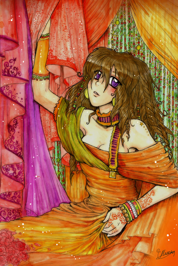
^Couldn't come up with a better title.
The sketch had beed lying around somewhere in my files and yesterday I got the inspiration to complete it. I got bored of my usual style to draw eyes and decided to experiment ^^ Tell me how it looks?
 (Smile)") First time drawing curls
First time drawing curls Anthea Isabella Grenelli.
I like how Anthea's dress looks here ^^
She's waaay pretty, but I couldn't "capture" it here. -__-
The "light" made the frill lose its colour, but still it looks good
The sand is edited by me. :3
Haven't decided a name for the guy yet. How about Naveed? or Ali?
This took a lot of time and effort, and I have never drawn clothes better than this before, I think this is one of my greatest works. ^_^
Tools: MOUSE, SCANNER, PHOTOSHOP
Time: Definitely over 10 hours

HERE IS THE ORIGINAL ONE (WITHOUT EDIT)
[link]
[link]
[link]
[link]
PLEASE!
Click here to create a critique!
For those who don't know, the "edit" means "the wound of words is worse than the wound of sword."
Related content


Comments: 96

I'll try to capture the second one first.. I just have to find some pigeons
It's a good idea.. the woman with a pot.. it's hard to for me to find something like that.. but i'll look for it too..
nice ideas..
👍: 0 ⏩: 1

ashdjkhaskdhkash thank you :,>
👍: 0 ⏩: 1
not a big deal.. but still i can't promise you anything.. otay?

👍: 0 ⏩: 1
It's okay it's okay, you agreed to help me that's all that matters *dialogue bazi*
👍: 0 ⏩: 1

Beautiful...I love the arabian theme and her dress!!! Do you have a full view of it?
👍: 0 ⏩: 1
Thank you so much 
Erm.. this is the full view
Would you rather that I make more darwings like this one of them?
(I really need support and motivation to carry on my work >-<;
👍: 0 ⏩: 1
that's k, i can still make it...how do her does her shoes look like?
👍: 0 ⏩: 1
Umm... good point, I didn't think about that yet ._."
But right now (in this pic) she just came from a journey, so I suppose she's wearing boots?

👍: 0 ⏩: 1


well hi there. I found this work among the critique me folder in the group #Critiques-Requested , so here we go, hope you don't mind that I don't use the official critique widget or the group's critique creator, as I don't like having to assign stars to stuff, as I feel it obscures the actual message of the critique. take note that my critiques are meant to be helpful and constructive and by no means offensive. alright? lets roll
to start with, the lighting effect is rather cool, and the scene overall is quite nice. her fashion seems a bit unsuited for the desert, but this is probably just on the outskirts of a town or something, and not in the center of a desert, so it's fine, it's just that based on the image alone, here fashion comes off a bit out of place. while her fashion may not fit the desert though, it overall does seem to rather fit the culture, least in my opinion.
the dress is a bit shiny, but this is also a rather and cool appeal to it, and compliments the rest of the fashion well
the choice to make the expression of the guy unseen in this shot is interesting, as it make you wonder how he's going to or is reacting.
the texture on the guy's head band is a bit too bold and eye catching in relation to the rest of the color palettes, so tone it down a bit next time. this boldness of course is also used to your advantage in another part of this picture though, and that is the girls hair. it's so dark and contrasting, that it makes her the vocal point of this artwork, which is great as that's also the center of the piece and where you want people to look
I do see hints of a romance theme in this, though I feel like it's not being used as strongly as it could be. her face shows traces of her feelings, but her body language is static and not helping to convey her emotions very well. keep note that body language is just as if not more important than the expression.
composition wise, the right side comes off as a little too plain, and I feel like perhaps showing the edge of a town or something showing nearby civilization could both justify her fashion and balance out the picture visually.
so, to sum up, you've done a cool piece here with nice fitting mood, scenery, and coloring, just work on your composition, incorporate more body language, and spruce up or crop out the right side of the image here. good work
👍: 0 ⏩: 1
Thank you for the critique!
Now for the replies:
Her fashion is like... the reason I made it that way is because she's not from the desert, she's from another region visiting a city and is currently on the outskirts: a desert. She's stubborn and does not listen to anyone, and is doing whatever she feels like (in here wearing whatever she wants)
The guy here yes belongs
Oh? Could you please elaborate more so as to how I can improve the body language?
The town is "south" of the picture. Like, if somebody walks NORTH from the town straight covering a distance, then they could see the two. In this case, the guy has covered a distance north from the town, that's why there's nothing else to be seen. Though I do feel as if I should have made their tents...
Thank you! Could you please give me hints as to how I can improve the composition, (in general) and body language?
👍: 0 ⏩: 1
you're welcome
ah, gotcha, I figured it was more so something like that, just wanted to point it out.
as for improving the body language, it really depends on what emotion your trying to convey, and in the end, I find it hard to explain because I'm also personally not that good at it. basically, I'd say go for more curving, her pose comes as still and vacant, perhaps curve her back forward more and with her hands on her chest, almost showing how she's telling him her true feelings and her heart. then amp up the expression more, perhaps to either be more teary or emotional. again, just possibilities, no direct course of action and I wouldn't recommend tweaking this to suit the needs, just learn from it for future pieces. I found this to be a helpful source to look at to begin to grasp the concept [link] but by no means is this too in depth of a tutorial
makes sense, though it doesn't help the composition
for composition, basically, I find the rule of thirds to be a good start on learning composition. it's where you cut your image into 9 evenly sized squares, like so [link] . the key is to get the most interesting part of the picture on the power points of this grid [link] . here's more explanations on it, [link] .
again, it doesn't always have to be centered or balanced, and this rule is only one technique that doesn't cover everything about composition, but you don't want the eye drawn to a relatively empty section of the pic or to leave too much empty space open whereas the other section is close together. in this image, the two characters are fairly close, then there's just a big gap of empty space to the right of them. since they are close together, it comes off as more fitting that the composition should be closer in around them, which is mostly is, except for that one right side, so it's thrown off a bit.
👍: 0 ⏩: 1
Thanks again! You helped a lot
👍: 0 ⏩: 1

You know, I can't really find anything to edit in this right now. I mean, the lighting is good, the folds in the clothing look natural, and I love the backround, simple, but again, the lighting makes it look really nice..Well done
👍: 0 ⏩: 1

I love the glow!! her eyes are so pretty too. Oh great job!
👍: 0 ⏩: 1

Love that shade of purple! Perfectly sexy!
Oh, and the way her hair is in the wind.
I LOVE I LOVE I LOVE HOW THE SUNLIGHT MANIPULATES EVERYTHING
her curls are stunning.
her dress is magical.
Seems like something right out of Little Mermaid, just a more...Arabic-like version.
And really love her boobs
The fact that he's just standing there is...WOW.
The shading would've killed me xD
👍: 0 ⏩: 1
In her eyes right?
HAIR. It gave me troubles -n-
It gives an "enchanting" kind of feel, yes??
Dress and curls. 0w0 I like them too.
Why'd you compare it to Little Mermaid? What's so common between them!? >:I
Well... you know, women of the past wore dresses with big necks and all >__>
What's so special about him standing there? XD
Thaaanks :3
You didn't suggest a name for him.
")
👍: 0 ⏩: 0

aaww Anthea she looks so pretty *w*
and yes u did a GREAT job in it!
haha i cant believe u didnt come out with a name yet xD
👍: 0 ⏩: 1
thanks 
well.. the names i liked i gave to nazia but this guy is my own character and i can't think of a name for him D: suggestions?
👍: 0 ⏩: 0


you're getting better and better, day by day!
👍: 0 ⏩: 1
Thanks!
But you didn't say anything about the drawing itself
")
👍: 0 ⏩: 1

The original one looks a bit boring. this is the good version with light and i actually love the thing that u blurred the guy ... original mien focusing sari larke pe ja rahi hay!
👍: 0 ⏩: 1
I noticed, so I edited it a bit, but I like the girl's hair in the original one more... oh well, it's good here too
All the focusing in the original was on guy? What do you mean?
👍: 0 ⏩: 1
I mean the guy head was more in the view then the girl!
👍: 0 ⏩: 1
WOW areesha!! this is awesome! loving the eyes! experimenting is goooood!!
👍: 0 ⏩: 1

Well job
👍: 0 ⏩: 1

I really really love the colours! Shiny as always but a lot more detailed. I prefer this with this light effect since it makes it somehow more romantic or mysterious. The lines are so smooth and I see you tried a bit different style for her eyes and such. Really pretty ^^
👍: 0 ⏩: 1
Thank you!
And yes! There's a huge story behind it. Actually I'm going to write a novel soon! More like an e-novel, but still! I'm still in the process of planning the chapters now, but it will be done in an year, I'm sure.
Will you read it?
Thank you again

👍: 0 ⏩: 1
Of course I'll read it!
👍: 0 ⏩: 1