HOME | DD
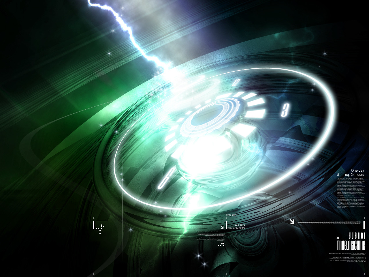
 yuenqi — Time Machine
Published: 2003-09-09 13:28:15 +0000 UTC; Views: 9120; Favourites: 91; Downloads: 3193
Redirect to original
Description
(Damn, I was in the wrong category)** UPDATED **
Fixed layer problems
And yea, there're 3 wallpapers with different resolutions in the zip file (1280x960; 1024x768; 800x600).
 (Smile)")
Thanks guys for all the support, criticisms and
 .
.** Original Message **Am I supposed to submit painting..
") Uh yea, I was actually doing my moral assignment this whole afternoon, and chatting with ~ blameshiori on ICQ. Around 4 or 5 pm, I felt stressful, so I made this in about one+ hour time. (Yea, those who understand me will know that I will do art when I feel pressure
Uh yea, I was actually doing my moral assignment this whole afternoon, and chatting with ~ blameshiori on ICQ. Around 4 or 5 pm, I felt stressful, so I made this in about one+ hour time. (Yea, those who understand me will know that I will do art when I feel pressure ") )
)This artwork can be considered as my first attemption in this style. (Nay, I did 'RedAlert' last time) Anyway, comment please~
Also thanks to *wirestyle , ~nefariax , and ~--tom-- to comment on my preview.
3D: Bryce
Photoshop Brushes: *inception8 's Gradient Center v1, M1 Tech Circles & M2 Tech Circles; Photoshop original brushes.
Total w/p: 3 (Zipped)
*** FULL VIEW OR DIE ***

Related content


Comments: 88

Mein gott, this is just fabulous. It's so pretty and I love the colours you used- it feels a bit like in hyperspace. And it's so clean~
👍: 0 ⏩: 0

I'll never understand how these kinds of images are made. :/ Very cool piece.
👍: 0 ⏩: 0


HEY! this is what you shown me! i liek this too much. i remember you said no 3d software is used. so good work on this! I like it
👍: 0 ⏩: 1

Did I say I din't use 3D software
👍: 0 ⏩: 1
yeah you told me. so what 3d software did you use
👍: 0 ⏩: 1

Oohh, wonderful wonderful. I was so lucky to see it in progress, I thank you for letting me see. ^^
👍: 0 ⏩: 0


You did great; but a hint on the 3d; the bryce is JAGGED (oof). But great job!
👍: 0 ⏩: 0


That's a good one !! Love the colourz !!

👍: 0 ⏩: 0

i thought that bryce is a program for rendering landscapes only..... anyway, its a great pic! I would like to add something to the inscription on the right side "1 day is 24 hours is 1440 minutes is bla bla bla seconds and so on..." would be more interesting, i think. Thanks for commenting my stuff!
👍: 0 ⏩: 0


fuyoo!!! giler aa!!
this is great man!! i can feel the space in it. Good job.
looks like you've done so many calculations!
👍: 0 ⏩: 0


interesting, but try not using 3D phrogs  (Wink)")
👍: 0 ⏩: 0

wahhhhhhh 1 hour u did this ?
sniff sniff teach me !!!
i love this !!

👍: 0 ⏩: 0

I told u it was good and i still think so..
nice work bud ^_^
👍: 0 ⏩: 0

I like the ((seemingly useless)) information on the bottom-right part. Gives the impression that the thing is 'doing something'.
Does it say anything, or is it just some random collection of letter?
👍: 0 ⏩: 0

Nice job, i like it a lot, esp the vector, how u made it glow, nice job on it, and the renders r good too, cept gritty at parts( i ddint know if it suppose to be like that). Nice job man.
👍: 0 ⏩: 0
Oh shit, I discover some layer problems..
👍: 0 ⏩: 0

awesome... i expected more painting style stuff from you but this is pretty cool too good job
👍: 0 ⏩: 0


hey that looks pretty awesome..almost looks real and in motion specially that effect around it..what a beautiful design ..kick ass job yuenqi

👍: 0 ⏩: 0

Frigging kickass! damn bloody cool! its excellent! it doesnt show for a 1st or 2nd attempt.. it looks very pro!
👍: 0 ⏩: 0

superb drawing/painting technique and skills.
the ring is superbly proportioned. the lightings, colors and metallic effects are carefully rendered. Brilliantly done. 10/10 dude! i'll put this in as a favourite
artistically, I'm sure you can put in some good meanings n thoughts into it cos time can be related to a lotta things. So there, I gave u a hint.
👍: 0 ⏩: 0


Trend whore to teh max!!!1
Just kidding, great job. I love the lighting effects and the clock/time theme is dead cool. Clocks are so neat
👍: 0 ⏩: 0


Hey, I think that's good enough! I though Bryce is for nature only
👍: 0 ⏩: 0


fucking awesome man!!!
its amazing everytime i see it ")
👍: 0 ⏩: 0

as i said...this is pure kickass for the start!
good job!
👍: 0 ⏩: 0

<= Prev |