HOME | DD
 yuumei — Draw this again! - Sprinkle of Stars

#stars #yuumei #starfreckles #yuumeiart #digitalart #freckles #redraw #underwater #drawthisagain
Published: 2018-06-16 21:30:40 +0000 UTC; Views: 64589; Favourites: 4703; Downloads: 801
Redirect to original
Description
YUUMEIART.COM 


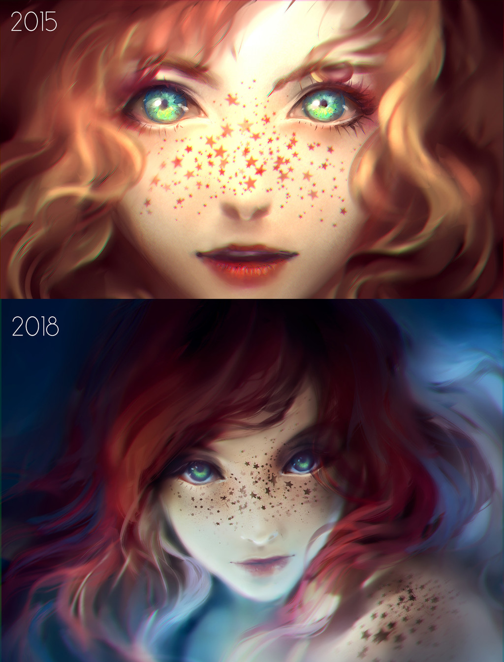
Did another redraw of an older painting, but this time it's only 3 years apart, not 10. Less has changed but still changed 
HD file and video process of this painting will be on my Patreon.com/Yuumei for June
Related content
Comments: 98

I remember when you first posted the original! I loved her then and I love her now
👍: 0 ⏩: 0

Honestly, she would make an excellent mascot concept for tourism to Ireland.
👍: 0 ⏩: 0

I've seen this description for freckles before and always thought it was a bit ridiculous. To see it in action (so-to-speak) is amusing. I like it. *Them
👍: 0 ⏩: 0

This is amazing. Could you pls tell me how you did the hair and the eyes?! because this looks so cool. 
👍: 0 ⏩: 0

I didn't even think the first one could get any better 
👍: 0 ⏩: 0

I can definitely see the improvement. And the change in perspective is a plus!
👍: 0 ⏩: 0

The improvement is subtle; in such areas as stiffness and movement <3 I love how your style stayed consistent throughout. It often seems like when people improve, you can see the improvement, but their style has become . . . worse.
👍: 0 ⏩: 0

To me, the eyes in the old one pop more, but the lighting and overall composition of the newer one shows a marked improvement. Both are still excellent pieces.
👍: 0 ⏩: 0

the contrast between the warm and cold colors in nice I'd call that someone improvement
👍: 0 ⏩: 0

While the framing differences are obvious, the skill difference seems to be pretty much zero. Kudos for having such consistent style and skill.
👍: 0 ⏩: 0

Both look gorgeous! you do an amazing job
👍: 0 ⏩: 0

Dang it your old and new look freaking awesome can I have yo skilz pls?
👍: 0 ⏩: 0

"My god, it's full of stars”
Great work. Looks very cute and awsome.
👍: 0 ⏩: 0

I really enjoy the changes you decided to make in the redraw! Looks really pretty c:
👍: 0 ⏩: 0
<= Prev |


