HOME | DD
 Z-Yan — Interview with the Vampire
Published: 2005-03-06 14:23:35 +0000 UTC; Views: 67187; Favourites: 1467; Downloads: 6867
Redirect to original
Description
I think the vampires in the movie are sexay")
Anyways
This is another movie composition I did
3b on a2 paper
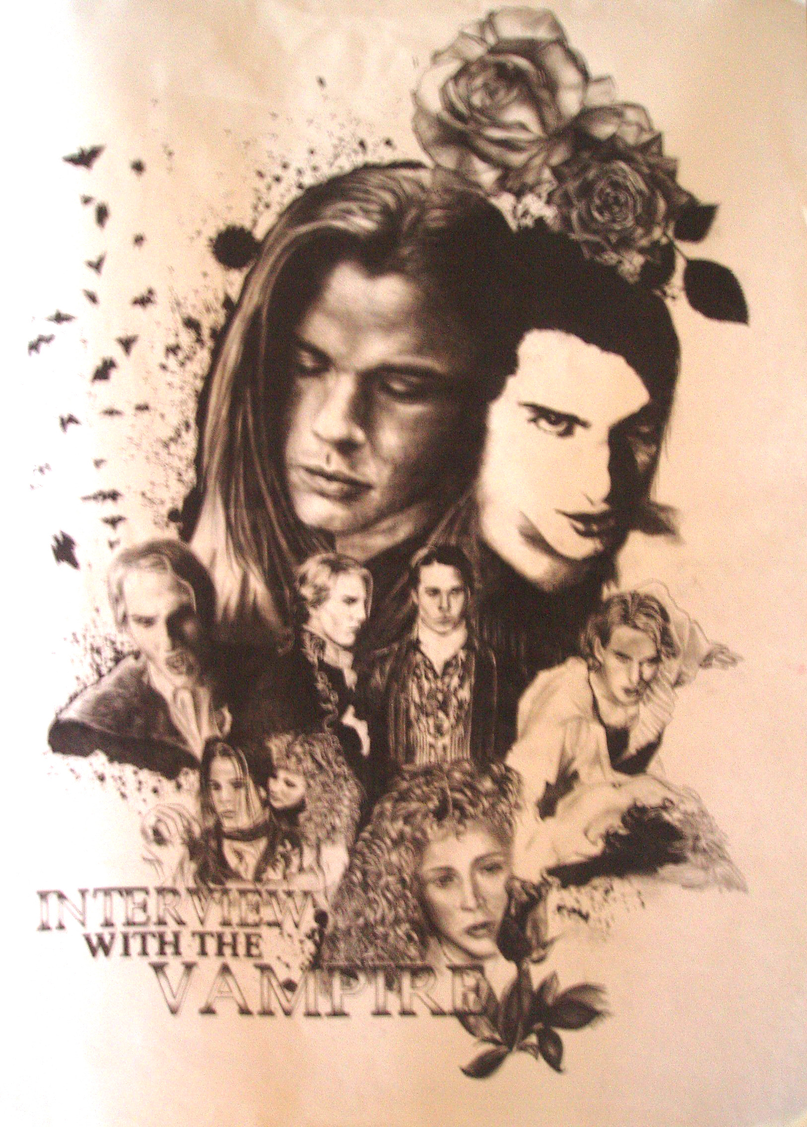
In the movie, Lestat (cruise, boy he was young then) created (sorta) Louis (brad pitt) when he drank from his blood. That's why in this compo they look as if they are merged together. He taught Louis to become a vampire in which Louis didn't really enjoy as his heart was still pretty human. That's why I used a white rose to represent Louis and a black one for Lestat as Louis has much more humanity in him compared to Lestat. Moreover, I find vampires a very seductive creature as they're always involved with women and lust, thus that's the reason of why I chose to represent them with roses. Due to the lack of humanity in Lestat, I drew him in an over-exposed effect to portray him as a supernatural creature.
Vampires = lots of blood involved, as they hunger for blood. Thus, explains the blood spreading outwards from them which slowly transform into bats. Why bats? Because they lurk in darkness from one place to another seeking for blood. Like bats they are blind. Blind in the sense of they don't know where to go and their life is pretty much pointless as they live forever in hunger. Then there's Claudia (very very young Kirsten Dunst) who is a young vampire... represented with a young rose. The movie involves the relationship between Lestat, Louis and Claudia. Both Lestat and Louis adore Claudia, which is portrayed with the placement of their fioures. Both Louis and Lestat are on the top with one Claudia at the bottom. If you connect them, it forms a triangle. But Claudia loves Louis more, that's why I chose to include a scene of Claudia hugging Louis.
The WhiTer pARt at the left Side of the PIc is 'caused by the flash of bad Photography........................ >.<"
hopefully I'll get a gigantic scanner to scan all my huge pics one day....
Related content


Comments: 184


This looks absolutely beautiful. You did an amazing job on it. ^_^ *favs*
👍: 0 ⏩: 0

Wow! It's a stunning composition! I only wish you had a proper scan of it. Fantastic job!
👍: 0 ⏩: 0

That is so awesome I like how lestat and louis kinda blend together.
👍: 0 ⏩: 0

")

awsome!, love the pic of brad pit!
and yes the vampires are sexay!
👍: 0 ⏩: 0

you did a wonderful job on this my dear, the bodies and faces are in proportion and the shading is unbelievable.. 
👍: 0 ⏩: 0


Omg! I love that movie and this drawing! I've watched that movie so many times that the tape is about to break! lol. Yes, I have it on a video tape. lol. Well, this is a fav! It's great!
👍: 0 ⏩: 0

This movie is SO GOOD and it makes way more justice to the book than the Queen of the Damned did. Even if the actors are far drom beeing my favorites... Awesome work you got there!
👍: 0 ⏩: 0

Thankyou so much for your comments~!! ^_^ I love Louie alot in the movie, guess my mind was so full of Louie back then as I was drawing this piece hehe ^^
👍: 0 ⏩: 1

this is amazing!! i love it, the symbolism!
👍: 0 ⏩: 0

I love the flow of the pic. Everything seems to fall nicely in place. I esp love the large Louie Head. The angle, shading and proportions are just commendable. Great Job.
👍: 0 ⏩: 0

Hockey puck, that's amazing!! Instafave right here!
And I agree, them vampires are smecksay.
👍: 0 ⏩: 0
 (Smile)")

Very nice composition, love the sepia antique tones. Nice use of subjects tied together to fill the space. Love it.
👍: 0 ⏩: 0

They are portrayed as best as they might be able to be through art...that's for sure
👍: 0 ⏩: 0
They are portrayed as best as they might be able to be...that's for sure
👍: 0 ⏩: 0

I love it - you've captured the mood of the film/book perfectly.
As for the likenesses; you really couldn't ask for better ones. The Claudia at the bottom looks a little squished, but I guess that's pretty appropriate considering her character and limitations.
So basically, it's awesome
👍: 0 ⏩: 0
Thanx hehe.. will try to take a better picture next time >.<
👍: 0 ⏩: 0

wish it were clearer and smaller. it stil is an awesome piece though
👍: 0 ⏩: 0

IT's pretty cool. I thought you added the brown on purpose, cause it works well. I can't really say anything bad about it.
👍: 0 ⏩: 1
Thanx
Maybe the unintentional effects ain't so bad after all
👍: 0 ⏩: 0
u can photostat lah
yeah jiad li it kinda, but wish that the white part is browner 'cuz sumhow it's kinda wierd... >.<"
👍: 0 ⏩: 0

WAHHHHHHHHHHHHHHHHH sell to me la can? i frame it up and hang in my room!
--
wee wang wang tin lei lei tei lei lei balibali puuuuuuu!
👍: 0 ⏩: 0

the composition is quite nice.. n the shading is very realistic.. but how come the color is brownish? did u purposely make the color like that? i think the big tom cruise face can shade a lil more coz its too contrast with the overall especially to the brat pitt at the side... n the lower tom n brat doesnt really look alike.. big figs r gd.. still can improve on the small figs.. the lettering is very gd n i can c the effort.. so as the background, very creative ( bats ).. overall the mood is controlled very well n it is a very gd piece.. keep it up!
👍: 0 ⏩: 1
it's brownish cuz of the photography
I didn't purposely made it like that
'cause every pic I took of it has a reflection from the shading
and this is the only pic I took which has the least reflection..
Thanx for the comments...
It was a rush work and you knew it
👍: 0 ⏩: 1

i think the brownish quality enhances the mood. don't you think so?
👍: 0 ⏩: 0

Its a shame that its so blurred, it really doesn't so it much justice. However the peice itself looks amazing...
👍: 0 ⏩: 0
<= Prev |