HOME | DD
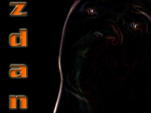
 zdan — Project Goa ver1

Published: 2001-11-13 12:46:15 +0000 UTC; Views: 310; Favourites: 1; Downloads: 33
Redirect to original
Description
1st version of the official wallpaper for my site. i feel its missing something but i ran out of ideas.please comment and tell me what do u think i sould add/remove
Related content


Comments: 9

I like the depth also. It's clean and smooth. And the colors fit's well togheter.
👍: 0 ⏩: 0

Personally, I love it.. I don't normally vote on things, but I will here... I think it's perfect the way it is.. You've got plenty of depth already... Keep it the way it is.. In my opinion...
Pet my monkey..
👍: 0 ⏩: 0

yeah... theres a typo in there.... the image i uploaded in my site is typo free
addind depth... hummm
/me shuflles around his primitive photoshop techniks
-{Project: Goa}-
http://www.projectgoa.f2s.com
The quest for non earthly energies
It is something to be able to paint a particular picture, or to carve a statue, and so to make a few objects beautiful; but it is far more glorious to carve and paint the very atmosphere and medium through which we look... Henry David Thoreau
👍: 0 ⏩: 0

I see what you mean about it missing something... and I too cannot quite put my finger on it. The only thing I would say is that the "Q" from "The Quest For..." looks like a "G"... "The Guest For..."
Is it just me?
It's a nice piece though... clean and yet grungy at the same time
~[Diado]~
~[Latest Deviation : https://www.deviantart.com/deviation.php? id=96749]~
👍: 0 ⏩: 0

This piece is great!
I tell you what it is missing!
Depth! Ok, it has some already, but it is really well worked at the moment, and if you can add depth without shadows (experiment with fait shadows on the other - tendrils? - I used that word today already..) then that would be ace.
Depth, but keep it as-is.
I am loving this!
👍: 0 ⏩: 0
used is not exactly the word. i read it and then i came up with a slightly different way of doing it, right word would probably be that it inspiered me (i think i misspeled that) (and that too)
-{Project: Goa}-
http://www.projectgoa.f2s.com
The quest for non earthly energies
It is something to be able to paint a particular picture, or to carve a statue, and so to make a few objects beautiful; but it is far more glorious to carve and paint the very atmosphere and medium through which we look... Henry David Thoreau
👍: 0 ⏩: 0

nice claws... I believe u used the DA's tutorial, I've seen it somewhere lying around.. Nice work.. I love the blending and those smooth curves. Looking forward to visit your site!
👍: 0 ⏩: 0

mmmm
Maybe depth? I feel no sence of depth in the picture at all. Maybe it should have some? Maybe not...? I think it could use some, how, i don't know.
Get fretteh.
👍: 0 ⏩: 0

looking good thus far, it does seem to be missing something, but i dunno what. if it clicks and i think of something ill be sure to note ya
👍: 0 ⏩: 0