HOME | DD
 zen-x — lost reflection

Published: 2002-11-27 00:54:39 +0000 UTC; Views: 263; Favourites: 6; Downloads: 72
Redirect to original
Description
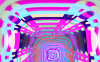
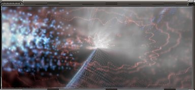
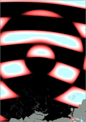
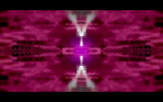
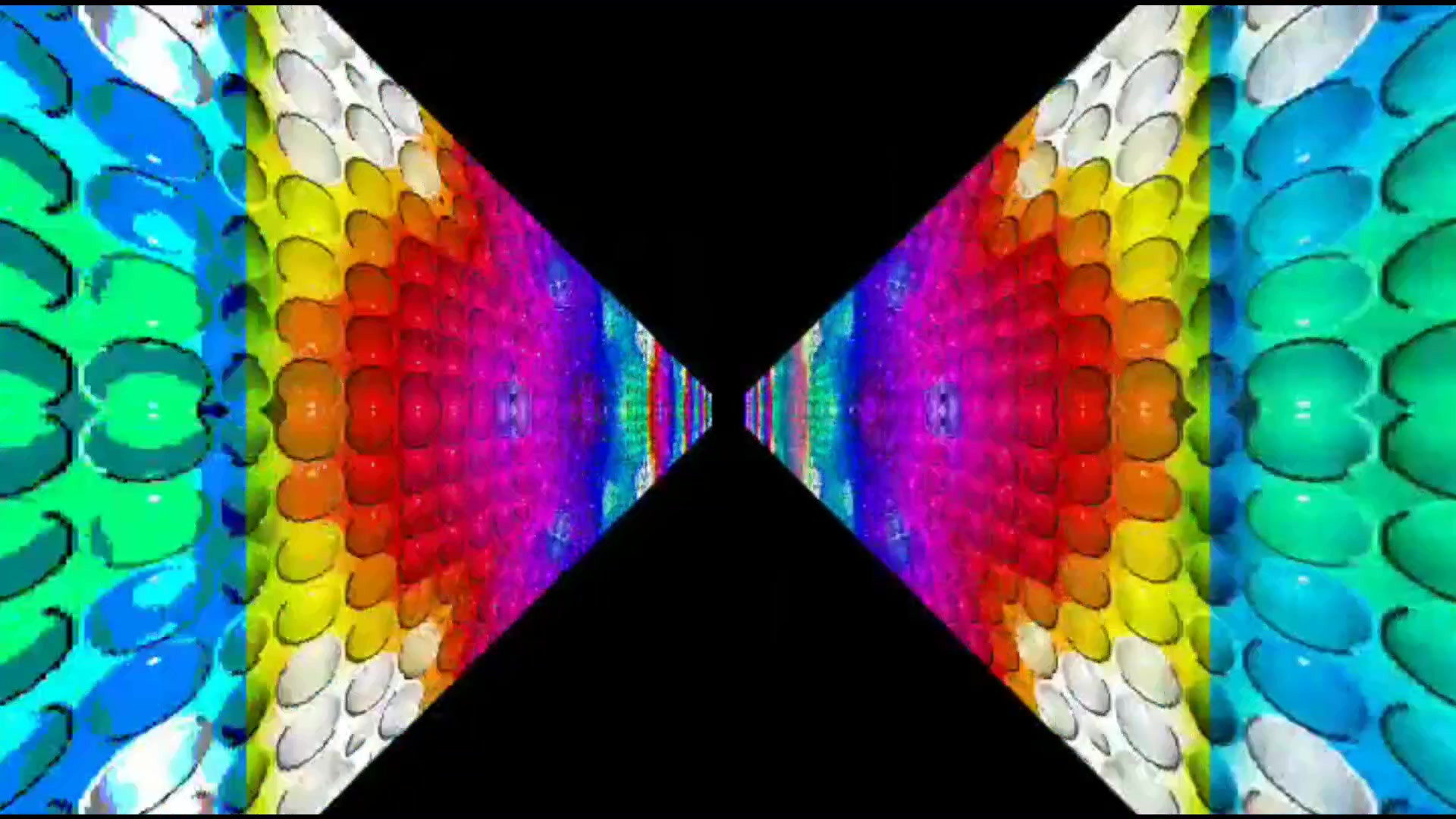
Sorry it's been so long but here you are another preset from me, this one took quite a few goes to get the right feel and tone (it started out as a remix then lost all the orginal presetHope you like it (don't be put off by the crap screenshot). Comments as always are welcome, if not craved.
Peace
Zen-X
Related content


Comments: 9

Its FAKIN cool...Alienated color of SScope & Dynamove with "r=cos(r*3)" formula are co cool...FUcKIN COOL!!!!!!My Favorite!!!
👍: 0 ⏩: 0

This is one of the AVS style I love the most!
Very, very beautiful
A preset like this, it pleases me 'cause I can watch it for hurs, and don't get tired of it!
Fab
👍: 0 ⏩: 0


too long indeed. Remember when you submitted that burning the flag preset & then it was 9-11 the next day? . . . anyways . . .
This preset astounds me. The alpha blending is absolutely phenominal, especially coupled with that color fade. Of course, the colors aren't my favorites, but this is a Zen-x preset. So once again, you're true to the good stuff. Excellent work.
👍: 0 ⏩: 0

Very melodic and quite relaxing. The red, blue and green stimulate many different things.
-doomit
👍: 0 ⏩: 0

Indeed, really nice effect you got there. It's a bit dark though, but i think that's always been your style
So a new pack coming out soon?
Last one? (hope not)
👍: 0 ⏩: 0

Very nice chrome/rgb preset, fully deserving its featuring, but This Is Not what i am waiting for. Get it?
👍: 0 ⏩: 0

My favorite preset of yours by far, great metallic looking gradients, I think you should add a 50/50 white Utone, but that is just a color preference. Very nice work.
👍: 0 ⏩: 0