HOME | DD
 zilla774 — user.defined
Published: 2004-07-15 11:09:30 +0000 UTC; Views: 28675; Favourites: 237; Downloads: 14583
Redirect to original
Description
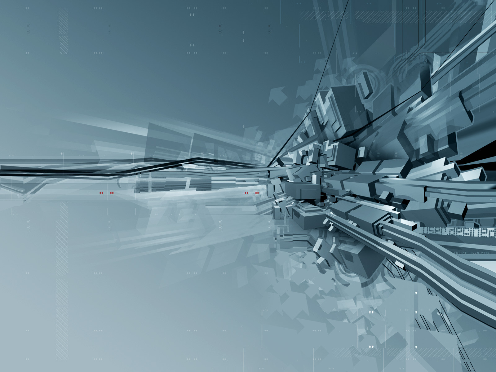
techy stuff: 3D Studio Max, Illustrator CS and Photoshop CS--- --- --- --- ---
I wanted to do something a little more vectorised and 'techy' with this piece. I had been playing around in Illustrator for a while and the idea for very simple vector boxes evolved. I used 3DS to get some random box shapes going then expanded on them in Illustrator and pushed it all about in Photoshop. A suprising amount of this image is constucted not from mesh or vector, but Pixel stretches in Photoshop - a technique I have quite got into recently.
The only frustration I had with this image is the use of a single colour space. I kept trying to add an accent colour to the piece but it just didnt work. In the end the inclusion of the 4 Red 2D circles was all that was needed to lift the whole piece. Quite a simple solution to this problem.
Related content


Comments: 89

Cool! Very cool! ")
👍: 0 ⏩: 0


I can't figure out how you like crap out so many incredible works one after another. So far I've got it down to you being a robot or you're just really fucking hardcore.
👍: 0 ⏩: 1


Man, you submit alot of images lol.....this is great too bro...all techy, and clean=
I'm missing those mid-evil images from ya, that we used to see.

👍: 0 ⏩: 0


This is probably my favorite thing I've seen from you, GJ
👍: 0 ⏩: 0

hey pretty nice. i like the 2d as well. set it as my wallpaper to see it in its full glory. looks good.
👍: 0 ⏩: 0

love the neutral tones, they go a lot with the way i've been setting up my pc recently.
i love the more tech feel, indeed it is excelent. i also like how you manage to still bring your own superb stylings to it, it still says zila to me, even tho it's a not exactly your norm.
great stuff, keep it up (oh, it's my BG atm)
👍: 0 ⏩: 0

Yeah many eye catchers and nice 3D a very great design
 (Wink)")
👍: 0 ⏩: 0

even if the 3d looks pretty simple there're still enough elements in here that keep the eye busy  (Smile)")
👍: 0 ⏩: 0


well i like it, but the colours are a little blunt and could do with changing around a little, a bit mono-colour really for my liking, not enough depth.
Other than that, good job. Nice render and 2D, works well.
👍: 0 ⏩: 0

1st computer geek tyo second computer geek:
"Well I found the bug*"
"Uhuh, where is it?"
"It's in the main cable plugin spot, wait, I'll give you a model sheet on it"
He hands above zilla-deviation to the other.
(* Bug: referring to the origin of that word usage: That a mouse had her nest in a bunch of computer cables, thus cauing errors ")
👍: 0 ⏩: 0

 (Cool)")


DAMN THATS GOOD, awesome collaberation and smoothnes of boxes, sounds complicated to make.
i got me a new wallpaper and you got yourself a
👍: 0 ⏩: 0


yeah I like that, nice use of the 3d and vector stuff, colour is perfect.
+fav for adding those 8 red dots!
👍: 0 ⏩: 1


Its not bad bro, but i think it could all use some more details.
👍: 0 ⏩: 0


Beautiful work, not a lot of people can pull of this sort of complex minimalism.
👍: 0 ⏩: 0


Hee... you and I should talk some time so I can get some hints about this minimalistic thing going on. I kinda wanna expand this sort of thing into my repertoire.
👍: 0 ⏩: 0

Well done buddy another great piece, I love it, you got a nice fresh idea going, The simple colors looks great. The 2d on the top right looks good with the tech rings and arrows looking great, Its not the same on the bottom, color dosn't match as well as the top. +fav buddy, i really like this one, Nice job
👍: 0 ⏩: 0

and what could i say??
just that i love it, and thank you for my new WP
simply perfect

👍: 0 ⏩: 0


the overall result of your experience is overwhelmingly beautifull. i love the layout of all the pieces but i think it whould rock more in a different colour-set. maybe u shold use "selective colour" to give more colouring to the piece. i whould love to hear more about pixel-stretching because i love the results and i dont know how to do it.. could u feed me back in that particular effect?

👍: 0 ⏩: 0

Oh my God this looks beautiful and a hell difficult to create... Many hours spent it seems. I like the freshness of this. The minimality of the colour also is an advantage. I like this one. It could also have a cd-layout version... And some music written for it I suppose. Do I ask much?
Ok, I will stop being a chatterbox and I will just 

👍: 0 ⏩: 0


Hey, I really like the sence of minimalism and simplicity that this has, the 3D abstract suits the overall theme well, especially with all that block-age. Good work!
( a little more red next time though, eh? )
👍: 0 ⏩: 0