HOME | DD
 zuper —
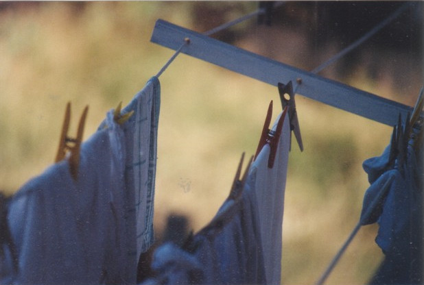
discrimination
zuper —
discrimination

Published: 2005-01-12 17:05:32 +0000 UTC; Views: 7526; Favourites: 135; Downloads: 1532
Redirect to original
Description
[link]Related content


Comments: 83


fantástica foto!! sobre todo el contraste y los colores
👍: 0 ⏩: 0

.
ME ENCANTO EL JUEGO
DE ENFOQUES Y LOS
COLORES, SIEMPRE
SON BUENISIMOS
_.
👍: 0 ⏩: 0


This one...the title makes one thoughtful. I say your last picture with similar subjects. Interesting idea...
Your focus is very advanced I'd say
👍: 0 ⏩: 0

I'm not sure why, but this made me smile.
Thank you.
👍: 0 ⏩: 0


nice message, very effective... some may not have caught on at first, but i always think it's good to make sure that your audience work to grasp your intentions.... congrats on a job very well done!
👍: 0 ⏩: 0

i lvoe what this says. you deff just proved a picture is worth a thousand words. and meaningful words at that! absolute

👍: 0 ⏩: 0

Um.... this is a DD?!?!?! 
👍: 0 ⏩: 0

and you didn't to tell anything, this is a image with feelings; great idea.
👍: 0 ⏩: 0

Interesting!
It really does remind me of cliques and exclusion.
By the way, the way you used depth is really cool! The only thing I think could improve this would be to have something somewhat subdued in the background like a fence.
👍: 0 ⏩: 0

Maybe you should take a look at this [link] ...maybe...i dunno..just maybe...could be an addition to your work...
Great photo you got there my friend...i like it a lot..and I like broches. lol
👍: 0 ⏩: 0


small, blurry, and grainy.....
not BAD, but don't see what all the fuss is about.
👍: 0 ⏩: 0

I really like the conceptual meaning of it, as well as the focus/focal point of the picture. You have a rea eye for this kind of photography. Keep it up!
👍: 0 ⏩: 0

very nice concept, really well done and really clever.
👍: 0 ⏩: 0


I say tear. So moving, so simpl. Simply moving. Tres beau.
👍: 0 ⏩: 0


Wow, this shot is really impressive! Love those simple comic like colours!
Title fits so well.....
Keep up the great work!

👍: 0 ⏩: 0


Simple but expresses a lot. A very very original idea, congrats ^^
👍: 0 ⏩: 0


love the idea - i like the use of depth... really well done.
👍: 0 ⏩: 0

this is quite example of descrimination  (Smile)")
but doesnt this belong in conceptual ?
👍: 0 ⏩: 0

That looks alot like the DD with the gummi bears.....feh...whatever
👍: 0 ⏩: 0


felicidades por el dialy deviation ")
👍: 0 ⏩: 0

That's amazing that you conjured up that much meaning and feeling from such a simple shot.. I'm assuming the clip in front is wooden? It really does throw me back to some real-life scenarios.
I usually don't check out daily deviations, either, but this is great. Perfect symbolism.
👍: 0 ⏩: 0

incredible that you came up with this idea first, great shot.
👍: 0 ⏩: 0


I've just been blown. I mean my mind was blown by the neat photo.
👍: 0 ⏩: 0


This is just too cool. I would have never thought clothespins could be personified..
👍: 0 ⏩: 0


wahaha it's got quite a narrative there ;D it's got really cool colors
but, I do not like how out of focus the clothespin is, i think the size contrast is too great between them (but that's just my opinion ) the big black shadow of the blurry clothespin takes my eye away from the schway color in the background just a little too much
👍: 0 ⏩: 0

I kinda looked at this for a while, nothing complex, nothing flashy, just the simplicity is incredible, great job dude!
👍: 0 ⏩: 0

Nice capture. But I think the position of the logo is keeping the picture from a perfect balance.
👍: 0 ⏩: 0

")


| Next =>