HOME | DD
 0meter — 080210 Yu

Published: 2008-02-10 09:28:44 +0000 UTC; Views: 3262; Favourites: 98; Downloads: 51
Redirect to original
Description
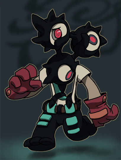
Character by , named YU. I feel guilty I left Ai out. They usually seems to be together.It was a delightful switch to my usual working style; simple and clean. No fucking wrinkles and muscles.
The symbol reads "Yu". It was orignally written in english but the "Yu" kept appearing unforgivably unattractive. The white "belly side" on the tail is not suppose to be there. I added it because it was hard to define Yu's tail properly.
Haha this drawing will feel so out of place in my gallery. I must sleep now. My labtop just wiggled in front of me.
Related content


Comments: 24

I think it's crazy how you can make 2D look 3D, just your style I guess, but still, it's cool.
Nice blur effects too, which reminds me that I would like to do something like that. :0
This would make a pretty cool wallpaper.
👍: 0 ⏩: 1

You should definitely try. Blurring is like an easy-A for getting genuine depth in your drawings.
Ah, you are right. This would make a fine wallpaper. Makes me want to make one...but too lazy. [also I am too content with my minimalistic cloud-wallpaper]
thanks for the comment, Z
👍: 0 ⏩: 1
I don't really have any compositions that would work with blurring as of now,
but I'll keep it in mind thnks.
👍: 0 ⏩: 0

No words except form "amazing"...*tear*.
Has you said,this is delightful ,the inking and the effects are just...beautiful and excellent.(But I don't know why...why do I think again that this is out from your style...?)
Anyway,I really like the colors that you have chosen for his bady.And I also like that you added a white strip on his belly;I think it adds a lot.Heh. (I dunno,but here,Yu reiminds me a bit a... jelly .HAHA I just can take a spoon and starting eat him.It is so real that I almost can touch him...)
I can see your signature behind Yu,you know.Heh,and about that "white sign"-is it just me,or maybe it's the same sign like in here: [link] ? Is it some kind of a letter or a word in Koran that says "Yu"? )
I think that you are getting better quickly,from every picture to anther.Good night and sleep well (haha the time that was in my country when I saw it first was...20:30.So I gusse that the time in your country was about...1:30-wow,you are an animal night.)
👍: 0 ⏩: 1
"why do I think again that this is out from your style...?"
Is it that different? But I suppose you are correct; the huge difference in this drawing compared to rest of work would be that the character in this picture is have very simplified details. Perhaps bigger eyes, and absense of nose, heh.
happy to hear that this looks "real". That was the type of shading I wanted to apply on this character. I thought it would be interesting. The "pink" part of the character does appear very edible. GET THE SPOON NOW
The letter that say "yu" is korean. The "white sign" behind "yu" is not; it is chinese. I been using it as my signature because I suck at creating good, effective signature. I may change it again soon. Blah. [if you are curious, the chinese letter is my last name]
I submitted this around 3 am I believe [I no longer remember]. Most of my deviations are submitted between 2am - 7am HAHA. It's just that I start working on a drawing in the afternoon and work none-stop until it is finished. It is not healthy I think.
Thanks for the comment Simon.
👍: 0 ⏩: 1
HAHA and he also doesn't have any neck. Heh,I think that it might because you usually DO NOT use in these colors(especially of the background.)
FINALY! Do you wanna join me for the eating...? *speaking in a full mouth in jelly*-oh my,this is not polite!
haha I already know that this is korean and chinese. And you already showed it up in your sketchblog how does your name look like in chinese.(and I might NEVER interpret this to English-and that's the hole fun in this strange chinese.HAHA)
Man!you are faster then I thought!to me,a drawing can continuous more than A HALF YEAR.I mean,if I don't want to continue a drawing so I just live it and starting a new one,and after a while I remember in it and finish (but it happends scarcity.)
👍: 0 ⏩: 1
Some people tend to have difficulty staying with one task because they have too many ideas. Hehe, perhaps your head just flows with new ideas and it irritates you to continue the same thing. Just a guess.
👍: 0 ⏩: 1
YES!YES! That's what I am talking about! sometimes,I just try to write my ideas,but I just can't control on my hands.heh heh...
👍: 0 ⏩: 0


Oh, wow. This is so... I CAN'T FIND WORDS TO DEFINE IT'S AWESOMENESS! ...Awesomeness doesn't do it justice either XD. It's so (much better word than beautiful), and the simplistic design of the character together with the strong emotion of the picture makes it so eyecatching and (ten times better word than likeable), it's almost impossible not to love this, especially for those of us familiar with the character (which includes me)! As if I really need to tell you, you did an AMAZING job on this!
")
👍: 0 ⏩: 1
Thanks a lot.
"Strong emotion" huh? I did want the image to appear somewhat "bold". I like doing that to characters like this; something about Ai's expressions seem very heavy most of the time [in Vap's gallery].
Glad you liked this. Thanks again ACN-Chuckie.
👍: 0 ⏩: 1
You're very welcome, Shagia! I have noticed that in vap's gallery, he always seems... somewhat troubled. I believe I remember her saying something like that it's because he has to deal with his counterpart Ai all of the time, who, in contrast to Yu, is immature and very energetic. But anyway, if bold is what you were going for with this, you definitely nailed it.
👍: 0 ⏩: 1
oops I realized I said "Ai" when I was suppose to say "Yu". Stupid me.
But thanks. Ai seems to have very silly personality. [perhaps some stupidity haha]
👍: 0 ⏩: 1
Yeah, I noticed you said Ai instead of Yu, but I was afraid at first that I was somehow misunderstanding you, so I had to be careful of how I worded my reply. Perhaps I am the stupid one XD! You know, I bet Ai would look quite astonishing in your style as well.
👍: 0 ⏩: 0

Very elegant. The coloring is also quite nice, especially the lighting in the eye.
👍: 0 ⏩: 1
Thanks for noticing the eye. I actually wanted it to appear to have a layer of transparent "glass" on the outer surface. Not sure if it worked out. Well, at least it looks alright.
Thanks for the comment Pooryorick.
👍: 0 ⏩: 1
Actually, the glass thing is exactly what I thought when first seeing it. So works for me, at any rate. Rock on.
👍: 0 ⏩: 0


Oh wow... never figured anyone will ever make a fan art of him :000
And since you made it, its double joy ;w;
It feels so...alive3Dsomething.. like in a way i will never be able to draw like <¦D; It really looks simple but still.. with something in it that gives it such a good feeling..
And its really awesome to know that symbol now~
...I really flippin love it that im gonna print it.
Yes.
YES I WILL.
..i cant stop straing at it..
...but i need to sleep...
|:1
Superawesomeilovveeee

👍: 0 ⏩: 0

Awesome detail here! I did miss you blur tool usage. ;^;
👍: 0 ⏩: 0

Hah, you used the depth blur again.
It's always weird when you don't use the red'y-pinkish colour for a background. It's become signature.
I like the shapes this character is composed of.
👍: 0 ⏩: 1
I have grown to dislike that red'y-pinkish background, haha. It seems I desaturated from [just] red so much, it began to have "cold" component [red + blue = purple/pink]. Now I add more orange so it will appear warmer.
Coloring the head was very fun to do. Understanding 3D shapes in general seem very fun.
👍: 0 ⏩: 0