HOME | DD
 0rAX0 — Uniform Icon Theme
by-nc-sa

Published: 2014-05-09 18:32:10 +0000 UTC; Views: 104310; Favourites: 292; Downloads: 27126
Redirect to original
Description
IntroductionMy very first icon theme for Linux!
Okay, so what the heck is that? Why everything is out of shape? Am I going nuts? Maybe.
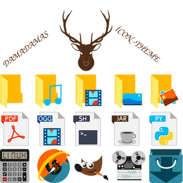
Uniform is a new icon theme made for Linux (GNOME) desktops. It's made by someone who tested every shape on the planet to get a unique and original theme until he flipped the table and unshaped everything. Consistency can be achieved by maintaining the same pattern instead of drawing the same container.


This is the first release, it's missing A LOT of icons. For now it's inheriting the GNOME icons. Oh, and it has no folders yet.


Buy me a cup of coffee ☕️: ko-fi.com/redalazri
Installation
Copy the content to ~/.icons or /usr/share/icons for system-wide access.
Arch Linux
AUR: aur.archlinux.org/packages/uni…
yaourt -S uniform-icon-theme
Versions


 v. 0.1: 9 May 2014: Initial release


 v. 0.1.1: Fixed broken links and a typo. Delete the folder before updating, this will create a new folder.


 v. 0.1.2: Added 7 new icons.


 v. 0.1.3: Tweaked and added 30 icons.


 v. 0.1.4: Tweaked and added more icons. Added partial support for default elementary apps.


 v. 0.1.5: Tweaked and added some icons.


 v. 0.1.6: Tweaked and added some icons.


 v. 0.1.6.1: Fixed the index file and added Chromium and Pidgin. Re-taking it slowly.


Last updated: 9 January 2015.
Related content
Comments: 90

Thanks! The top one is Vilbur. But I forgot the second, need to look for it in Google Fonts.
👍: 0 ⏩: 0

I'd love to see Android version on Google Play.
👍: 0 ⏩: 1

Any reason why certain icons have a specific shape (or color)? Random? Chance? Secret concept?
👍: 0 ⏩: 1

The shape is random, but the colors choice depends on the icons; sometimes it's taken from the original icon and sometimes not.
👍: 0 ⏩: 2

Humm, the complexity of the icons also varies quite a big deal. That gimp icon really stands out in this respect.
Don't get me wrong, I really love most of your work, I just want to ask about/challenge the underlying rationale of this icon theme a bit.
👍: 0 ⏩: 1

Yeah, I'm aware of that. Some icons will eventually be tweaked. As you may know, you don't always start with a clear idea of what you want but you iterate until you get to it.
Please keep the challenges coming, don't worry. 
👍: 0 ⏩: 1

Ok 
I think – and this is something that frustrates me about some icon themes (e.g. libreoffice do this upstream) – that mimetypes and apps should be distinguishable from each other. When I look at the pdf icon (and obviously you haven't disclosed your concept of mimes), my first (intuitive) thought would be that this is a mime, hence a file, not an app.
Another thing I'd personally avoid is using fonts in these icons. The "2+2" is the calculator I suppose. Why not borrow the idea of so many calc-appicons and use the signs of the 4 simple mathematical operators (+,-,/,*)?
👍: 0 ⏩: 1

No, those are good remarks, they're not silly at all.
The PDF icon was a last-minute change, I was just going to do Evince's e, and tried this one instead. I might change it, who knows.
I'm trying something different; why not borrow the concept? because it's the concept "of so many calc-appicons". I don't want to play it safe, I'm experimenting; if some concepts don't work I want to see them fail with my own eyes and know why myself.
👍: 0 ⏩: 1

You're right, after all this is version 0.1
Will watch how this theme evolves!
👍: 0 ⏩: 1

it would be useful to use a single color for each category of apps.
👍: 0 ⏩: 0

This would be the bomb! I've seen a lot of icon themes and this is one of my favs. Are these icons in svg or png?
👍: 0 ⏩: 1

I don't know, no KDE no download.
👍: 0 ⏩: 0
<= Prev |
