HOME | DD
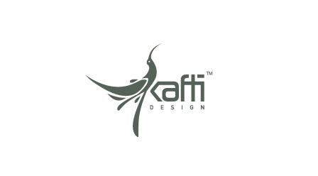
 11thagency — CRUI LOGO CONCEPT 2
Published: 2009-02-05 07:25:25 +0000 UTC; Views: 73887; Favourites: 373; Downloads: 7146
Redirect to original
Description
CRUI LOGORelated content


Comments: 63


Wow, nice work.. ❤
Thanks for sharing ❤
---------
Also you can find Free PSD Logo Templats at: FreePSDFiles.ml ❤❤❤
👍: 0 ⏩: 0


Wonderful and distinctive work...
-
You can also Find Free PSD Logo Templates Renewed Daily Here: PSDFly.com
👍: 0 ⏩: 1


This is a lovely logo design. One of the keys to success of a logo is that it should look good whether in color, monochrome or grayscale and your logo design has certainly achieved that. Check out similar inspirational logo designs at www.flickr.com/photos/infinity… .
👍: 0 ⏩: 0

Logo completes symbolize "Research" & urban theme.
👍: 0 ⏩: 1
Wonderful and distinctive work,
-
You can also find Free PSD Logo Templates renewed daily here: PSDFly.com
👍: 0 ⏩: 0

I'm looking for people to submit graphics to my new site. It's basically a marketplace where authors can sell their digital items.
You will benefit from a massive 70% off each sale of your item. All you have to do is upload and submit & you set the price!
rocketraiser.com
Hope you're interested!
👍: 0 ⏩: 0


Beautiful logo
Favors on this site
[link]
Designed and Win
👍: 0 ⏩: 0


I know this is out-dated, but browsing DA and wanted to pop in and say this is a great logo. Kudos.
👍: 0 ⏩: 1


can u do a logo for me...its for a film festival...the only thing i can do is credit your work...
👍: 0 ⏩: 0


Very nice! The gradiënt in the b/w version is just right and I really like the balance between the colors in the top version!
👍: 0 ⏩: 1

 (Wink)")

Looks nice! I like this one better then the other one. It has more harmony with text and logo, i like it! Keep it up
👍: 0 ⏩: 1


Thank you very much it dose means a lot to me  (Smile)")
👍: 0 ⏩: 0

| Next =>