HOME | DD
 20aday —
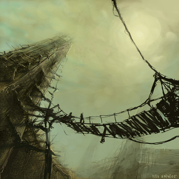
towers of mud n straw
20aday —
towers of mud n straw
Published: 2005-04-30 12:54:40 +0000 UTC; Views: 70489; Favourites: 3580; Downloads: 14475
Redirect to original
Description
topic was ancient towers of mud n straw (done for dsg forum on conceptart, ps7)Related content


Comments: 377

they r drawn in photoshop with graphic teblet
👍: 0 ⏩: 0


It reminds me of the concept art for halflife 2, I like the stark contrast between and bridge and the sky, very impressive!!
👍: 0 ⏩: 0


wow man...your perpective is awesome..the strokes really in some way give it's detail..one of kind 
👍: 0 ⏩: 0

Wow... so many gorgeous DDs today... I really love the art style, it reminds me somewhat of the Lord of the Rings, only less fantasy-themed... More metaphorical, perhaps... Very nice

👍: 0 ⏩: 0


A beautiful peice. Something that could only come out of a dream.
👍: 0 ⏩: 0

The tones are so well used here, it just blows me away. Wait, not away, maybe right into my PS CS sketchmode. The monochromatic greens and the relative low range that is very expressive paints a beautiful picture, grotesque and dark though it may be. And the perspective give such a strong sense of vertigo, of falling into the infinite abyss with one last glimpse of the gloomy world. Wonderful piece.
👍: 0 ⏩: 0

I love the angle and the colors! Amazing job. Congrats on the Daily Deviation too!
👍: 0 ⏩: 0

i wouldnt walk on that bridge...
👍: 0 ⏩: 0


That makes me dizzy. Wow.
I want to live there...
👍: 0 ⏩: 0

watdapak?! dat sou paking kul! I laik de perspektif! nais kolor tu... gud joub!
👍: 0 ⏩: 0

amazing work - i love it... gives me a feeling of Myst.. i love those games
👍: 0 ⏩: 0


Woooooooooooooooooooooooooooooooooow, very pretty, makes me think....
👍: 0 ⏩: 0


It looks like a photograph!
Very cool.
Congrats on the DD
👍: 0 ⏩: 0


Damn this is so damn'n awsome
It brings so much Damn emotion

👍: 0 ⏩: 0

Okay, I'm in love with this picture. 
")
👍: 0 ⏩: 0


Yowee. Its perfection. love the colours, love the strokes, love the compositon, the balance....I particularly love the buildings in the background...all shroudy + ghostlike! definitely a fave!

👍: 0 ⏩: 0

Wow! 
👍: 0 ⏩: 0

OOoooooh...I'm lovin it... *favourite*
Sorry- I fall in love with any picture with strong perspective in it
👍: 0 ⏩: 0


Its so awesome, Sincerely you are very talented!!!
--
\\ Acidesign | Plastiqueweb | Prints __//++
👍: 0 ⏩: 0

Awsome. It looks just like scratches or something. So cool...
👍: 0 ⏩: 0

i like the technique used in this artwork, it reminds me of oddworld... its got alien / tribal feel to it
👍: 0 ⏩: 0


i like this a lot. It reminds me of a movie I just can't seem to grap the title of. It looks like a photograph-very exiting inspiring piece.
👍: 0 ⏩: 0


Wow.. this looks like something from one of my nightmares..
👍: 0 ⏩: 0

Wow! It's a great piece of art! It sure looks like a nasty fall if the bridge broke.
👍: 0 ⏩: 0

Whoa. That's VERY good. Seriously, you did a great job on this picture. Good work.
👍: 0 ⏩: 0

Such a simple composition with amazing detail. Nice work. 

👍: 0 ⏩: 0

this painting is really impressive, the loose style of it give it a very own touch, and definately add to the creepy atmosphere. I like how everything is fading into the distance, how the dull light creates suspense, how you lead the viewers eye.
the only disturbing thing is that you used a soft brush for a few of the planks, a simple hard brush would have been much better
however, that's a well deserved DD, congrats
daniel

👍: 0 ⏩: 1
thanks man
not sure what plank u mean but i agree,.. theres much i could improve but it was a 90 min sketch i did for conceptart forum,.. never expectet so much nice feedback
and im just experimentin with new photoshop brushes,.. creatin like 1 or 2 new ones per pic  (Smile)")
cyo -max
👍: 0 ⏩: 1
well, I meant the planks of that hanging bridge, it's sort of odd that those silhouettes of the planks look so smudged/blured.
yeah, custom brushes are a good thing, you can nicely avoid having too regular edges with that, the strokes get a more natural feel, actually. but dunno, I personnally am getting away from using soft brushes in my paintings, except for blending and colour corrections.
but of course, it depends on you
take care *waves*
dan
👍: 0 ⏩: 1
ah jetz weiss ich was du meinst, des war dumm weil hab die bruecke gemalt, net aufgepasst un alles auf hintergrund reduziert,.. muss ich von zeit zu zeit machen weil mein comp sonst laggt ; P
hab nich zwischengespeichert und dann konnt ich nur noch mim harten brush und de rhintergrund farbe bisschen ausbessern,. is aber definitv n fehler der mir kein zweites mal passiert
wo kommstn eigentlich her aus deutschland?
 (Wink)")
👍: 0 ⏩: 1
jo, das problem dass der comp bei großen dateien und vielen ebenen zu sehr laggt kenn ich auch, aber ich vermeide es so lange es geht, alles zu collapsen. wobei es grade bei paintings nervig is, wenn man einen strich machen will und dann zuschauen kann wie sich der strich in 5 sekunden aufbaut...
ich komm aus dem raum leipzig, und du?
👍: 0 ⏩: 1
yo das mit den 5 sek verzoergerung kennich nur zu gut,. obwohl ich meistens auf 2000 x 2000 mit 250 dpi arbeite was ja relativ klein is
kewl du kommst aus leipzig? da solls ja gut abgegangen sein am ersten mai
ich bin bayer, genauer gesagt aus nuernberg
👍: 0 ⏩: 1
jo, das is wirklich nicht gerade groß.
weiß nich, ich versuch immer größer zu arbeiten, zu mal ich auch das ziel habe druck qualität zu bieten.... hab mir um drei ecken jetzt endlich einen prints account angeschafft. ich bezweifle zwar dass ich groß was verkaufen kann, aber der läuft ja nich aus, wenn ich also mal besser werde hab ich immer noch die chance was abzusetzen
in leipzig hab ich bis vor 5 oder 6 jahren gewohnt, jetzt leb ich inner kleinstadt in der nähe.
👍: 0 ⏩: 0


Reminds me of the wicker man t-shirt that iron maiden had. excellent stuff
👍: 0 ⏩: 0
<= Prev | | Next =>