HOME | DD
 Neizen — Oil vs1 -editorial

Published: 2005-10-04 21:28:16 +0000 UTC; Views: 6568; Favourites: 135; Downloads: 325
Redirect to original
Description
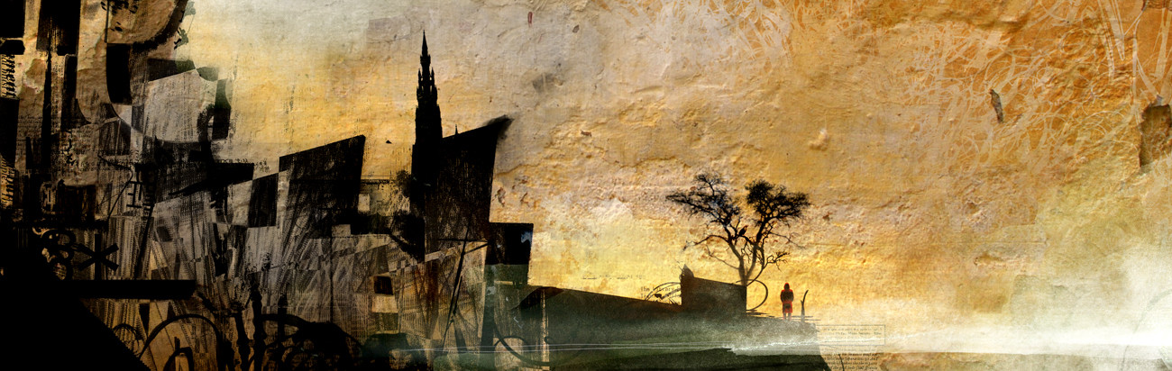
adobe ps7.0 + metal tray + dry sesame sauce, done during class today..This is an editorial assignment for a NY Times article (that our professor actually illustrated 2days ago) we had to come up wth sketches during class.. so, here is one of them..
[Im soo glad that we dont 'have to' use classic editorial approach-which we kinda had to before]
here is the BW version [link] [the vs for the newspaper]
Related content


Comments: 28


good heavens, it looks like it's done on three hundred year old paper! that's awfully clever. the whole thing is menacing! i'll need to read that article.
👍: 0 ⏩: 0

The colors, the motive and the style work together perfectly. Great job!
👍: 0 ⏩: 0


That's stunning. This work has an incredible feeling of aggressiveness in it. Fits very well to aggressive orchestral music. Woah, thrilling. <3
👍: 0 ⏩: 0

i don't know what the legality issues are as far as the stores go, but do i have your permission to print this up for my wall? i really like it. if not, that's fine, i totally understand.
👍: 0 ⏩: 0


I can't draw worth shit. if drwaing were an ocean, I'd be drowning and my instructor would be describing the water...okay. maybe now THAT bad, but I sitll can't draw worth a hoot. however...I have to learn, or my professors will send me to the stocks for sure. lol.
btw, Excelletn drawing, you're talented, that's for sure. keep drawing, damnit!!

👍: 0 ⏩: 0

I enjoy this piece very much. I, however, wish that the figure was in an area of a little more prominence. Perhaps it is intentionally for the figure to be placed in the corner so that the eye doesn't initially see it. But I would love it if a little more emphasis could be placed on it.
Nonetheless, I love this work. It seems to convey some desperation - perhaps against the establishment, materialism, capitalism, ...?!
Nice work.
- Steph
👍: 0 ⏩: 0

I saw this i was just like "wow". THis is brilliant. Such simplicity but busyness. great stuff.
👍: 0 ⏩: 0

I love how sharp the tones are. Very nice line work.
👍: 0 ⏩: 0


mürekkeple yaptım sonrada photoshopta yaptım üşendim.neyi nerde nasıl yaptın anladıysam arapoluyum abii yah.bu da hoşşş olmuşşş bu arada
👍: 0 ⏩: 1

Pardon yaw dun aksam kafa biraz dumandi
DA 'a koydugum versyonlari photoshapta cizdim, arkadaki texture onceden scan edilmisti..
Ancak resmin ilk versiyonunu murekkeple yaptim - hala okula goturup scan edilmak icin beni bekler...
tekrar cok saol bu arada
 (Smile)")
👍: 0 ⏩: 0

im love it, the perpective, trace, texture, all...
👍: 0 ⏩: 0

Hehehe, everytime I check the deviations, I hope it's your work.
How do you get the effect of the back ground? And how do you get the picture after it's been worked on in computer? Just print it on a normal printer, or do you need a special type?
👍: 0 ⏩: 0

Screw the Ravens, go Eaglessss
👍: 0 ⏩: 0
Yu see, thats why I dont like the new post-modern-bullshit gods.. They just 'damn' you.. Or 'work in mysterious ways' ... and just fucking sit on their ass till judgement and shit nothing gets done..
I want the old school Lighning Bolt in one hand and shield in the other "Ill zap your ass!!" type of god..
Have that dude and his family hangin around and yll have beleivers..
If anyone complains; ZAPPPP!!
Yre out BEYOTCH!
[ thats about how far my religious thouhgt goes]
👍: 0 ⏩: 1
"If anyone complains; ZAPPPP!!
Yre out BEYOTCH!"
I read this and heard Piero's voice. I think he'd be a kickass god, don't you?
👍: 0 ⏩: 0

I must say I definitely love this texturey/grungey version rather than the plain black and white. Dry sesame sauce! I have never heard of using that as a medium before, but it looks stunning. Very nice.
👍: 0 ⏩: 1
Thanks a lot (:
Yeah, I definately prefer the metal vs, I had to do the bw version since it was going to be for an article in the body of the paper.. it sucks that its gonna be my final..
Sesame Sauce!! the big SS of mixed media!! You gotta try it, definately one of the best cooking supplys to be used in art (doesnt beat the decaying banana juice though
Bows to master cheez
Take care
👍: 0 ⏩: 0

wow, thats so dark. Very cool! your style is very impressive. You can definitely tell the scale and magnitude of the huge piston cranks loming over the small man at the bottom. Your stuff kinda reminds me of the artwork done for Pink Floyd's The Wall. Amazing!

👍: 0 ⏩: 0


