HOME | DD
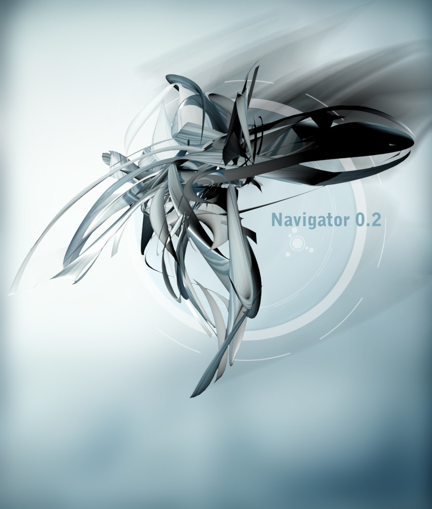
 3dho — The Navigator 02
Published: 2003-07-08 04:15:54 +0000 UTC; Views: 544; Favourites: 5; Downloads: 118
Redirect to original
Description
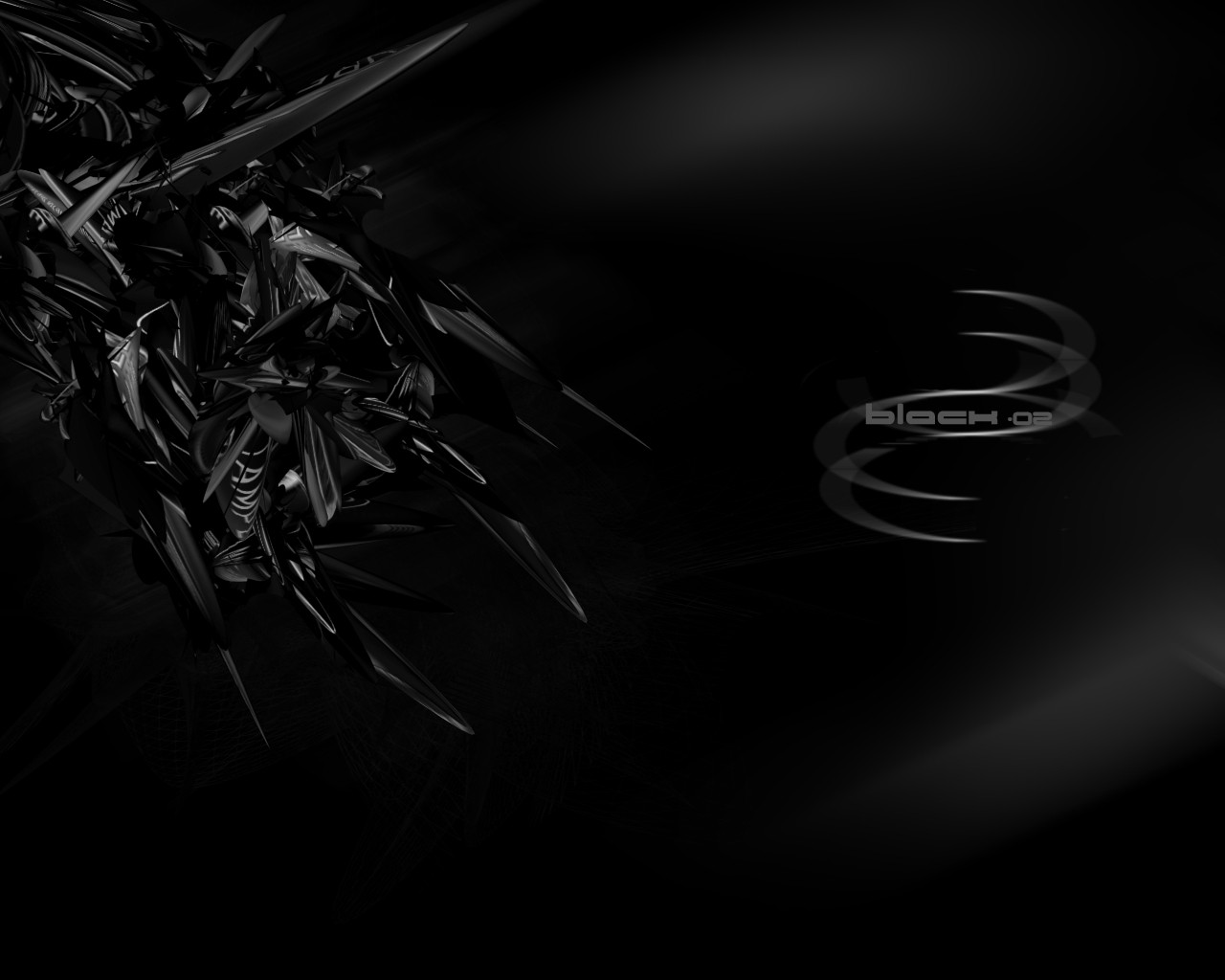
havnt been able to come up with any wallpapers latly so figured id try this sense says its easyer than wallsi dunno about that gave me about the same amount of headache
comments and sujestions welcome
Related content


Comments: 20


love the blue/chrome colours in this ")
👍: 0 ⏩: 1
")

awww so nice thats it im going to have a go at this style love it ")
👍: 0 ⏩: 0

xcelent work  (Smile)")
👍: 0 ⏩: 0

awesome work. It's so realistic, great color choice too! *dls more stuff*
👍: 0 ⏩: 0


pretty nice, real good 3d and the bg is good but i dont like the grey parts at the top just takes from it a litttle but its a great piece
👍: 0 ⏩: 0


This piece is somewhat underviewed, seeming as its so good, whats with the currnet lac of images?
👍: 0 ⏩: 0

brysonn..ok you know i've been away, but i can say that becos of that i can see the difference in your work from a few months ago, up to now...this is very sleek. I love the colours and the design-like detail in the background.
well done babe!
👍: 0 ⏩: 0

nice abstract artwork, good use of 2d and very good color choice, i like it a lot
👍: 0 ⏩: 0

Nice abstract work. I think it would look a bit better if the corners were lighter. It sorta looks like there bent a bit, which doesn't look that well with a futuristic abstract piece. The font could also be a bit more creative. But overall nice work
👍: 0 ⏩: 0

nice minimal design bro..nice model, nice piece damn it
👍: 0 ⏩: 0

Ooh, I like it! Very realistic... loving the bluish tone as well.
👍: 0 ⏩: 0

I said it's easier for me! everyone's different This is nice though, even if it did give you a headache. The shape is pretty sweet, and the colors are great as always. It's subtle but effective.
👍: 0 ⏩: 0

wow..im impressed...
must...download...more...stuff...of...yours...
👍: 0 ⏩: 0