HOME | DD
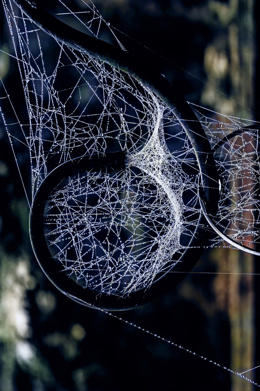
 4420 — Natures scheming

Published: 2008-04-23 10:36:41 +0000 UTC; Views: 869; Favourites: 43; Downloads: 0
Redirect to original
Description
More of an experiment in style and technique than a intentionally finished piece and so comments,suggestions and ways to improve are greatly appreciated,thankyou.Please view full size,thankyou.
Related content


Comments: 26


great job
i mean this is amazing.
love the colors and the composition.
great job with the monotone.
This is purly amazing.
👍: 0 ⏩: 1

Excellent details. The textures are so interesting.
👍: 0 ⏩: 1


Focus is stunning, I quite like the sepia toning to it.
👍: 0 ⏩: 1

I was torn between sepia and it being a straight black and white,even now Im not too sure.
Thankyou
👍: 0 ⏩: 1
I think the sepia is a nice change from your usually work.
You are very welcome.
👍: 0 ⏩: 1
Thats a good point ,I never seem to use sepia these days,time was I used it for everything.
👍: 0 ⏩: 1
I'm the same.
But now I fall on the same damn colours.

👍: 0 ⏩: 0


")


I love the shot. I think it's really well composed and well done. The only thing that I dislike at all, which is very little dislike of it, is the starkness in the center of the light. It's not that I dislike it, so much as my attention seems drawn there instead of the image as a whole. If that's the purpose, then it is great - you've done what you intended, and I love it.  (Smile)")
 (Wink)")
👍: 0 ⏩: 1
Yes thats a fair point.Ive dodged that area a fair bit as the image lacked a center and the leaf shadows in the backgrounds are very distacting on the unedited version (the lighter area just breaks their prominence slightly).But you're right it is a little overexposed and distracting what really catches my eye more though is the the bottom edge of the leaf where the light has caught it.
I think its a case of not having spent enough time setting up the shot and relying to heavily on editing (i do that all the time unfortunately)
Thanks for the critique,it always much appreciated
👍: 0 ⏩: 1

👍: 0 ⏩: 0

The angle is perfect and I really like your light source!
👍: 0 ⏩: 1

