HOME | DD
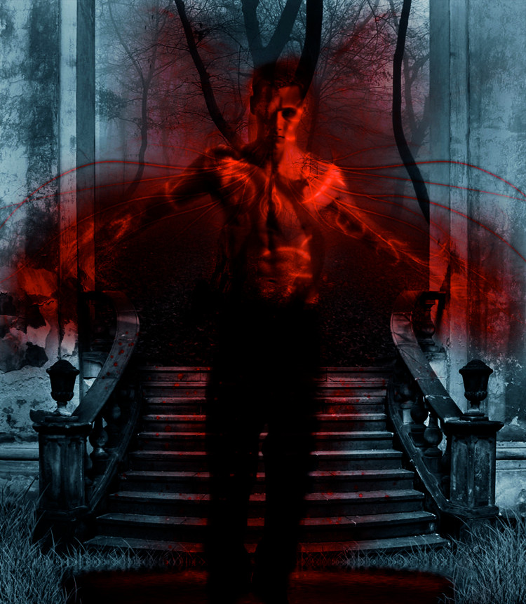
 6DeaD6SeT6 — Demon?
Published: 2010-01-31 04:15:50 +0000 UTC; Views: 1819; Favourites: 19; Downloads: 44
Redirect to original
Description
Stock Man: [link]Stock Location: [link]
Related content


Comments: 30


Really beautiful color scheme here again. I like how you really make the demon stand out, like he is almost jumping out of the screen at you. I also like how there is red almost like glowing off of him, it is a really nice touch.
At the top, i dont know if they are tree limbs, but you can see them through the demon...i dont really know why, but that is kind of bugging me. It draws the attention to that, and not to the demon itself. I like the touch, but I believe you should have faded it a little more.
👍: 0 ⏩: 0

This could have been better
Though i'm not capable of doing even this much, but still i feel that the things arnt blending in that well as they did for the dancing girl..
I hope you don't mind some constructive criticism...
👍: 0 ⏩: 0


Hi there! I'm from Project Comment and I'm going to give you, hopefully, a great comment that will help you in the future.
Really nice contrast between the blue background and the red all around him. It's definitely an interesting concept, to say the least and I'm not really sure what to think of it. But don't let that hinder you from thinking this is a great manipulation, because I assure you it is. The only concern that I would have, is maybe making him a bit more prominent in the photo, rather than having him completely blended in.
Other than that, you've done a great job here!
👍: 0 ⏩: 0

This is pretty sweet, man. I love the red a lot, and I love how it stands out against the blue. Good job!
👍: 0 ⏩: 0

I like how the red halo behind the demon looks like wings. But at the same time, I think (it's just my opinion) that the background and the man don't fit. Like, blue and red fit well, but it looks too artificial in this manip (I don't know if I'm explaining it well, in short, to me, it looks too obvious that the demon is manipulated and copy-pasted there)
This said, I think the idea is great ^^

👍: 0 ⏩: 0

Nice work! I really like this one. great use of contrasting colours and ligting to create a focal point within the artwork. The title 'Demon?' fits the piece well
Love the effects on the 'Demon' BTW - they give him a very surreal look.
Dan
 - :D")
👍: 0 ⏩: 0


This picture is also a good manip. I like the colors, but not as much as I like the other with the dancing girl.
It's really well blended together, and the red color around him is really amazing. The dark colors suit the mood of the picture perfectly.
But I do think the red is maybe a bit too much? I'm not good with photomanip, but I think the person stands out a bit too much, he doesn't seem to be in touch with the background.
👍: 0 ⏩: 0

This one is pretty cool. I like the colors you used throughout the image, however it seems like it's hard to place him before or in front of the doorway, or if everything is ghostlike. Try to make things in front of doorways more solid then the background behind it unless they are a ghost or spirit (his arms I am referencing the most.) Other then that good job.
👍: 0 ⏩: 1

I can see what you mean, now that you mention it, it does seem a bit.. 2D. I'll play around with it and see if I can come up with anything. Thanks for the comments.
👍: 0 ⏩: 1
Your welcome, good luck!
👍: 0 ⏩: 0

I'm usually not a fan of photomanipulations myself; especially since the ones I've seen here tend to veer towards the nature of 'look, I made my eye green'. This, however, is some excellent work which really shows what a photomanipulation should be.
I like how you preserved the quality of the original model photo and background, and the way you blended between the two is fantastic. The use of color and the positioning of the subject is also very eye-pleasing. I enjoy giving criticism and think that it's a great way to help someone improve but I really like everything about this picture, technically speaking.
In addition, I like the way that you portrayed a concept; the lines both obvious and non all come from the model's heart and brain. You also didn't overdo it with the blending; there's a nice amount of focus on that culmination of visual lines without looking like a shoddily done special effect. Very nice job!
👍: 0 ⏩: 0

This looks really cool, I like the demon quality of this. His pose goes really well with the feeling over this piece
👍: 0 ⏩: 1
Thanks! Yeah when I saw the stock I knew exactly what I wanted to do with it.
👍: 0 ⏩: 0


Tight photo manip for some reason i think of Mortal Kombat when i look at it
👍: 0 ⏩: 0


👍: 0 ⏩: 1
 (Smile) - :)")
 (Wink) - ;)")
👍: 0 ⏩: 0
I'm not usually big on photo manipulation, but this is pretty twisted!
👍: 0 ⏩: 0

Interesting Choice Of A Background.Nice Use Of Contrast To Make The "Demon" Stand Out.
👍: 0 ⏩: 1