HOME | DD
 7he1ndigo — How to Create Textures for Borderlands
#borderlands #photoshop #texture #tutorial
Published: 2015-08-28 14:34:04 +0000 UTC; Views: 2859; Favourites: 21; Downloads: 11
Redirect to original
Description
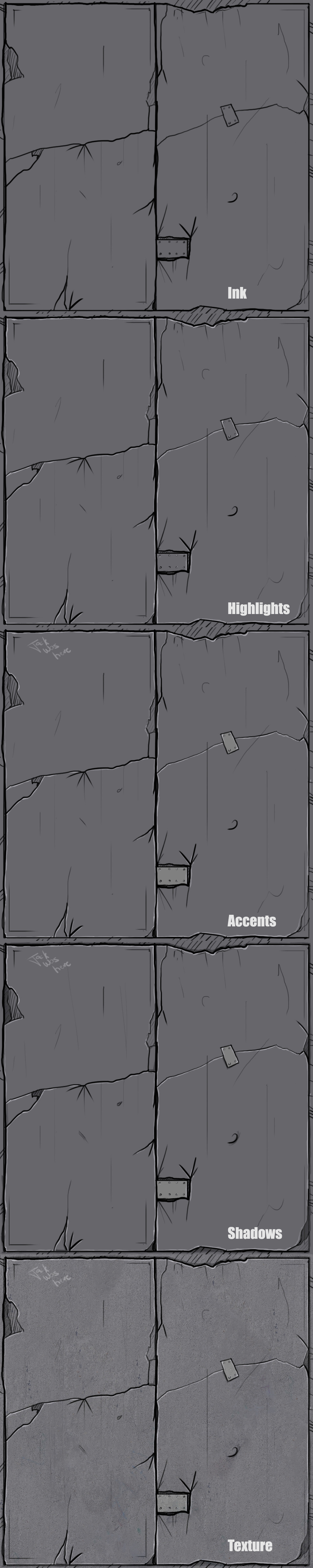
Tutorial length: 1hr0) Start with a 1024x1024 blank canvas with a #808080 background layer. I've actually slipped in a little bluish-purple in my base layer.
1) Ink in your basic pattern on a layer above. For this texture, I used a default photoshop brush, round with hard edges, shape recognition on, with pen pressure control, #000000. Use cross-hatching for the deep areas and quick lines for the surface scratches. Vary your line weight as you go to give it that natural feel. Borderlands has a lot of band-aids and patchwork to sell it's flavor, so don't be afraid to scratch and patch it up. The outlines and the most important cracks come out thickest, while the supporting linework is much thinner - make sure you vary your line width!
2) Highlighting. Use the exact same brush as above on a layer below your ink layer, with a much lighter shade. For this texture, the light is presumed to be coming down from above, so I've highlighted the highest points of the texture, that being the 'inside' of the ink layer.
3) Accents. This layer goes under your highlight layer, and is super quick - I just color the patchwork with a slightly lighter grey and gave it a cheeky signature.
4) Shadows. Pretty much the opposite of the highlight layer, and on a layer beneath accents. I've colored in any 'deep' sections with a darker grey and paid attention to areas where I'd like extra depth to be more visible. I basically outlined the ink layer on the opposite side of the highlight layer. Remember to vary your line width!
5) Texture. Grab a texture from cgtextures.com that isn't too smooth or too pockmarked - you want a nice balance between roughness and smoothness. This layer goes on top of all the other layers. I have mine set to Soft Light and 70% fill, but you can mess around with photoshop until you find a nice balance. Manipulate the levels and curves if you want to create extra depth. Also, it might help to use a scatter brush on low opacity to bleed in some extra color on a multiply layer, like a rusty brown or a grunge green, just for some extra taste.
Hope this helps
 (Smile)")


")