HOME | DD
 99SamPanda99 — ~SugarSaturn Contest Entry~

#contestentry #pastel #pink
Published: 2019-01-08 02:35:26 +0000 UTC; Views: 337; Favourites: 36; Downloads: 4
Redirect to original
Description
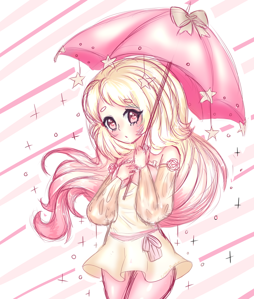
This took a bit of time so I hope you like it!The water effects are really bad, I feel like I was lazy with the background : (
I adore the colors of this OC though! I like how the hands look, not so much the feet, but whatever.
(for Sugarsaturn 's contest)
Related content


Comments: 18


Vision

Technique
oKAY WO A H THAT IS ONE MIGHTY GOOD DRAWING! I REALLY love the aesthetics of this piece, it makes me feel all warm and bubbly inside. The hair is so well done, it almost makes me feel like it were real! The flowers are really accurately drawn and pretty! Subtle details really makes this drawing pop, and it attracted my eye at first glance.
Your choice of base shading color was a really good idea, it always does give a better aesthetic than just black. The foreground bubbles are a little difficult to see, but that doesn't matter too much.
However, there are a few SMALL things that I would like to point out. Even though this is a pastel drawing and the colors are light, I feel like you didn't make the character stand out enough. The hair was clearly the most eye-catching aspect of the drawing, but the rest of the body would kind of just kind of sink into the background if it weren't for that dark line art. I would suggest either saturating either the background or the character's colors more.
👍: 0 ⏩: 1

I used the original color palette without taking into consideration the entire piece, looking at it now I could have done a lot more to make the character pop. Thanks so much for the critique!
👍: 0 ⏩: 1

Overall
Originality
Technique
Impact
I think you did really well on both the hands and the feet! I feel like the lighting is placed well, but it overlaps the lineart in multiple places overlap, which can look odd. This is a shame, because your lineart looks wonderful!!!! You can put the lighting on a clipping setting over your colors, and it should stop it from going over the lineart! I love the way you did the bubbles on this piece, they look lovely, and it's a nice effect!! It is a bit of a shame that the background blends into the bubbles, however, that may just be my personal opinion, and it doesn't take away from the piece.
{I do apologize if this isn't the best critique, I don't do these really ever, but I wanted to try!}
👍: 0 ⏩: 1
Ah, I always have trouble with overlapping lineart, I'll try my best to improve on that this year.
Your critique wasn't bad at all, thank you!
👍: 0 ⏩: 1
It's no problem!! Like I said, the clipping tool does wonders for keeping the lighting from overlapping!
👍: 0 ⏩: 0

Np! It looks so so so good!!
👍: 0 ⏩: 1

I am shook :0
this looks so beautiful qwq
thank you so much for participating ywy
👍: 0 ⏩: 1
Thank you so much!! The charcater was really cute so I just had to participate :'3
👍: 0 ⏩: 0
Me too! I really want to use them more ^^
👍: 0 ⏩: 0

oof you gotta make winning the contest really hard 🤣
its a very stunning drawing!
👍: 0 ⏩: 1
Ack, thank you!! good luck with your entry :>
👍: 0 ⏩: 1
welcome! and ill need it lmao
👍: 0 ⏩: 0