HOME | DD
 a-batch-of-bread — Anothertale: Teddy

Published: 2015-12-12 02:39:09 +0000 UTC; Views: 583; Favourites: 22; Downloads: 0
Redirect to original
Description
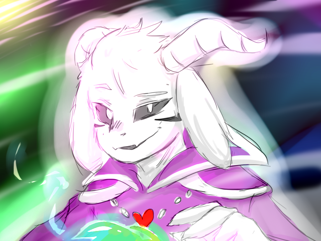
Please leave some feedback for me! I'm not really satisfied with this drawings to be honest, and i need some help on how to color and how to do lineart well >w< Thanks!~~~~~
My OC Teddy from Anothertale!
Read it here--> Anothertale Page 1
New pages will be coming out soon I promise i'm just a little stressed out from all the tests lately so it's been taking me a while.
I'm still accepting your OCs for Anothertale! Look in the description on page 1 of Anothertale for more info!
For those of you who already read Anothertale...
What do you think Teddy's power is? ;D
>w<
Undertale belongs to Toby Fox! If you haven't bought the game yet, please do! It's worth your time and money :3
Related content


Comments: 5

Greetings from Get-Gud!
If you want to get better at line work, I have a few suggestions!
The first thing I notice is that your lines are too consistent in thickness and weight! Line weight is a great way to really make a drawing pop. At the moment with the time of linework you have, it feels flat. If we took away the color and lighting, would the lines hold up on their own and give us a sense of depth? Not at the moment. Best use of lineweight though, is to present depth for our eyes. Thicker lines for things that are closer and overlapping, with very thin lines for things that are farther, less important or fine details.
The second thing I see is sketchyness. skethy lines can be pretty cool in some pieces, but in other ways they can create confusion or distractions on a piece. A big issue with your sketchy lines, is that they don't always lead to anything or connect to anything specific. Although we can tell what is what on your character at a glance, the second we focus in on the lines we lose a lot of the figure and information. For instance, the shirt in general is really confusing. Your folds are drawn in the same way as you draw outlines , short strokes with gaps here and there. So it's hard to tell where the arms begin and where the folds end. The neck area is most confusing for me as well. I can't tell if their wearing a special kind of shirt with more cloth up there, if their shirt is ripped, or if it's supposed to represent regular folds and a turtleneck. It just generally feels like you may not of known exactly what you were trying to draw, so you conceptualized it. But because this is more cartoony and graphic, conceptualized areas can hurt it, when compared to something like the face hands(and parts of the hair) that are very clear! One thing you could easily do with lineweight involved is to make your main forms and outlines, with thicker lines. Everything else like wrinkles, folds or rips would use thinner lines. Here's some examples of sketchiness with complete forms kingkaijuice.deviantart.com/ar… kingkaijuice.deviantart.com/ar… enriquefernandez.deviantart.co… powflip.deviantart.com/art/Yea… kingkaijuice.deviantart.com/ar… In general these examples are very solid looking, but stil have a lot of sketchy unfinished, fast drawn qualities to them.
Next practice your long strokes! There's a lot of shapes and forms that can be drawn with one swipe of the pen. Your doing it very well with the hair actually, long strokes for each line in the bangs. But I'd like to see more of that in the rest of the body. One thing that might help is to act like your drawing on paper. By that I mean, try not to zoom in while you do linework. On paper, you can't really zoom in. Every line you make is from a default level, which not only allows you to make long strokes in lots of areas, but also keeps your lines consistent. In general it's good if you can alteast see 80% of your whole drawing.
Lastly, clean up a little bit!
Some might say it has to do with confidence in your forms and ideas. A lot of people find it easier to draw something that is a little ambiguous because it means they can get away with a lot of stuff without their work looking bad. Which is fine, but unrefined sketchiness doesn't help you are linework wise! So don't be afraid to practice sketching in a more confident way. Visualize the forms you want to make and just go for it. Do some excerises redrawing one of your old pieces(or even this one) but without doing sketchy lines at all! It might be rough the first go, but nothing happens overnight. Remember, if something doesn't look right, your an artist. You can ALWAYS draw it again and find out ways to draw something better.
Other then that, I think my only gripe is that the atom energy thing, looks light it should be emiting some kind of light that would also be hitting the character. Right now it looks like it's just glowing in it's own little world, with it and the character not really interacting. So perhaps do a look into creating multiple lightsources, reflective light and etc. Some pink/purple light along your characters chin, cheek, nose, hands(probably covering a lot of the and) chest and a bit of the arms would do nicely! Instead of just that glow by itself, not really shaping against the form of your character there.
👍: 0 ⏩: 1

Thank you so much for your feedback! >w<
this is really helpful!!!
I'm going to try to follow your advice and put them practice... Again, thank you so much! :3
👍: 0 ⏩: 0

Hmmm... You know, I don't really know how to do really professional line work either. Maybe certain parts of the character or scenery that are closer to the reader have slightly thicker lines... I don't really know ^^'
👍: 0 ⏩: 0

that looks like an atom and i am miLDLY CONCERNED.....
on a side note, this is cool ;w;
👍: 0 ⏩: 1
awww thanks >w< !
why art thou concerned >^<
👍: 0 ⏩: 0