HOME | DD
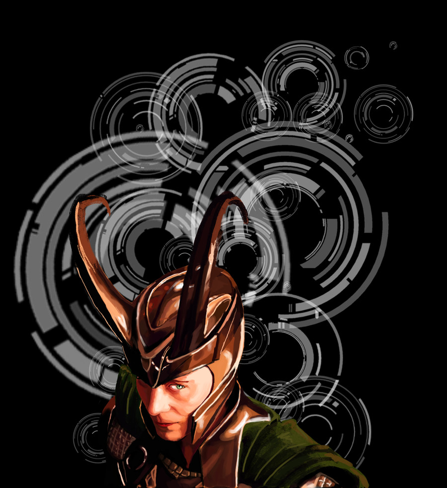
 A-would-be-king — Weird background is weird
Published: 2012-09-12 06:23:26 +0000 UTC; Views: 627; Favourites: 16; Downloads: 57
Redirect to original
Description
I found this awesome site that has screencaps from a bunch of movies so I started by painting this one because it had the prettiest lighting. I probably should have done something Doctor who related (the background would have worked so much better) but no.Character does not belong to me.
but this drawing does.
Related content


Comments: 8

As for me, I'd say the circles serve as more of a distraction than anything - and somehow make the helm blend in, drawing the focus from our favourite mischievous little shi... trickster's face to the centre of the image. As ~Stryder642 suggested, it would work better in smaller size, and with lesser opacity and/or in colours corresponding with his cape and armour, methinks. The character himself is painted very neatly, though, you did emulate the expression perfectly indeed; I also like the way the textures of the cape, metal and skin visibly differ, and the lighting.
It's a pity you didn't polish the horns, but they're a pain in the ass to draw even if they somehow squeeze into the shot. ;D
(that has been a gratuitous wordvomit of the sort I tend to throw up when I get overexcited about Loki or good fanart, or the two combined. Just gonna shut up and fav now. don't mind me. :3 )
 (Smile)")
👍: 0 ⏩: 1

Thanks for the critique, and I don't mind the wordvomit at all, feel free to do it more often. I do have to agree with you on the background, and the horns (that helmet is a pain in the ass). I keep saying I should fix the opacity of the background, but I never get around to it...
👍: 0 ⏩: 0

I like the background pattern with the image. For me, it relates to the pupils of the eyes, and the intense light in them that demands attention from us. You have a great ability to capture a persons gaze and facial expression. If I had anything to suggest, it might be to make the overall image size and the background pattern just slightly smaller (but keep your main figure the same size) to really draw the viewers focus to the foreground figure. Right now, the pattern and the figure are on equal footing for the viewers attention (unless that was your intent...then of course, ignore my suggestion, OK?).
👍: 0 ⏩: 1
I'm not entirely sure what my intention was going into this, really all I was hoping for was for it to turn out, but I see your point, I look out for that from now on.
Thanks for the comment/compliment/critique!
👍: 0 ⏩: 0

Woo! This is awesmazing! I love the variety of brushes you used...
👍: 0 ⏩: 1
thankyou, I spent ages looking for new brushes.
👍: 0 ⏩: 0
