HOME | DD
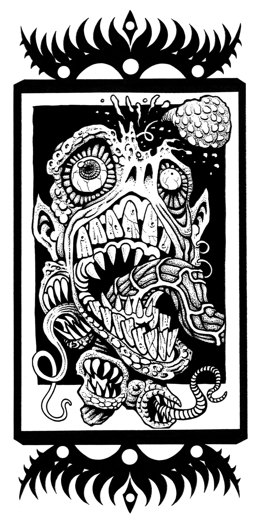
 a8ken — Eye Tentacles

Published: 2008-03-21 20:19:41 +0000 UTC; Views: 888; Favourites: 17; Downloads: 0
Redirect to original
Description
I know its not amazing and theres some flaws but i wanted to do something simple and i kind of like the outcome. a lot more practice is needed though.Pens and tablet
Related content


Comments: 11


You could always unface then fave then unfave then fave and so on...
👍: 0 ⏩: 1
 (Smile)")


Neat! Even though it's digitally done, it looks like a painting because of the grain. I like that you left the pencil lines in it.
👍: 0 ⏩: 0

Very cool pic, and as Lulu here said, the colors go great with each other. I esp. like the yellow eyes
Something that annoys me though, is that it seems that you are saving pictures with loss, which makes the edges where colors meet look fringy. ( I don't know if this could be deviantart related, 'cause when I saw some of my pics, they also looked slightly fringy.. Hmm :/ )
Also, some of the pencil lines could be erased better.
Hope I'm not coming off as too harsh here, just trying to be helpful
👍: 0 ⏩: 1
i completely agree, i redrew it because the first one was shitty and i couldent be bothered to erase the pencil lines because i just wanted to get it coloured. I use three layers to get the outlines darker and flatten layers before i sdave but i dont know if that would make a difference to the quality, and the saved version is actually alot better than when it was in fireworks.
I need alot of practice and some tutorials i think.
No you didnt come off harsh just helpful, i need all the help i can get with colouring! thanks
")
👍: 0 ⏩: 1
Hmm, I'm not that into files and such, really, I just know a little about the basics of the most popular formats. I usually save in jpg with the quality set to max, without any loss. That way you get a small file, that looks as good as you need. Helpful link, maybe: [link]
In order to get the linework dark/contrasty enough, you can try to dabble with Levels ( Image -> Adjustments -> Levels) and such. Ironically I'm still just getting into those fine tuning things in Photoshop, so I'm no master yet.. ")
I'll dig up some links once I stop being lazy.. I know I have some bookmarks lying around here somewhere..
👍: 0 ⏩: 0

I really like this, the colours look great together!! 

👍: 0 ⏩: 0