HOME | DD
 AagaardDS — Building An Empire

Published: 2007-12-13 20:50:42 +0000 UTC; Views: 10970; Favourites: 140; Downloads: 297
Redirect to original
Description
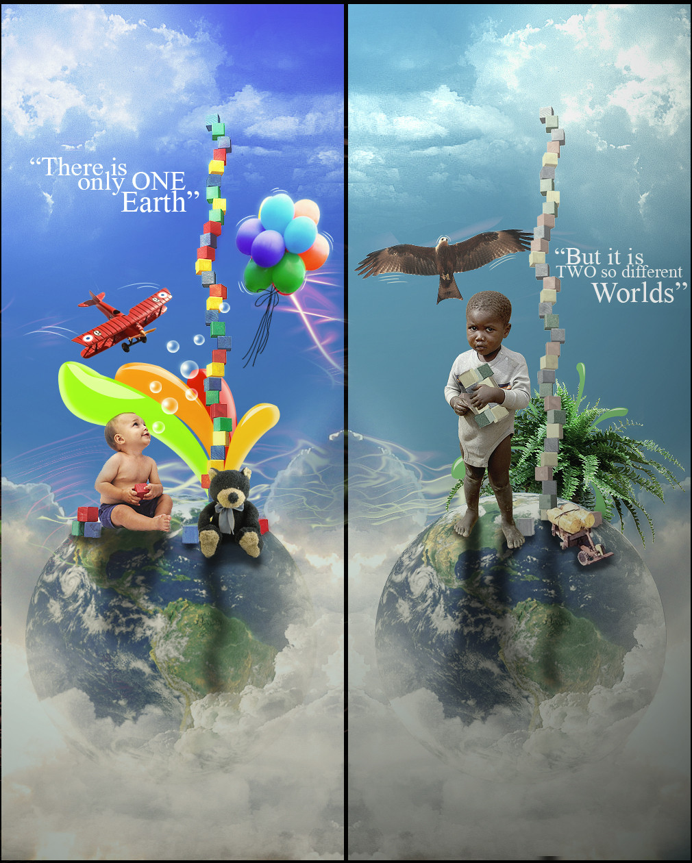
"The eternal mystery of the world is its comprehensibility."My first real Photomanip! Building A Empire is the idea of building your own world! I have tryed to make some contrasts!
Up and down - the upper half is summer, and the other half is winter! Then you have a choice do you chose winther or summer?
Old vs. Tech. - I have tryed to use old things - as the church the statue the air balloon - but also some Tech. modern shapes!
It took a long time to make, and i hope you like it!
At first sight the colours seems very wierd, but I am satisfied with them that way...
Related content


Comments: 36


SÅ lidt da - den er jo genial?
👍: 0 ⏩: 1

Tak igen  (Wink)")
👍: 0 ⏩: 0


Great idea, i dont really like the vector brushes...but still really nice
👍: 0 ⏩: 0

this is great (: might i ask how you got that rock structure at the bottom ? i might want to make something like this.
👍: 0 ⏩: 1
Its a mix of 3-4 different stocks! Found on sxc.hu
👍: 0 ⏩: 1
thanks ! what should i search for ?
👍: 0 ⏩: 1


Great! The deatils is really nice. I really like waht you did with the tipography and textures on the background.  (Smile)")
👍: 0 ⏩: 1
Thanks alot - im very happy with the typo. so im glad you like that part!
👍: 0 ⏩: 0


hey.. i have been to that church... are you from dresden?
👍: 0 ⏩: 0
I think you could, just give it a lot of hours
👍: 0 ⏩: 1

hehe, thanks
mind if i ask you about some advice from time to time ?
👍: 0 ⏩: 1


Another great design, very interesting! Reminds me of your last one styled like that because of the same colors
👍: 0 ⏩: 1
My last styled like that :S ehhe - then i think this is a hundred time better! Or what
Thanks for

👍: 0 ⏩: 0


Tak tak - det er altid en ære når woet kan lide det man har banket sammen
👍: 0 ⏩: 0

pretty awesome
the idea's great and the realization also!
great
👍: 0 ⏩: 1
Thanks - sadly the idea issent uniq ")
")
👍: 0 ⏩: 0

Thank you very much... You are a great watcher
👍: 0 ⏩: 0

Looks really good. I like the arm that is just sticking out at the bottom left >_<
👍: 0 ⏩: 1
Yearh its also one of my fav. details!
👍: 0 ⏩: 0

everything is very well blended. and i love your texts. i like it basically.
👍: 0 ⏩: 1