HOME | DD
 Aaron-A-Arts — Caesar 7 Infancy
by-nc-sa
Aaron-A-Arts — Caesar 7 Infancy
by-nc-sa

Published: 2010-05-26 23:55:37 +0000 UTC; Views: 6474; Favourites: 20; Downloads: 151
Redirect to original
Description
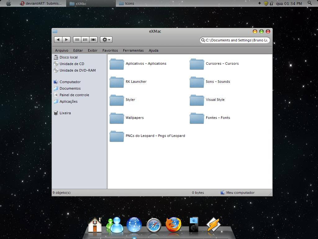
Preview for those interested. click download, or if you've got a huge monitor stretch the window for full viewsimply put, its a Caesar clone
") in the final release version the caption buttons will be a lot closer. still not like xp, mac, or linux. but close
in the final release version the caption buttons will be a lot closer. still not like xp, mac, or linux. but closeit should be finished pretty soon.
suggestions, comments welcome
Related content


Comments: 61

Hey dont get mouthy kid xD
I get a lot of questions i prolly just missed it. What was the question?
👍: 0 ⏩: 1

Its ok i have it ^^
But thank you
 (Smile)")
👍: 0 ⏩: 0

can you share the libraries icons? Music, documents and stuff? I cant find them.
👍: 0 ⏩: 1
 (Wink)")
How can i do this "1 item selected" thing in win7 64bit?
[link]
👍: 0 ⏩: 0


when u r planning to release it....
just as a suggestion,do work on borders,as mac themes lack them,borders become rough or rounded or fuzzy,please work them to make them perfect
2ndly...there r so so many themes which are very cool...but they lack a very good start menu...this is a weak point...try making a woww start menu too..
👍: 0 ⏩: 0


This is it! Looking forward for a bottom taskbar. Sorry for being lazy to browse the comments if it has been already requested.
👍: 0 ⏩: 0

oh my god thats awesome
but if i were you i would use a gray taskbar and mac os x like dropshadows beneathe the windows

👍: 0 ⏩: 1
i'll prolly have a substyle with black, and default with gray. and yeah, fat low shadows
👍: 0 ⏩: 1


Wow it's one of the best theme I've never seen O.O
👍: 0 ⏩: 0

awesome.
btw, the font on the search bar looks a bit large, but that's just me.

👍: 0 ⏩: 1
i'm sure there is a way to change it. i'll see what i can do
👍: 0 ⏩: 0


looks great. good idea to port/remake this. Is it possible to do huge shadows?
👍: 0 ⏩: 1
anything is possible with the shadows. right now i'm using the mac 7 shadows, its extremely difficult to get the shadows perfect but i will probably put in the effort once everything else is in place.
👍: 0 ⏩: 0


You can center the text if you use windows blinds....
It be cool if the min,max,close buttons were bigger.
👍: 0 ⏩: 1
yeah, i don't like windowblinds cause i'm all about free, open source, sharing and piracy xD
i'm keeping as true as possible to the original design so the buttons are what they are.
👍: 0 ⏩: 0

Your Mac7 already rocks but this is even better! If I may suggest a next theme, please do a Nuala or a Promate graphite port (I know, I know, we should let you finish this theme before asking for another 
👍: 0 ⏩: 1
i had been seriously considering a nuala port. i can probably make that happen
👍: 0 ⏩: 1
This reply is a ray of light in an otherwise shitty day.

👍: 0 ⏩: 0


When do u plan to relase it? I cant wait
")
👍: 0 ⏩: 1
i've been a little preoccupied, but you can expect to see it in the next 2 weeks
👍: 0 ⏩: 1
Taka ur time and really thx for share ur works.
👍: 0 ⏩: 0


Big Shot! Best Windows 7 Theme what i have seen so far!
👍: 0 ⏩: 0

On the right side of back/forward button.. Look here: [link]
👍: 0 ⏩: 1
oh i got ya, fake buttons. i'm usually against that kinda thing. i mean, i like the style but useless buttons seems excessive lol
i might make one like that iuno
👍: 0 ⏩: 1
Great! Looking forward for this vs.. pls make a vs that has the fake buttons..
👍: 0 ⏩: 0

i'll do one with a light version
👍: 0 ⏩: 0

The taskbar should be the same color as the window, gray type
👍: 0 ⏩: 0
You should center the titlebar of windows. To look more like a Mac.
Heres an example:
[link]
👍: 0 ⏩: 1
unfortunately in windows 7 aero themes you cannot center the text. so i just go with no text
👍: 0 ⏩: 0

| Next =>