HOME | DD
 aaronlopresti — Power Cubed (formerly Atomic Toybox) #1 page 1

Published: 2014-02-19 08:05:44 +0000 UTC; Views: 1738; Favourites: 37; Downloads: 0
Redirect to original
Description
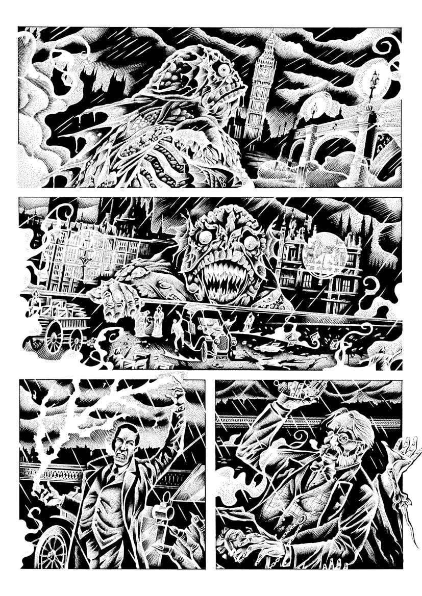
This is page 1 to my creator owned series being published by Dark Horse Comics called Power Cubed (TM). This was originally named Atomic Toybox way back in 1999 when I published only one issue of it through Image Comics. Those of you who actually bought the comic may recognize this page. This is a re-drawing of the original page 1. I did extensively re-write the issue and the series but a couple of pages will be pretty much the same from the original issue. Those pages will, however, be re-drawn to better reflect my current style and abilities. The inking on this page (by me) is all most all pen, where as the original page from 1999 was almost all brush. Notice the obvious Steranko influence. (and yes, I know that Eisner did this type of thing before Steranko but I discovered Eisner much later than Steranko).Related content


Comments: 14


Gorgeous page! I love the big guy's face in the second small panel.
👍: 0 ⏩: 1


Pretty spectacular, although I wonder if the mansion wouldn't look better drawn in 3-point perspective.
👍: 0 ⏩: 1

It would definitely be more dramatic. I got preoccupied with the design of the house and probably didn't put as much thought into the presentation as I should have.
👍: 0 ⏩: 0


Oh looks like Matt beat me to the punch with the Will Eisner Spirit comparison. The technique on that house design is spot on linework!
👍: 0 ⏩: 1
Thanks, Erik, I appreciate the nice comments.
👍: 0 ⏩: 0

I love the Eisner-esque implementation of the title! Great stuff!
👍: 0 ⏩: 1
 (Wink)")
Thanks, Matt! Eisner...Steranko...either or
 (Smile)")
👍: 0 ⏩: 1
True. I'd be happy to have my work compared to either of those!
Someone compared my work to Frank Miller's once. I don't see it at all, nor am I entirely positive he meant it as a compliment...
👍: 0 ⏩: 0