HOME | DD
 aaronwty — Batman Begins..
Published: 2005-04-01 13:40:30 +0000 UTC; Views: 4983; Favourites: 73; Downloads: 150
Redirect to original
Description
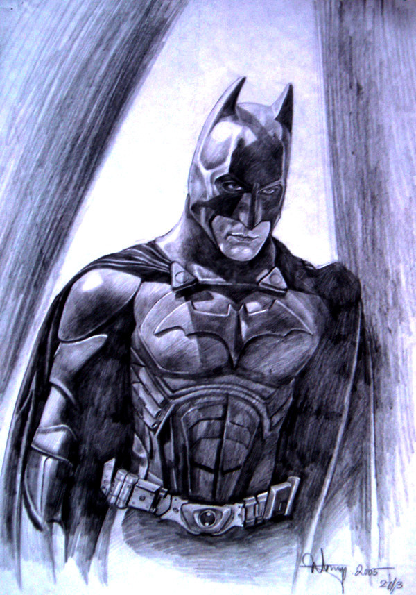
spent around 4 hrs plus doin this n i think the time was worthed.. kind of like a photorealistic approach.. hope u all like it.. 3B pencil on A3 paper.. as usual..Related content


Comments: 34

so this is wicked. I love the lighting and belt ^_^
👍: 0 ⏩: 1

its a piece of very old work i did in college.. thanks alot
 (Smile)")
👍: 0 ⏩: 1
you're most welcome ^___^
👍: 0 ⏩: 0


As ~dark-politics and ~ShaskinTawuk said about the shading, yes, it does need some work - mostly making it darker and more uniform in direction. The thing I wanted to point out is his head. His facial area look a little too narrow - especially around the eyes.With the way the ears of the cowl taper inward, it really makes his face even more narrow - distorting it a little.
The details of his costume are fantastic...the various plates of the armor, gadgets on his belt, the bat motif on his chest...all excellent.
Nice work!
👍: 0 ⏩: 1
thanks for ur detailed comment^^
👍: 0 ⏩: 0

Yes, and in addition consider having your shading in a single direction. Or make it homogeneous enough that you don't notice the randomness, because that gives it a very sketchy look (opposite of the photorealism look).
Nice work.
👍: 0 ⏩: 1
thanks for ur kind comment^^ but i think shading in different directions is my style.. thats another way of sketching.. for me i think its quite em.. not so interesting to shade in the same direction... i find that no so natural.. it depends on how u do it actually.. n normally i dun go for photorealism in my drawings.. i think my style is more to sketch with the use of strokes.. thanks again for ur comment!
👍: 0 ⏩: 1
My comment about the uniform direction was because i noticed you went for the 'photorealism look'. If that's what you aim for, you'll find it easier if you do it that way. Of course, that's not what you wanted so no harm done. Besides, different approaches, different results. I still like the outcome
👍: 0 ⏩: 0


Absolutely spectacular! As ~ShaskinTawuk said, it would have been nice if the shading on the cape was darker and smoother, but as it is, it's still stunning. The detailing in his costume is just unbelievable. Great work!

👍: 0 ⏩: 1
thanks alot^^ thanks for ur advise too!
👍: 0 ⏩: 1
You are most welcome, it was a pleasure to view.

👍: 0 ⏩: 0


Nicely drawn, but don't you think some darker shades would be better? i think you should try using 6 or 8 B pencils in addition to the 3B for i can see the (err.. how should i describe it..?) the connection places in the dark shaded areas. The dark areas don't look homogenous... But as i said nicely drawn, well done
👍: 0 ⏩: 1
thanks for ur advise^^ i'll make the black tones more even next time
👍: 0 ⏩: 1


Yay Batman^^!! Hes like my favorite super hero person ever!! Another job awesomly done 
👍: 0 ⏩: 0

")

