HOME | DD
 aarora — Blue Horizen

Published: 2004-04-10 16:25:06 +0000 UTC; Views: 878; Favourites: 14; Downloads: 301
Redirect to original
Description
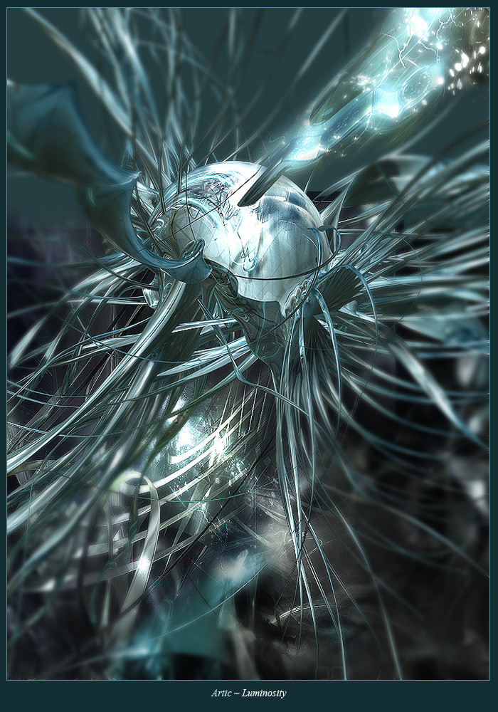
vsThis was a fun collab.
I did the render/2d
10d did another render/brushing
This was 10d's first collab and I think he did a very well job with it.
It was great working with you 10d
 (Smile)")
Please Full view this
Comments and favs would be really apperciated as always
Related content


Comments: 29

damn man i love 3d art!! awesome gallery!! i love almost every piece in here --+favs!!!
👍: 0 ⏩: 0


wow, amazing, you guys did a well job, damned, awesome collab

👍: 0 ⏩: 0

wow u guys did a pretty good job...everything fits well.. +fav keep it up!
👍: 0 ⏩: 0


")

Wow that is nice! I give ya 10/10 I am impressed...one of the best works i've seen from ya
 (Wink)")
👍: 0 ⏩: 0

some jaggies in it, personally i like the purple version more.
but this one looks quite nice as well
👍: 0 ⏩: 0

the brightness rules
it looks great
except for the lettering, i dont like it so much, but whatever
👍: 0 ⏩: 0

WTF ?? amazing buddy 
btw. thx 4 the 2nd devwatch
👍: 0 ⏩: 1

")


Hmm, I think the 2D is too bright and the render could be a little more sharp. Looks cool though
👍: 0 ⏩: 0

glow on the 2d work looks awesome. nice brushing and render.
👍: 0 ⏩: 0


pretty nice, but i have to agree that it is a bit fuzzy in some places
👍: 0 ⏩: 0

wow, the 2d is awesome, gj on that. I also alove the colors
only problem with it is that it looks a little bit fuzzy in places...
👍: 0 ⏩: 0

the 2d is interesting
render seems a bit to blurry
but good job overall
👍: 0 ⏩: 0

My cherry has been popped.
Nice working with u 2 man.
It turned out pretty well considering the haste and chaos it was made in.
👍: 0 ⏩: 0

awesome 2d skills! the render looks nice too.. great work guys!
👍: 0 ⏩: 0

Looks great very nice feel of depth, great job you two
👍: 0 ⏩: 0

Do you really need "BLUE HORIZEN"? Does it mean anything? Can't we do away with the silly technophrases yet?
Otherwise I like it. Original 2d. But could we get some more color?
👍: 0 ⏩: 1

rofl , stop mee zagen en maak eerst een avator voor ge op een ander zaagt .
my opinion : very nice work great typo but it looks a bit blurred => the render.
but overall good job .
👍: 0 ⏩: 0


