HOME | DD
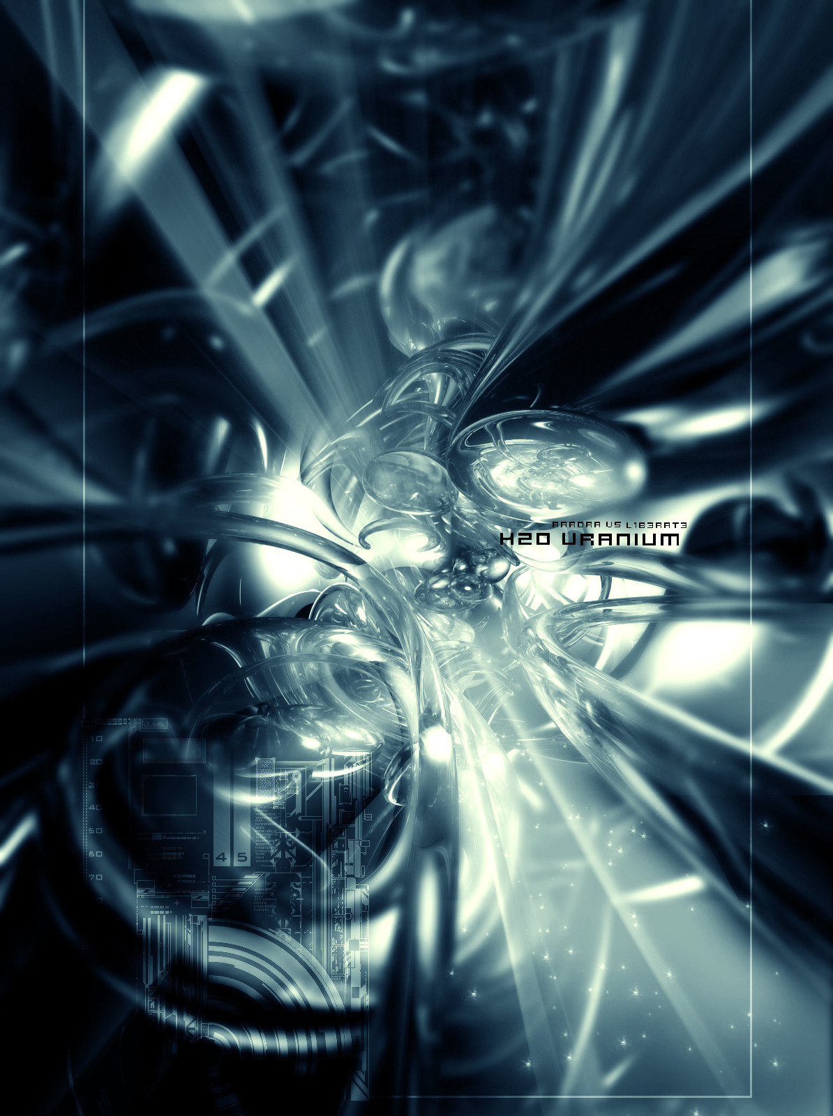
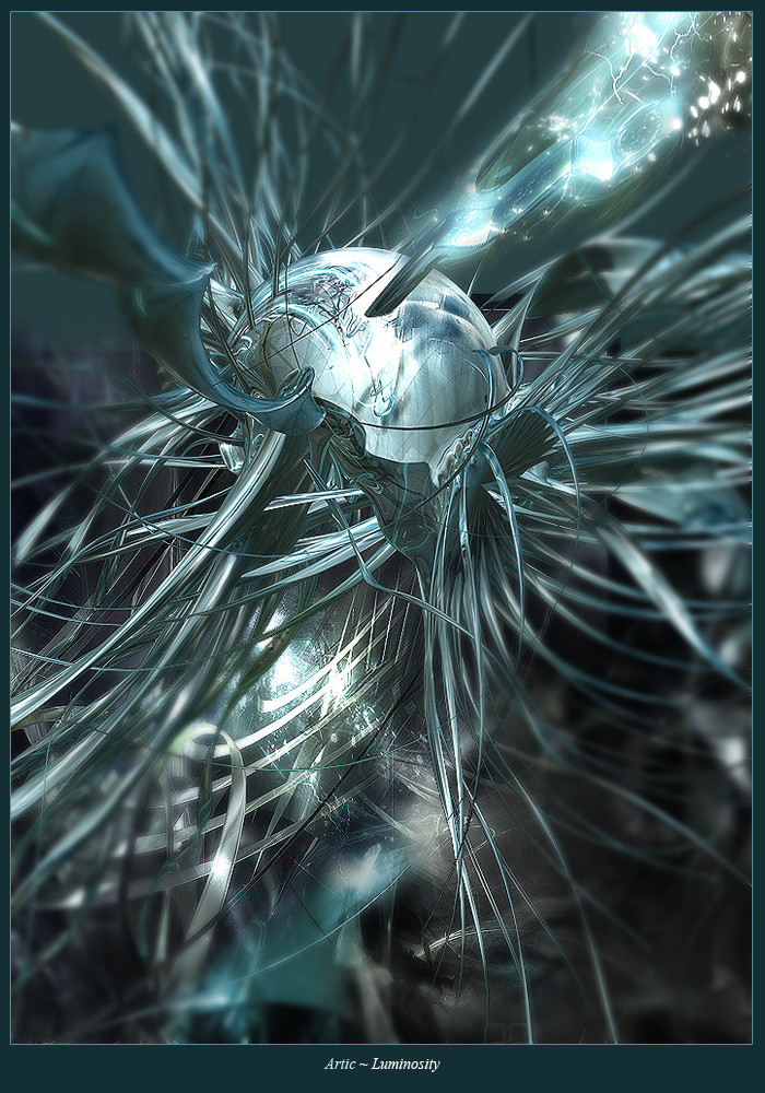
 aarora — H20 Uranium
Published: 2004-03-14 21:32:46 +0000 UTC; Views: 1849; Favourites: 34; Downloads: 737
Redirect to original
Description
vsI did the render and the 2D l1b3rat3 did the brushing to it. Please comment and fav would be appricated.
Please Full View to see all the details.
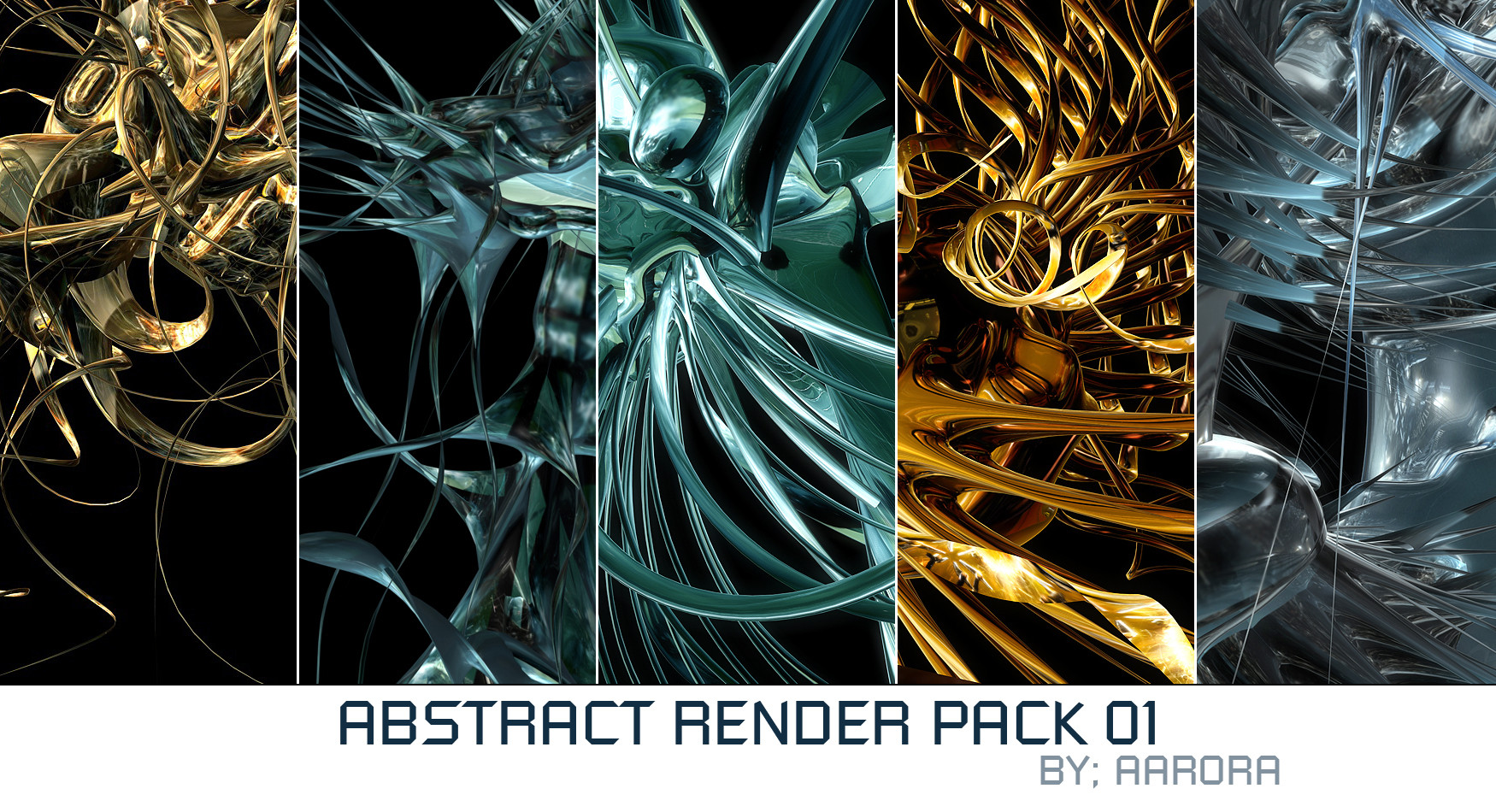
Related content


Comments: 75

wow, this is Hot $h!7, thats amazing, i thank you for the opportunity to look at it!
👍: 0 ⏩: 0


The actual render and lighting is amazing. However, I'm not a big fan of the 2D on this one, and the title looks a little plain, nothing original about it. Overall a nice image, I still like it, just think it could use a little work.
👍: 0 ⏩: 0

Nice render and color. the blur is also great 
")
")

👍: 0 ⏩: 0


*remains speachless for a very long time* That is...wow. Amazing ^^. +fav
👍: 0 ⏩: 0

that blur enhance the style of the piece, but I think you guys could do better than use inception brushes...
👍: 0 ⏩: 0


like the other said, i like that focus on it..good renders and 2d..the only downfall in this piece is probably the text...could have been better but anyways..reallly good overall...keep it up guys
👍: 0 ⏩: 0

........................................ ........................
Wow, all I can say is wow. Wow wow wow wow wow wow wow wow wow wow wow wow.
See?
0________________________0
Okay sorry
It's very good!
Did you draw it?
👍: 0 ⏩: 0

thanks, we used bryce for the render and photoshop for brushing/2d.
👍: 0 ⏩: 0

That is amazing work. Definite 
👍: 0 ⏩: 0


looks awesome guys, good brushing, nice render, great 2D
👍: 0 ⏩: 0


render is great!! love the colors, but the 2d on thr left is a little intrusive, try and make it a little more subtle. but other than that awsome job both guys
👍: 0 ⏩: 0

great render, brushin and colors.. don't really like the 2D
👍: 0 ⏩: 0

very very nice 2d , but its a shame there are some blurred parts
👍: 0 ⏩: 0

Pretty good stuff. I think the 2d is great, but it doesn't seem to fit too well. Great render though. Overall its impressive  (Smile)")
👍: 0 ⏩: 0

dont like the text or the 2d.. doesnt fit.. everything else looks good thought ")
👍: 0 ⏩: 0


nice 2d and render, some sharp parts, nice colors too
👍: 0 ⏩: 0

bryce renders rn't my favs really, but this one is quite nice
cool lighting.. not too overcrowded, nice design
gj
👍: 0 ⏩: 0

It's alright... not very original, but is anything these days? The brushing is ok, but not Ben's best.
👍: 0 ⏩: 3

I just realized that it's a print even -.-''
👍: 0 ⏩: 1
It's pretty cool, just needs a lil bit of work I suppose.
👍: 0 ⏩: 1
Hehe, not according to favs :rolleyes: Oh well
 (Wink)")
👍: 0 ⏩: 1


i aint bruches a bryce render in ages... guess i aint got it nemore..... :trouds away with head down:
👍: 0 ⏩: 1
Meh... as long as your c4d stuff stays up to scratch, it doesn't really matter.
👍: 0 ⏩: 0
I agree, I also think it's kinda lame not to do your own 2D these days.
👍: 0 ⏩: 1
Yeah... I only used brushes for a few weeks.
👍: 0 ⏩: 0

a little to blurred at times, however i enjoy the reflectivity and 2d effects in this
(side rant - woaaaah some people here taking it way too seriously. Art is marmite, you either love or you hate, if you hate, you move on to something different, you don't piss in the pot, those who do need priority checking.)
👍: 0 ⏩: 0

very nice! i like the focus on the center of it and the blury outer edges... i'm not a huge fan of that color but it does look very nice. nice render, nice 2d, and all around nice work both of you
👍: 0 ⏩: 0

This is really cool. I love the 3D in this. And the color. Very nice
👍: 0 ⏩: 0

Ok I'm sorry but all the people that fav'd you are full of shit.
#1. The render is just a terrible mess of Bryce spheres/ovals/toruses, with the default reflective materials (TRENDWHORE) it's nothing interesting....even remotely.
#2. The aliasing on your pixel font is horrendous you can see the distortion as clear as day, and most of all IT'S BLACK. HOW THE HELL DO YOU INTEND FOR US TO READ THAT?
#3. The 2d although quite detailed, is a mish-mosh of undefined, illogical shapes and composition, not to mention that all of the 2d is on overlay and is near impossible to see.
That's the end of my short rant, all the people in here are full of shit and they know it. It's a trendwhore world here at da and you just struck a gold mine of n00bs waiting to fav ur sad excuse for a design. I feel sorry for the world of design when I look at your image.
👍: 0 ⏩: 1
if ur guna be an asshole about it dont comment asshole people like You dont deserve to be on da
👍: 0 ⏩: 1
I beg to differ, it's you whore-a-bundle "designers" who spoil devart for all the serious artists out there. Also, I have every right to piss on art like your if I so choose, so quit being a whiny lil bitch and take the comment for what its worth, all the people that commented on your work are commenting just for the sake of commenting on something that looks only remotely interesting. Anything flashy will spike their interest. In my case, I felt like ranting today and your image was there to rant about because of its sad excuse for a design, let alone a piece of art.
👍: 0 ⏩: 1


Man dont even stress dreamwalker...you guys did an excellent collab here and it shows, the lighting is great, and the blur is smart...it really looks sweet there..and ya know what somebody is always going to come out of the woodwork and say sopmething bad, no matter how good and unique it is....but it wouldnt be da without them to.
Great job you 2.
👍: 0 ⏩: 3

Sorry bud, but I kinda agree with dreamwalker and instrukt here..
Just look at the image properly..even you should realise.
I dont really wanna argue because you are both my friends, but I do agree you should be more original like I already said aswell, you have potential but just keep doing similar things.
Peace.
👍: 0 ⏩: 1
I made a whole new style of art for abstract bro...lol how much more original can ya get lol.
All my stuff is different...I just dont do 2d I like the image to speak for itself.
👍: 0 ⏩: 0
First off, dreamwa1kers work is not only 100x better than aarora's but I JUST checked you page, and I'm sorry but if anyone, ANYONE needs to follow any advice it's you. YOU should look at your work. Your work isn't any better in terms of composition or level of complexity in relation to aaroras collab here. Leave your childish attempts at insults at the door because I seriously doubt you even GLANCED at DW's page, or his work at overflow to back up your silly attempt at retort.
👍: 0 ⏩: 1
Man you both took it all wrong..lol..you can turn this into a flame or whatever you want.....but thats not how i saw it.Sorry y'all took it that way...I never claimed to be all high and mighty.
👍: 0 ⏩: 0

"no matter how good and unique it is...."
W 0.o T !
and for your information, he asked for it (the crit that is)
👍: 0 ⏩: 1
| Next =>