HOME | DD
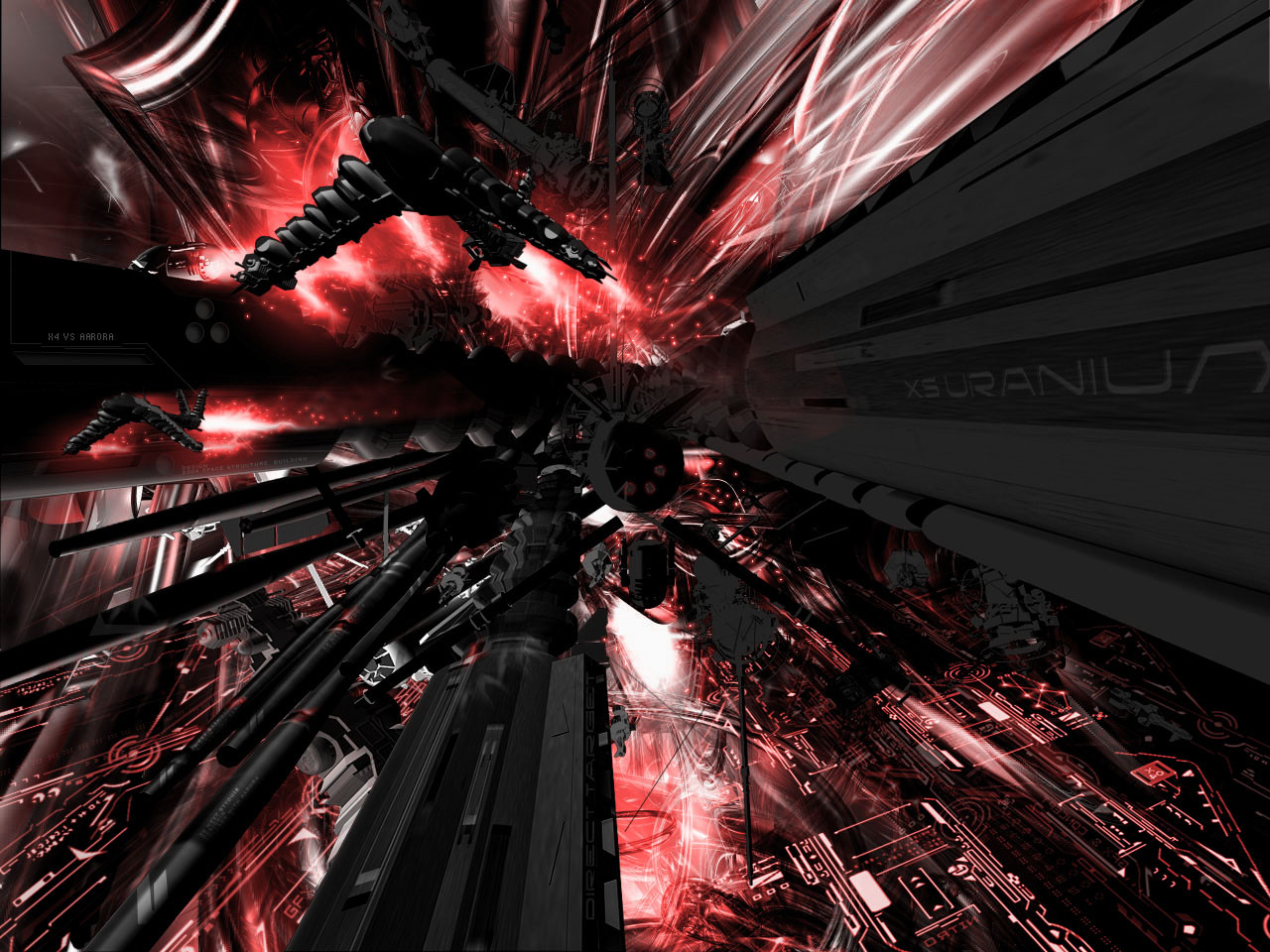
 aarora — Technical Indistry

Published: 2004-05-24 17:42:49 +0000 UTC; Views: 976; Favourites: 11; Downloads: 609
Redirect to original
Description
This is something that i just recently made.I like this, I think it came out pretty well.
I have used one render from smashmethod.
Please tell me what you think.
Like always comments and favs highly appreciated.
Related content


Comments: 27


wow dude, i was wrking on that SAME render.. from (i forgot) 3d render. well, u did that, made it all white and bright, i was thinking of more of a factory/industrial building type. all firey, but i do like it ")
👍: 0 ⏩: 0


Hey thats great! Looks like all vintage kinda style of like a digital world or something.. you're amazing...
👍: 0 ⏩: 0

Niiiice Shankster! Sick render bro and the touchup looks awesome! Good work man.i like the colors too
👍: 0 ⏩: 0

interesting out glare technic  (Smile)")
")
 (Wink)")
👍: 0 ⏩: 0


seems like my comment didn't come up, but as I was saying its sum awesome work!! first time I've seen your work and its excellent keep up the good work!!
👍: 0 ⏩: 0
wow, first time I've seen your work and its awesome!! one of my fav works I've seen on here
👍: 0 ⏩: 0

Don't like the color bro, but really nice work indeed.
👍: 0 ⏩: 0

I'm fed up of seeing smash's renders. But this piece really does it justice, so I have to say I am impressed. Excellent work dude and great brushing.
👍: 0 ⏩: 0


awesome 3d and brushwork but the color is a bit plain
👍: 0 ⏩: 0


I'm not too fond of the big loopy 2d things on the left side. I think it looks a little like scribbling. I think the title could be more parallel with those flat things by it, too.
👍: 0 ⏩: 0

nice work man, I like it very much. The brush work and lighting effects are very well done..
👍: 0 ⏩: 0

Well I can't really comment on the renders too much. Since you did use someone else's render. The colors are ok. THe type for the title just doesnt work for me. It is far too intrusive to me.
👍: 0 ⏩: 0

")


you spellt industry rong in the title and the pic
👍: 0 ⏩: 0

I like this a lot great load of brushing and the 3D is great too but it could use a little warmer colour
👍: 0 ⏩: 0


Looks intresting very nice light effects and the render is great. I like the trees in the middle. Nature meets future.
👍: 0 ⏩: 0