HOME | DD
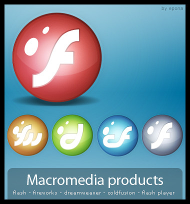
 Abfc — Macromedia Icons
Published: 2008-04-01 02:53:29 +0000 UTC; Views: 1376; Favourites: 12; Downloads: 154
Redirect to original
Description
Some actually good icons for Macromedia (Adobe) Fireworks and Dreamweaver. :3Download contains five 128px2 PNG icons.
Added three new icons: Two versions of Flash (red and grey) and an icon for the Extension Manager.
")
Comments and questions welcome.
If someone pays me I might make some more, like Photoshop or Coldfusion. :3
Related content


Comments: 21

I really like these.
You should make a bunch for all different apps,
I would pay and commission you but I have no monies
")

👍: 0 ⏩: 1

Meh, Macromedia (Adobe 
👍: 0 ⏩: 1
true, you should do ones for windows utilities like 'dustbin' and 'my computer' ect
👍: 0 ⏩: 0

 (Smile)")


George carlins legendary, i got all his crap on my Ipod
👍: 0 ⏩: 1
Heh, ironic... You say he's legendary, and then refer to his work as "crap". :B
👍: 0 ⏩: 1

Personally I prefer these to the other ones you did, they were cool but these are a lot easier to read. I really do love this gradient style at the moment, (everyone seems to call it the web 2.0 look, bleh). It complements the fonts well and keeps it readable.
The rounded corners are a nice touch, makes the icons more interesting compared to the square ones. I think they killed the look when Adobe brought out Macromedia. I always thought it should have been something more like CS2 but these work perfectly.
Any chance of paying by 'favors' for some Photoshop, Flash, Illustrator and InDesign ones

👍: 0 ⏩: 1
Well those aren't fonts. I used the pen tool to make the logos on them. :B
To hell with 'Web 2.0', I just made 'em how I thought would look cool.
And I agree, Macromedia was better than Adobe.
What kind of favours?

👍: 0 ⏩: 1
I'm a sick of hearing about the 'Web 2.0' look myself, why I bleh'd
...and I think you know all too well what favors I mean.
👍: 0 ⏩: 1

I actually think these look really good. I honestly have no suggestion. Other than maybe making the borders noticable rather than it not being solidified. But either way, I think it looks great like this.
👍: 0 ⏩: 1


I think thats the point, there are none.
👍: 0 ⏩: 0