HOME | DD
 abstractmix — ABT

Published: 2005-09-13 06:34:11 +0000 UTC; Views: 6415; Favourites: 150; Downloads: 1049
Redirect to original
Description
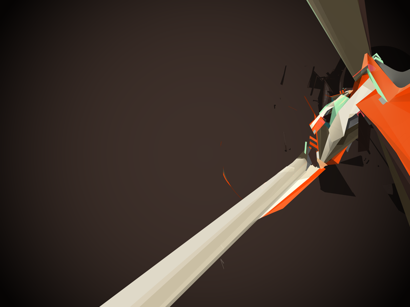
A Bent ThoughtA personal expression of whats going on right now. Possibly for print.
Edit:
Re sized the high rez picture better and crispened up the piece.
Related content


Comments: 24


How do you do this kind of things? Illustrator? Photoshop? A little of both?
👍: 0 ⏩: 0

Teach me o'great master... (Smile)")
👍: 0 ⏩: 0


toThePixel [2005-09-17 23:37:53 +0000 UTC]
Great usage of color, the form is what I like the most tho, it defys what you would expect to see with some average dA abstract trash, you've definatly got a great sense of style here, keep it up.
👍: 0 ⏩: 0


Will do
👍: 0 ⏩: 0


really interesting concept and as a few others have said it looks a little out of focus, but still none the less i like it and i think the colours are sweet.

👍: 0 ⏩: 0

Simply stunning, the composition is really strong. It seems aliitle too blured, i dont knwo if that was your intention, it could do with being alittle sharper.
👍: 0 ⏩: 1
Yeah i think its because i made it a highres this time and shrunk it down, i will try to edit and cripsen it up. Thank you.
👍: 0 ⏩: 0

It's pretty cool.. nice colours, but I think it lacks some sort of definitive form.
👍: 0 ⏩: 0


Nice render and colors.
Nice and simple .
Keep it up!
👍: 0 ⏩: 0


try spend more time on focus-area details and depth of field///

")
👍: 0 ⏩: 0

")
