HOME | DD
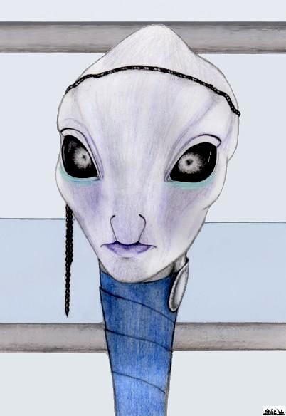
 Abydell — 'Alien' without backround

Published: 2005-07-03 09:29:29 +0000 UTC; Views: 1015; Favourites: 6; Downloads: 39
Redirect to original
Description
I hated how he was lost in the backround in the Original version. So I painted it out. You can see him much better now. I might end up sending this to Scraps, I'm not sure.Click here to see Original Version....>[link]
Related content


Comments: 14

really?! i loved the effect of the original it made it look like a page from a coloring book but thats wha made it unique ever bit of space was used and thats hard to do sometimes

👍: 0 ⏩: 0

I love the composition of this!! His expression is cute!
")
👍: 0 ⏩: 0


looks like he's under water and there's BUBBLEz coming from his head and he caught one of the bubbleZ and hes looking at it  (Smile)")
👍: 0 ⏩: 1

Interesting take on this. You have a good imagination!
👍: 0 ⏩: 1

Well I guess that old saying is true with this pic....
"That sometimes Less is More"
👍: 0 ⏩: 0

he's so cute, I didn't mind the background before, ut I like haleighs idea, a different color for the back ground.
👍: 0 ⏩: 0

no scraps he's too cute for scraps! but maybe you should do a background in a different color?
👍: 0 ⏩: 0


Very awesome. I can see him very good now. Beautiful work, as always.^^
👍: 0 ⏩: 0

yeah i definatly like this.. the other version was good, mucho detail.. but was alittle er.. noisey..
don't scrap this one, it's too good to sit in there..
👍: 0 ⏩: 0

Oh yeah, I definitely like this version better! I feel like I can get a much better look at the detail you put in there without having my eye drawn to a lot of extraneous stuff. Very cool.
👍: 0 ⏩: 0