HOME | DD
 acidDOTdica — Acidotica True Type Font WIP
by-nc-nd
acidDOTdica — Acidotica True Type Font WIP
by-nc-nd

Published: 2009-09-23 11:10:50 +0000 UTC; Views: 11113; Favourites: 82; Downloads: 4554
Redirect to original
Description
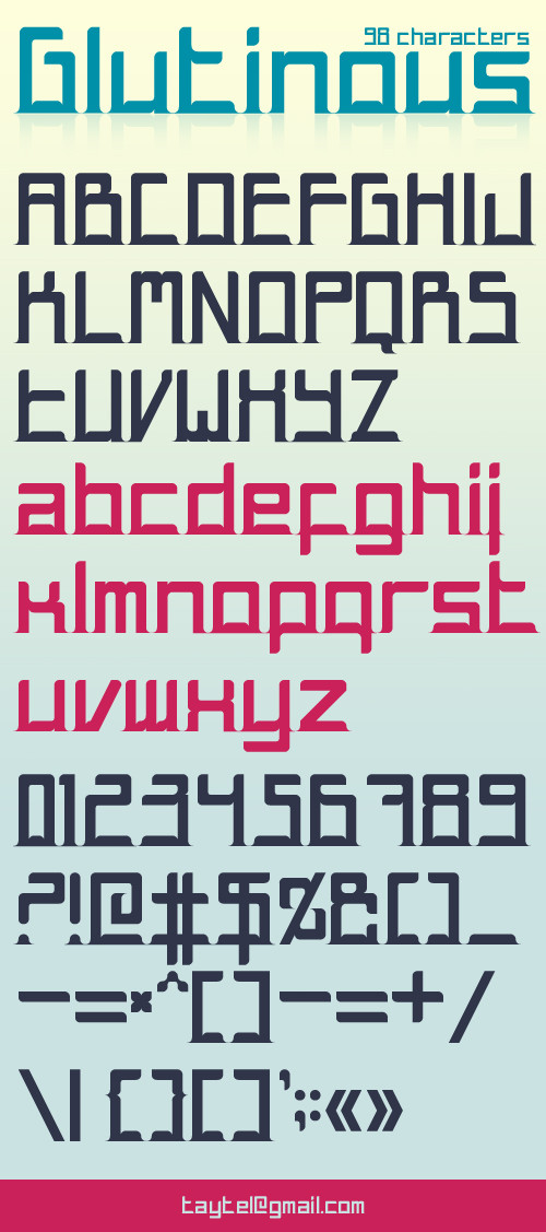
Acidotica True Type Font [PROTOTYPE VERSION]
Ahh, my very very first take on creating a font. Well, I guess it couldn't have been otherwise since I've always needed a font that looked just like this so why not try to make it yourself?
")
Please note that this is a prototype version of the final font, the service I used (after hours of hard work, even though it looks like just lines, trust me it's more than that) didn't add "Y", a complete "W" and the Danish letter "Å".
If anyone out there wants to help me out so I can include these last letters then that would be awesome, I'll feature you and praise you to the heavens.
Finally, this is a personal font, so whether it'll work for you out there in your personal works is totally up to your talent, not because my font "sucks" xD. I've made this font to myself, but please use it if you can.
Important Notice:
Do not use my font, especially because it's a prototype, in commercial projects unless you've discussed your project / kissed my ass enough till I give you a green, flashing go for it.
As always, if you've made something with this font please send me a link and I'll check it / maybe fave it / maybe feature it. That is, if you've remembered to credit me
 (Wink)") .
./ ACID out!
Related content


Comments: 27


To all downloaders and whatnots 
I don't bite that often.
👍: 0 ⏩: 0


but otherwise it looks good
👍: 0 ⏩: 1
Hehe, it's meant to be this thin.  (Smile)")
👍: 0 ⏩: 2

not to mention anyone using photoshop or even illustrator can create an outline on the text and make it slightly bolder without meshing those way cool little parallel lines.
Kudos awesome font! has anyone given you any ideas for the missing letters?
👍: 0 ⏩: 1
")
Peace!
👍: 0 ⏩: 0

👍: 0 ⏩: 1
hehe aww don't, it's cool, it's a common mistake
👍: 0 ⏩: 1

Wow ")

👍: 0 ⏩: 1

well, it´s not my site" I just found it via twitter!
👍: 0 ⏩: 1
aww then it's not awesome xD. Just kidding. You're awesome anyway, just because you're you.
👍: 0 ⏩: 1
")
Aww thank you very much, I would love seeing it used somewhere!
👍: 0 ⏩: 0
