HOME | DD
 Adalbertus — The hard way or the hard way

#amber #fallout
Published: 2018-08-19 19:55:11 +0000 UTC; Views: 940; Favourites: 33; Downloads: 9
Redirect to original
Description
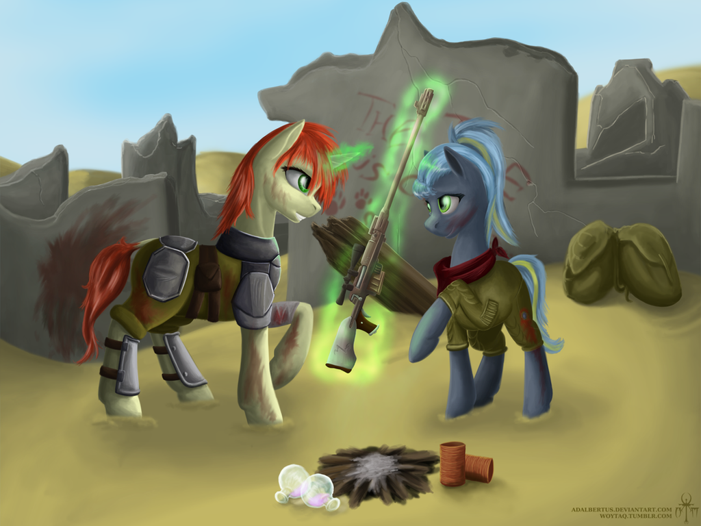
That took me a lot longer than I hoped it wouldbut, hey, look, an actual background this time
and she's not naked
I guess that's both an up-side and a down-side
")
and yes, I know I still suck at drawing humans, but I'm trying
Related content


Comments: 14

👍: 0 ⏩: 1

👍: 0 ⏩: 0

Overall

Vision

Originality
Technique
Impact
I love the use of earthy colors in this piece, and the lining is not generically red or pure black. The tone of this artwork is very neutral and not very eye-blinding, and less use of flashy colors! I could really tell that this is a very well worked piece and it isn't half-baked. Though, there is a bit of concern in terms of how this artwork is positioned, and here's a bit of my advice:
Lighting and shading:
This is what affected your vision score. I can see there is an attempt to put a fixed lighting, which I assume is diagonal, from the upper left hand to the lower right hand. The direction of where I should be looking at guides me from the lighting to the character's face then leads me to scan through the character's initial appearance. The only problem here is the inconsistency of the shading in the piece. I can see that you are using soft shading to make your drawing look less clunky and solid. While this is fine with your art style, as it balances out with your solid and thick lines. I do advice learning some hard shading techniques if you want your artwork to feel more alive and rounded!
Black/Color shading:
This is often what the artists the "sin shading" because with using black for shading, artworks can look a bit muddy and overall, just a bit dirty. Black shading is good if your art style consists of thicker linework with a balanced color of hard coloring and shading. If you want to go with thickening your lines, you wouldn't have to soft shade as often(or else the piece will not look very balance). To tackle this problem, study some real-life photos, and you'll notice that something like an orange, there is a sense of redness in its shades, and they do not stay the same solid color. If you master this, this will add depth to your artwork and it will look a bit livelier!
Here are some different ways to color shade, and this goes with any art style or form an artist does(I'm sorry I forgot how they are officially called so I made some of these up in terms of the term):
[I recommend looking at the color wheel for this]
1.) Neighboring colors/Tri-coloring: For example, you want to color something with its main base color as green. Besides the color green, there are the colors blue on one side, and the other yellow. You can use yellow as a way to lighten up and blue to shade.
2.) Complimentary colors: The opposite of red is green, the opposite of blue is yellow. depending on how you use them, they can make either your art piece stand out perfectly or blind people, so be careful with this one.
Ther are other coloring techniques you can use, but these ones the most commonly used.
Luster:
Your piece seems to lack a bit of luster, and this connect a bit with the shading part. You seem a bit unconfident with your lighting and focused too much on shading. This makes your artwork feel rather flat and hard to look at the center. To tackle this problem, I suggest you reference for lighting and notice where lighting should be focused on or not.
Texture:
It appears you want to use texture and effect on your artwork. This is no problem since I do too with my solid line art-base artworks. The only problem with this is that the texture seems overused and it makes your character blend too much into the background. This is an easier fix than the others, and all you have to do is try using other textures for clothing, the dirt, the wood, and so on. Texture can also go with your character's hair. I can see there is some attempt at making her hair shinier, but it looks shy and unconfident. Don't worry, just maybe lighten the shines a bit more(trust me on this one, but the majority tend to overdo lighting on hair, I applaud you for not going too far, I also go a bit too far with hair as well, haha). I also advise looking at references on a different object and their luster, as something like leather is different from latex luster.
Character pose and anatomy:
You seem to have a basic understanding of anatomy and with your style, this isn't too much of a problem. Most I often tell people is about posing. Standing still is always a fine pose to work with, but the trick is always the spine/back. Her pose does not give me too much of her character ad she feels a bit static. If you want to use this pose, I suggest work on angle. The angle of this artwork is very straight, and going back to what I said, feels a bit static. Though, I am glad that she isn't just standing with nothing, as the weapons she has and the way she is dressed tells me her kind of character. This is plus points!
Color choices:
This is the area I am actually happy about because unlike most cartoon-based artists, they seem to often use oversaturated colors and sometimes... they feel too blinding. There are hardly pieces on DA that doesn't use saturated colors. Good job on this one! This is your strongest area!
Background:
The background seems fine, as I went to what I said about character, angles matter. The more complicated the angle is(even in photography, this is true), the nicer images tend to look!
Overall, the sepia color is very nice and I am glad to find a piece like this somewhere in DA, I wish there are more artists like you who does this coloring a bit more!
👍: 1 ⏩: 1
Thank you so much for those awesome advices! I will keep them in mind in the future. I have some serious gaps in my shading and coloring skills, sok I'm sure your hints will come in handy  (Smile)")
I think some of the problems you pointed out ("black" shading, textures, some of the inconsistencies) are caused by my attempts to make this picture look dirty. A failed attempt I guess, but I will try to avoid it in the future.
👍: 0 ⏩: 1
No problem! I am glad to be of help!
👍: 0 ⏩: 0

O stary.. rysuję ludzi od wielu WIELU lat, a wciąż wyglądają źle i nie proporcjonalnie
Good Job

👍: 0 ⏩: 1
Ale twoje ludzie wyglądają świetnie
👍: 0 ⏩: 1
Dzięki :3 ale i tak jeszcze długa droga przede mna
👍: 0 ⏩: 1
")

thanks
I worked pretty hard on this one
👍: 0 ⏩: 0
