HOME | DD
 AdrienCGD — Clashing Neighbors
by-nc-nd
AdrienCGD — Clashing Neighbors
by-nc-nd
Published: 2012-09-15 09:34:34 +0000 UTC; Views: 6303; Favourites: 144; Downloads: 332
Redirect to original
Description
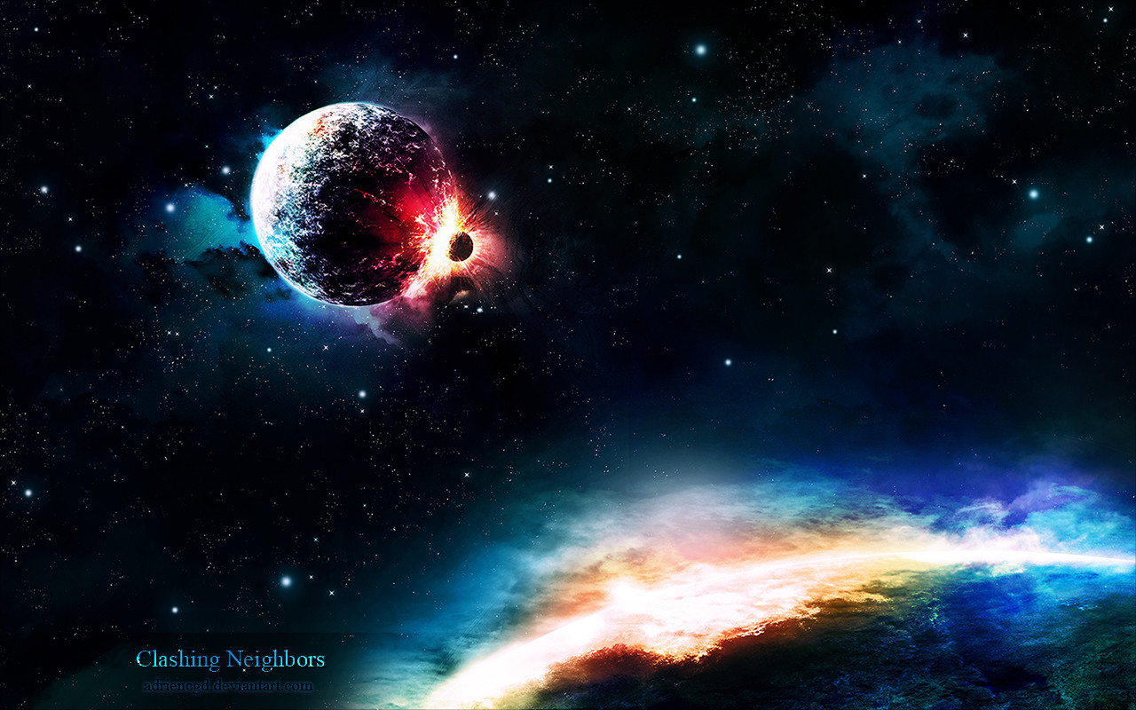
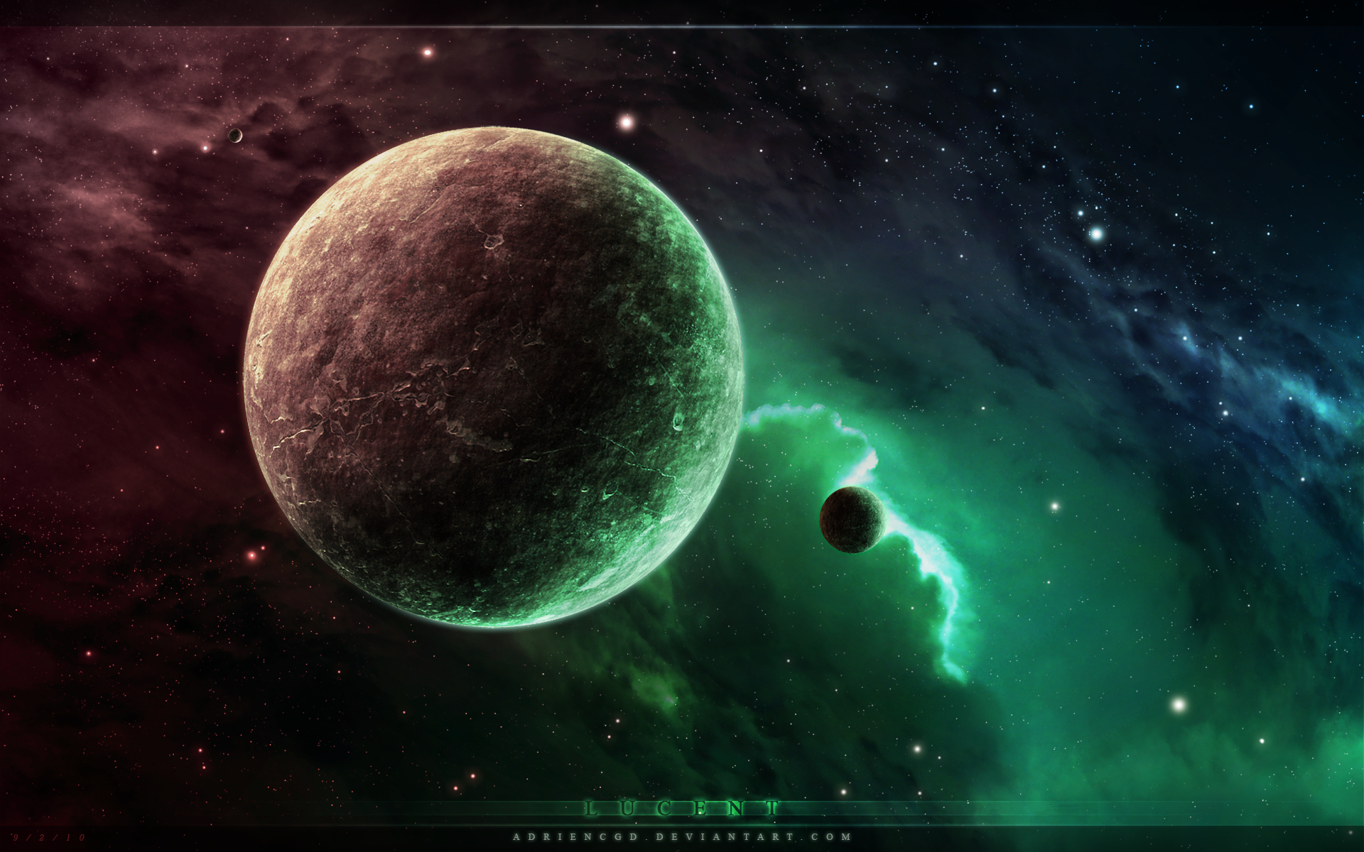
Clashing Neighbors, a piece created in three days. I tried working out details as best as I could, but there are still some edits I need to do. So far I like the outcome and would love to hear some feedback and critiques.Wallpaper download sizes:
1280x720
1280x800
1440x900
1680x1050
1920x1080
1920x1280
3200x2000
Related content


Comments: 29

👍: 0 ⏩: 0

Overall

Vision
Originality
Technique

Ok, Fair warning I am not great at critiques. :/
Ok, this is a very great peice, the colors used were really well done and the idea works with the colors. It looks like the two planets just crashed into each other, but I think there should be more of a blast coming from it. The lighting is nice as the light from the blast covers the other planet down in the bottom corner. My experiance with t3D is non existant but I am good at spotting these things. Whe Ifirst saw this I was like WOAH! The stars in the background look perfect. I think it is brilliantly done.
👍: 0 ⏩: 1

Thank you for the critique, I appreciate your feedback
👍: 0 ⏩: 1

Overall
Vision
Originality
Technique
Impact
I heard something about critiquing, so here I am e.deviantart.net/emoticons/b/b… " width="15" height="15" alt="
")
First off, a great color palette you have chosen; it makes the points of interest stand out well while still conveying the vastness of space. The starfield is good, too. Not too prominent or too subtle, just right. However, I'm not writing this critique to point out everything that's done well (which I have seen from some and, personally, I find it defeats the point of critiquing) but rather what could be improved.
For me, the most irritating part is the bottom-right. It is extremely bright and saturated and thus steals the show of the planet in the back. Additionally, it is quite hard to identify what it is exactly; in the end, I settled with a planet due to the curvature of the bright line. The texture is hard to see at first glance which makes the viewer feel a bit lost, and we certainly don't want that! So, let's try to find some solutions to this problem!
Probably the most confusing element is the bright area. If it's illustrating some cataclysmic event, the non-circular shape of it makes it hard to identify it as such. A more shockwave-like form would probably suit better.
Regarding the texture of the planet, not only could it use some brighter highlights to make it easier to see that it is, in fact the surface of a planet. It also feels a bit out of perspective, but this can easily be fixed with the warp-tool.
Actually, I have tried to cover up the bottom third to see how the image looks without the bright lights. I think it looks quite nice on its own but this is purely subjective. Nevertheless, it'd look even better if the top right had a few more details (such as different layerings of the nebula or small pockets of dust obscuring the view). Thus, it can help balancing the whole piece, seeing that, as of now, every other corner of the image is filled with something. The only way the viewer can leave the image is through the top right, so by blocking his "escape-route" with something like the aforementioned more-detailed cloud, you can achieve some neat results. Just make sure that it doesn't steal the show of the other elements.
You have definitely improved over the past two years! Looking at the (if I may call them like that) "beginner-mistakes" on the older pieces, this one here is a couple notches above all of that. Yes, there are a few issues here and there, but the base-package is definitely there. It is great to see an artist reach new heights with every new piece, and I hope to see you continuing to strive for perfection! e.deviantart.net/emoticons/s/s… " width="15" height="15" alt="
 (Smile)")
👍: 0 ⏩: 1
Hey Phoenix! Thanks for the insightful critique! I definitely love this type of feedback, despite all the things you pointed out I couldn't feel better about it! I was struggling with the foreground planet because I liked the colors and strong light on it, but it is totally unrealistic. I guess it's even harder to figure out it's a planet than what I had thought. I am definitely going to post an updated version of this project in the future. I'm probably going to get rid of the foreground planet and crop more towards the clashing planets and have more space gas while bearing in mind your tips and advice. Thanks again!
👍: 0 ⏩: 0

that is sooo cool! i have to ask how you got those lighting effects! i have been trying for weeks to get something like this! could you send me a link to a tutorial or something, anything helps?
👍: 0 ⏩: 1
Most of the tutorials I followed are the main ones that you'll find when searching "space tutorial" on DA. The rest was a lot of experimenting over a few years. The main idea is to have several smooth gradients and slow down when editing. Take a minute to look at the detail and see what can be done. The more you pay attention to small things, the more professional it will look and the better you will understand lighting. Main thing is to have several layers of gradients of light, each different so that you have a more polished light effect. Colors are usually overlayed as an "overlay" filter or "color" filter afterwards. Experiment with textures, putting them above or under the color layers will affect them differently
 (Wink)")
👍: 0 ⏩: 1
thanks for the advice! it helps a lot
👍: 0 ⏩: 0

Hey thanks! So ironic responding to this message because I've been away for a month! I keep doing this since the past three years! Always thinking I'll come back and then it's every once in a while that I check in lol
👍: 0 ⏩: 0

This is amazing!
I'm not going to write a critique because I don't really have the time for a proper one now (and a poor critique is worse than an average comment), but "awesome" sums it up.
Thanks a lot for providing it as wallpaper!
👍: 0 ⏩: 1
Hey, you're welcome for the wallpaper! Thanks for the lovely compliment
👍: 0 ⏩: 0


Very striking piece! Love the colors
Here's a mini critique.
What I like:
- Great colors
- Interesting sharpness
- Awesome details
What I would think should be improved:
- Perhaps a little too contrasty: glows aren't spread out enough to my taste (I love big soft glows ")
- Planet not bright enough compared to the "edge" (If the planet edges are bright, then the planet should be theoretically almost as bright)
- Background a little too dark (I always find that having a brighter, more colorful background makes all the elements fit together better
👍: 0 ⏩: 1
Lol I like how you pointed out that you like the sharpness XD
And thanks for the advice. When it comes to the glow I agree, and I think that's what I'mma do with my second version of this. I personally couldn't figure out what was so wrong with this piece. As a thumbnail it looks gorgeous, but when you full screen it, it's kinda bleh and the foreground planet is confusing lol
👍: 0 ⏩: 1
It's not bleh
But it is easy to confuse the planet as a continuity of the background.
👍: 0 ⏩: 1
You're right about that. Like I said in another comment, I'll make a different version without the planet ^.^
👍: 0 ⏩: 1


how do you create space nebula ? (always wanted to learn that) ... other than that i find it cool
👍: 0 ⏩: 1
There are plenty of tutorials on DA. But to make them nice you have to practice several times. With each project you learn a ton and get so much better every time
👍: 0 ⏩: 0

This is amazing, you really make my space scenes look like dog dirt :3
👍: 0 ⏩: 1
Lol that's not true! I took over two years to get here and there's still plenty to learn and for me to fix on my current deviations
👍: 0 ⏩: 1
Cant imagine how you could do better O_O'
Show me some tips sometime?
Mine sure could use some help.
👍: 0 ⏩: 1
Well I replied to your note just now
And once you've done a few years of it, you start noticing small things that can be improved here and there. It's one of the best and worse feeling because you're never full satisfied, but it drives you into perfecting yourself.
👍: 0 ⏩: 0