HOME | DD
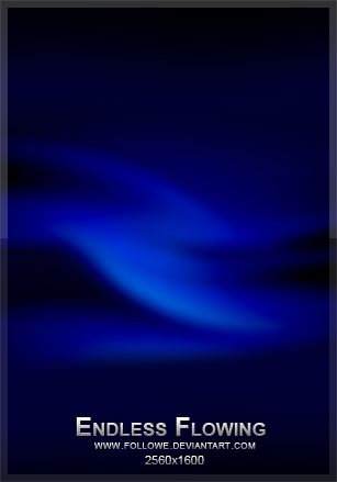
 Aeires — Free Flow

Published: 2004-12-21 05:54:19 +0000 UTC; Views: 1177; Favourites: 36; Downloads: 195
Redirect to original
Description
Ultra Fractal. Kinda dark, you decide.Related content


Comments: 83

 (Smile)")


👍: 0 ⏩: 1

Thanks. Spent some extra time on the colors. Not exactly what I was planning, but it seemed to work, so I rendered it.
👍: 0 ⏩: 1
And the result came out beautifully
")
👍: 0 ⏩: 0

subtle shaddow lines almost incisons across this volume of thick plasm, ectoplasm; a landscape from the netherworld with an inverted sun has its own light.
👍: 0 ⏩: 1
Cool description. Thanks for the excellant critique.
👍: 0 ⏩: 0

This is gorgeous, dark really adds to the air of mystery, what really is covered by your satin sheets? Love it

👍: 0 ⏩: 1

👍: 0 ⏩: 0

Thanks. Blue works for me, so when I come back after a long break, I'm more likely to use it.
👍: 0 ⏩: 0

wow.. so flowing.. so smooth.. great job.. the title really fits - was my first impression, too
👍: 0 ⏩: 1
Thank you. One of these days I'm going to start running out of names, but right now the images are doing a good job in giving me their own name.
👍: 0 ⏩: 0

Like the blue
and the satin look so great

👍: 0 ⏩: 1
Thanks. Every now and then I come across a formula that has a wavy, satin look to them. One of these days I'm going to really work with them more.
👍: 0 ⏩: 1
Cool, can't wait to see more of your work

👍: 0 ⏩: 0

Beautiful flow with rich hues of blues...
Gives off a very romantic feel to me... like getting lost together in a bed of satin sheet.
 (Wink)")
👍: 0 ⏩: 1
When I made this, I had no idea of that, but a few people have mentioned it.

👍: 0 ⏩: 0

Wow, pretty cool, makes you think dark thoughts
👍: 0 ⏩: 1
Thanks. I was in a kinda moody, depressed mood when I made this, so I guess it came out in the work. Can't make them all bright and flowery.
👍: 0 ⏩: 0

It does have a darker quality to it. The swirls look like they are trying to conceal someting or are in more of a coiling type of set. In a way, it also reminds me of a dark mountain ridge. I like it!
👍: 0 ⏩: 1
Thanks, Adam. The first layer had the waves, almost like a big cloth that was waved, like when you throw sheets across the bed. I worked on this formula for hours and deleted at least three versions that I didn't think had enough to them. It got to the point I was going to make it work just for the victory in it. Luckily the next one is working much better.
👍: 0 ⏩: 0


Nice metallic blue and I really like the shades and hues of the other colors at the bottom.
👍: 0 ⏩: 1
Thanks. I adjusted every layer for the color, one at a time, and went back and repeated it a few times. I liked the color on the bottom also, but when I enhanced it, the blue glared too much, so I had to settle for the balance in it.
👍: 0 ⏩: 0

Ooooh, I love the colours in this one! Nice work!
👍: 0 ⏩: 1
Thanks. Knocking off the dust so I figured I'd get back in it with my favorite color.
👍: 0 ⏩: 1