HOME | DD
 AenTheArtist — MvsC Poster 1 Process
Published: 2008-10-31 01:53:03 +0000 UTC; Views: 2152; Favourites: 15; Downloads: 85
Redirect to original
Description
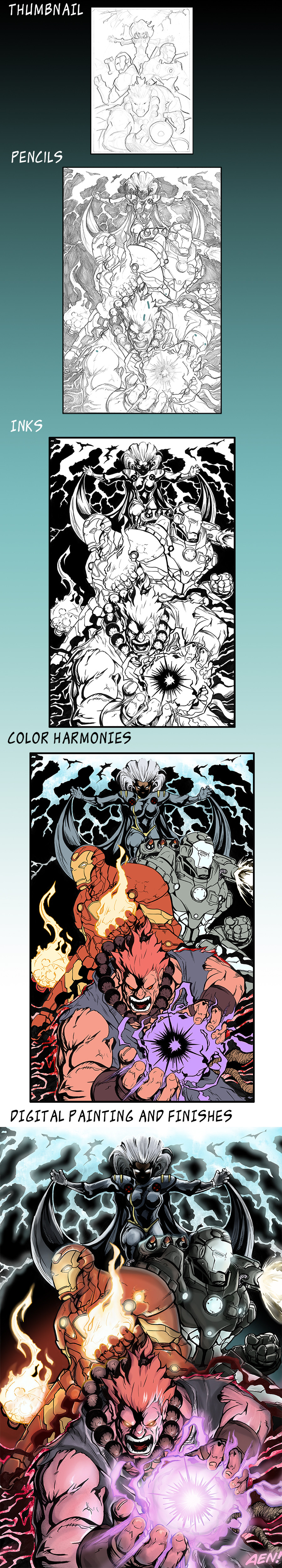
**UPDATE Colors**The colors for this piuece are absolutely gaudy and eye-popping. I guess that's the purpose of an advertising poster but still, it's all over the place.
Iron Man was the most fun to do. Since he has only 2 swatch sets, he was great practice for light sources and reflected light, a concept I'm still grasping.
**UPDATE Inks**
Inks are done!
Inking this was harder then I imagined. Fun, but a little difficult. I used a thresholded pentel brush pen's for the Iron Men's lines.
What is thresholding? I little process of snipping and clipping I do to my brushes in order to make the lines appear more mechanical and less organic.
As you can sea, the crow quill pen and I have been going to couple's counseling and we get a long much better now
**UPDATE Pencils**
So... much... FUN! And it's gonna be even more fun to ink... though it will give me a bit fo a headache
This is the first poster of my 4 giant comissions. I'll be updating this dev as I develop the inks and colors so you guys can critique every step of the way. I really wanna get this right so don't hesitate
I really haven't drawn Iron Man or War Machine before, and I think I wanna do it again sometime soon. That's 90's Storm in the background playing Thor, btw.
8H, 2H and F Pencils on vellum finish bristol. Best paper ever, except corsican, if your into grayscale pencils.
Akuma/Gouki © Capcom Entertainment
Storm, Iron Man and War Machine © Marvel Entertainment
Related content


Comments: 36

LOVE THIS!
great energy, great effect work and WOW loving the inking, I'm so proud  (Smile)")
👍: 0 ⏩: 1

Thanks, this Sunday morning is filled with love
And it will give me wind because I'm going to draw all frickin' day long. Nothing but cigarettes and tea and some bristol.
👍: 0 ⏩: 1
haha, sounds like lots of fun here some more love in case ur running low
~love~love~love~love~
haha.
👍: 0 ⏩: 0

Artist's walktrough is always great thing! Everyone can teach something from them...
The final effect is really great! I'll 
👍: 0 ⏩: 1
Thanks! That's why I want people to see it
👍: 0 ⏩: 0

looks fantastic man - no need for my colouring services anymore!
👍: 0 ⏩: 1
I wouldn't go THAT far, but thanks
👍: 0 ⏩: 1

Great job!!!
Don't worry about the colors....i mean, Iron Man is orange and yellow, and Akuma uses purple energy...what did you expect?
I liked how you took each character's main colors and made a little aura around them with it.
the entire thing was great. The only thing i noticed (and this is reeeeally nitpicky) is that Iron Man's eyes are usually drawn a bit more rectangular.
See? i told you it was nitpicky
anyways, great job, A++

👍: 0 ⏩: 1
Thanks! Yeah, the colors were a headache because of the mount of light sources (4 in total, + 3 reflected light sources on the Iron Men).
👍: 0 ⏩: 0
Thanks
I've still got a long way to go in the color department, though. You know, those choices of what to do, and more importantly, what NOT to do.
👍: 0 ⏩: 1

You are welcome. We all have a long way to go my friend. But we will get there together.
👍: 0 ⏩: 0


this is pretty tight! i recommend that u use storms lightning and akumas purple energy as the lighting sources in here in terms o coloring. great work
👍: 0 ⏩: 1
Thank you! Yeah, this has several light sources. Thing is, it's gonna be pretty hard. Akuma is actually generating 2 light sources; one is his Gou Hadouken, the other is the little black/red aura that appears on his back that flashes for a split second before he does a hyper move in the videogames.
So, yeah... it's gonna be a bit of a headache to color...
")
👍: 0 ⏩: 1
lol u should check my saga of the swamp thing if u want hard to color....but this piece is effin awesome man.
👍: 0 ⏩: 1
Thanks ")
👍: 0 ⏩: 0

Que onda la neta esta genial tu poster solo fijandome note os detalles uno seria las manos de storm creo irian un poquito mas grandes y dos la mano derecha de War Machine no tiene tanto detalle como el resto del personaje esta genial XD
👍: 0 ⏩: 1
Si, tienes toda la razon, las manos de storm estan chiquititas. Sera corregido.
Hmm, tambien la manita de War Machine necesita un poquito mas.
👍: 0 ⏩: 1
hehehe perdona si me escuche mal o algo solo es lo que note O_o si dije algo que no debia disculpa no soy muy bueno diciendole a los demas lo que piensa hahaha, pero al igual si ves algo en mis dibujos me agradaria que me lo comentaras XD
👍: 0 ⏩: 1
No, no, no, no pidas perdon, tengo que oir estas cosas, porque si no, lo hubiera entintado como estaba y ya la hubiera cagado. Jamas tengas miedo de decirme estas cosas.
Ten por seguro que lo hare contigo tambien.
👍: 0 ⏩: 1
muchas gracias enserio y lo mismo no tengas miedo de decirme mis errores porfa XD
👍: 0 ⏩: 0

Looks great! only complaints I have is that Storm's hands look a little too small, as well as warmachine's rocket launchers on his back seem to be at an odd angle.
congrats on your comissions!
👍: 0 ⏩: 1
Well, that's 2 people who said storm's mitts look too small so I guess I'll right that in the inks.
👍: 0 ⏩: 0
Wow...i love that game.
Great job so far! I can't wait to see the finished product ^_^
👍: 0 ⏩: 1
Thanks
👍: 0 ⏩: 1
hahaha, the best work come when we let go and just have fun, this is a lot of fun and ur awesome shone through...more so than usualy, u know i like ur stuff. Glad to provide the boost.
👍: 0 ⏩: 1