HOME | DD
 aeonart — SMSTYM

Published: 2005-03-01 20:16:13 +0000 UTC; Views: 379; Favourites: 2; Downloads: 196
Redirect to original
Description
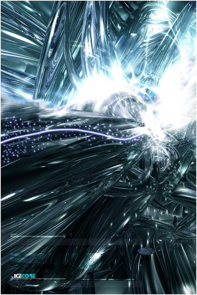
Sold My Soul To Yo MamaDecided to try some more vector-like work 'cause I got good feedback on "Hollywood Vibes".
Kinda styled using minimalistic artists' ( such as ~endigo ) styles, in my own interpretation.
c'N'c'N'fav,etc. appreciated.
Related content


Comments: 21


Really nice bro. The colors you picked are an eye candy
👍: 0 ⏩: 1
")


i love the tagline!!!!! can i ask for how much?!?! lol
👍: 0 ⏩: 1

people are so hard on you! lol. this is awesome m8.
👍: 0 ⏩: 1

yeah, it's only for my best though.
👍: 0 ⏩: 0

hehe those cubes are cute lol
nice tho, simple, and effective vector, I like it.
👍: 0 ⏩: 1

The background is okay, but you should work on your typography and composition. The blocks don't really look good to me, you could have done something better than just that.. But overall, it's not bad. Experiment, you'll get better  (Smile)")
👍: 0 ⏩: 1
cheers, i only used simple stuffz 'cause i didn't wanna try too much and not like it.
👍: 0 ⏩: 0

Hmmm soemthing about this piece doesnt appeal to me, i like pieces with a bit more, i liked ur hollywood vibes piece, but this one dnt do it for me, keep brushing foreward in this area tho, your showing promise
👍: 0 ⏩: 1

A simple but stylish look
A good start to minimalist vectoring, it's an interesting style which I find stands out better when more detailed-keep practising vectorring, with this as an indication seems you could make some really appealing pieces
👍: 0 ⏩: 1
thanks man, thats kinda what i needed - some push in a direction... any direction lmao.
👍: 0 ⏩: 0

you should have made a unique logo instead of the preset hearts.
but nice job on the colors, and its a great minimalistic piece
👍: 0 ⏩: 1
i kinda tried to edit them a bit with the gradients, plus it's not my logo, just thought it would go withthe title a bit more.
thakns anyway.
")
👍: 0 ⏩: 0