HOME | DD
 aevel — Security device eCommerce
Published: 2010-03-08 12:51:12 +0000 UTC; Views: 6037; Favourites: 17; Downloads: 0
Redirect to original
Description
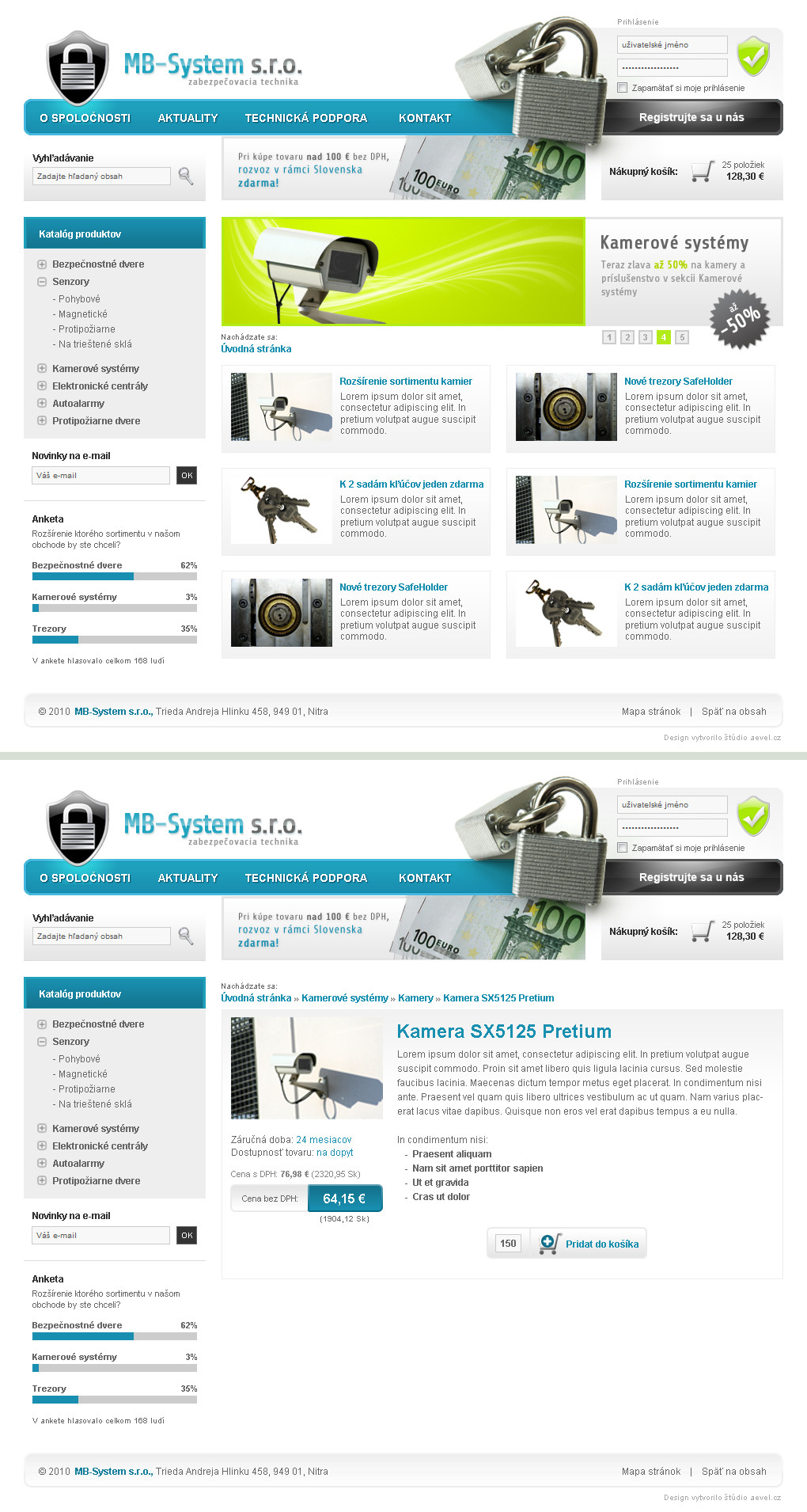
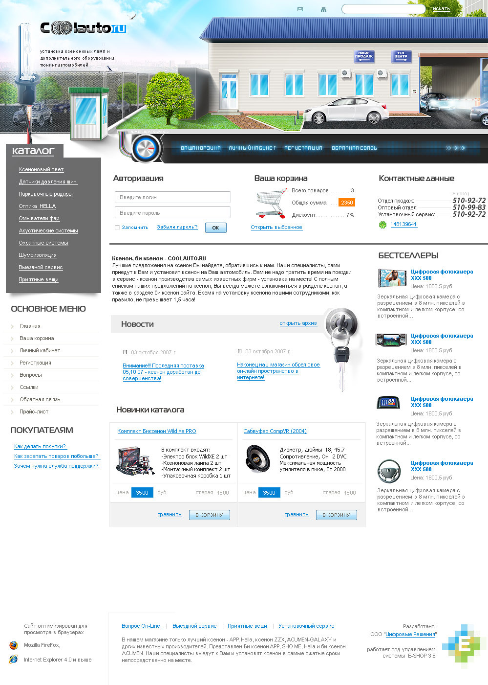
Design concept for fictional e-shop with security devices..This design is for sale so if you like it, you can buy it.. PM me if you wish to do so
 (Smile)") Further editing of design by my side to fullfil your wishes is also possible
Further editing of design by my side to fullfil your wishes is also possible  (Wink)")
Favs and comments are welcome!
Related content


Comments: 17

I think you have a little problem with padding&margin range, because there is no consistency. But that's ok, after all the main concept is good and I like it (^_^)>
👍: 0 ⏩: 1

Thank you!
👍: 0 ⏩: 1
sorry for my late answer, here some of them.
first, on sidebar I see the range of search form and email submit form not same with the range of catalog produktov and top menu from left side.
second, on main content page two I see the range of image to not same with the text
check here: [link]
sorry if I'm wrong ^_^);
👍: 0 ⏩: 1
Thank you so much for further feedback and your time!
👍: 0 ⏩: 1
yes, you have a reasonable excuse. I got a new lesson today thank you ^_^)>
👍: 0 ⏩: 0

Your work have been featured in my blog [link]
Please take a look to see all the other fantastic artists that were features along with you.
👍: 0 ⏩: 1
Thank you

👍: 0 ⏩: 0


Pěkné zpracování, ale v menu nemůžeš používat za tím textem přeci stit. Bylo by to v pouzití, pouzívaní alternativního obrazku textu. Ale to snad vis jako programator sam
👍: 0 ⏩: 1
to preci vubec neni pravda
IE6 uz nema ani oficialni podporu ze strany MS, a pokud by na takove stranky nekdo s takovym prohlizecem prisel, holt by se mu neudelaly stiny za pismem, v pouzitelnosti by to ale nicemu nebranilo.. to je jen eye-candy odmena pro uzivatele s modernimi prohlizeci
👍: 0 ⏩: 1
jaj ajo, jsem si neuvedomil ?e se to da delat atributem text_shadow. Toz teeeedy sorry
👍: 0 ⏩: 1