HOME | DD
 Agresidy — A little rest

Published: 2011-07-08 18:16:34 +0000 UTC; Views: 3544; Favourites: 50; Downloads: 197
Redirect to original
Description
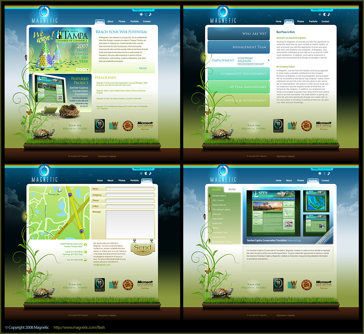
My New DesignRelated content


Comments: 26

 (Smile)")


Hi there.
I fetured you here [link]
Please, let me know if i did wrong
👍: 0 ⏩: 1

A beautiful and intricate design! Does the text on the left menu "light up" when you mouseover it? I ask because it seems a little dark. I just love the opening of the doors concept. Overall, a very good and original design!
👍: 0 ⏩: 1

No, when you put your mouse on the text remains the same.
Btw: Thanks for what you said.
👍: 0 ⏩: 1
You're welcome!
You might want to consider brightening that text though, not everyone has good eyes or a good monitor.
👍: 0 ⏩: 0

Nice idea! Layout is refreshing.
I would take off painting which are under youtube link. It jumps right into eyes.
👍: 0 ⏩: 1


")

Overall very beautiful. I especially love the foliage growing around the two boxes on the bottom left and right and the scattered butterflies. The only things I would say that could use improvement are that the light colored window on the right grabs most of the attention but doesn't appear to be the most important thing on the page. Also the links on the left are kind of hard to see. And finally, the word "TROPICO" in the logo on the top left looks a little more "creepy" than "tropical".
👍: 0 ⏩: 0

