HOME | DD

ahillesus — Realty Identity A

Published: 2010-07-01 12:23:49 +0000 UTC; Views: 4478; Favourites: 24; Downloads: 0
Redirect to original
Description 
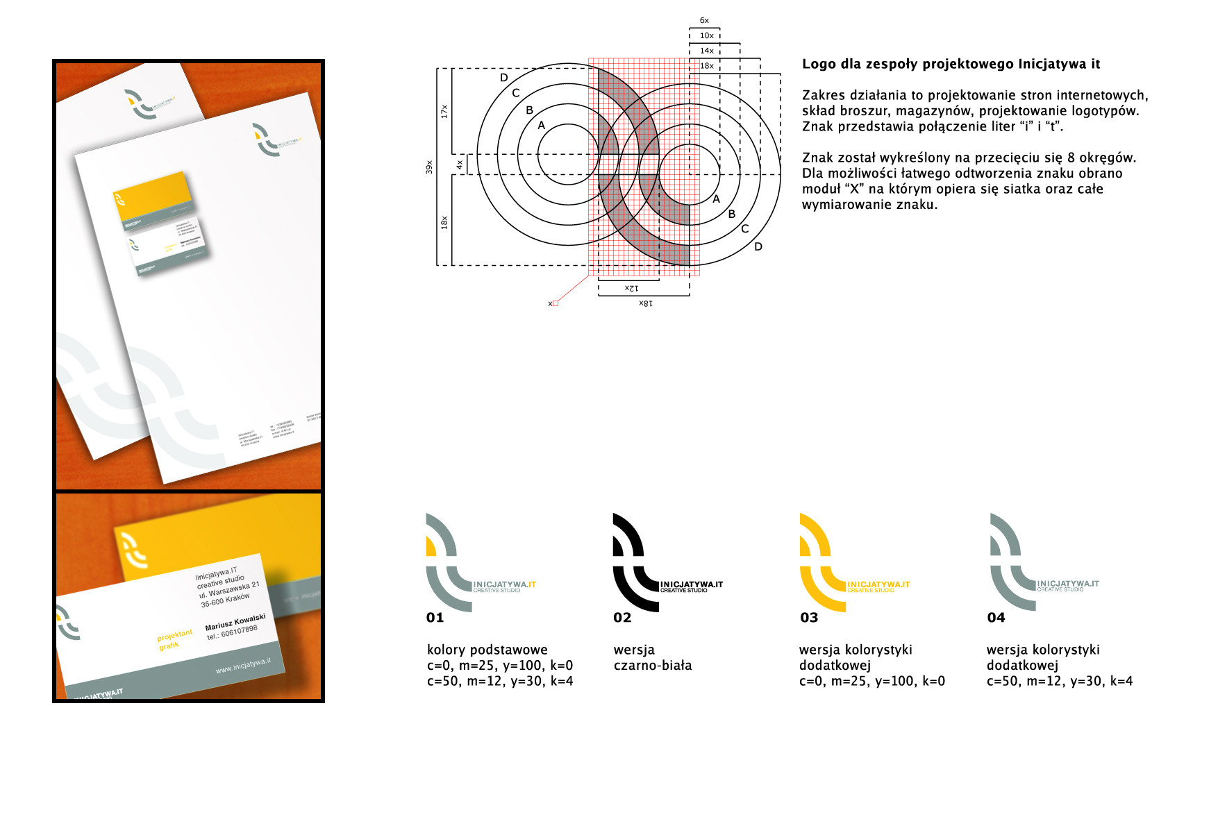
The corporate identity for a realty bureau.
Related content
Comments: 16

kirpluk [2010-07-18 10:33:50 +0000 UTC]

very nice

👍: 0 ⏩: 1

ahillesus In reply to kirpluk [2011-10-18 12:02:01 +0000 UTC]

TY!

👍: 0 ⏩: 0

ahillesus [2010-07-16 09:17:41 +0000 UTC]

Скорее не круг в круге, а ключ с ушком в виде крука обрамлен разомкнутым кругом, символизирующем надёжность. Ключ символизирует то, что возможны варианты сдачи помещений "под ключ" а так-же что у компании найдется ключ к каждому клиенту ну и что сотрудничество с компанией - это ключ к успеху.

👍: 0 ⏩: 0

zik92 [2010-07-15 19:53:33 +0000 UTC]

а что символизирует круг в кргуе?

👍: 0 ⏩: 0

NickDart [2010-07-10 15:43:23 +0000 UTC]

Very nice work!

👍: 0 ⏩: 1

ahillesus In reply to NickDart [2010-07-12 10:10:14 +0000 UTC]

thanks.

👍: 0 ⏩: 1

NickDart In reply to ahillesus [2010-07-12 11:03:22 +0000 UTC]

Your welcome

👍: 0 ⏩: 0

zainansari [2010-07-10 09:53:35 +0000 UTC]

nice one

👍: 0 ⏩: 1

ahillesus In reply to zainansari [2010-07-12 10:10:06 +0000 UTC]

ty.

👍: 0 ⏩: 0

goiabarea [2010-07-10 09:09:25 +0000 UTC]

I like it too^^

👍: 0 ⏩: 1

ahillesus In reply to goiabarea [2010-07-12 10:10:00 +0000 UTC]

they are simple, I`m working on making my logos more complicated, yet simple.

👍: 0 ⏩: 1

goiabarea In reply to ahillesus [2010-07-12 23:21:58 +0000 UTC]

yeah, but don't use to much details, if you print the logo in a very small size u'll not see it

👍: 0 ⏩: 0

blackdoomy [2010-07-10 07:56:00 +0000 UTC]

You logos are pretty cool

👍: 0 ⏩: 1

ahillesus In reply to blackdoomy [2010-07-12 10:09:37 +0000 UTC]

thanks man.

👍: 0 ⏩: 0

Ahmad95 [2010-07-10 07:40:16 +0000 UTC]

Nice I really like it! What does the company do?

👍: 0 ⏩: 1

ahillesus In reply to Ahmad95 [2010-07-12 10:09:29 +0000 UTC]

This company is doing realty.

👍: 0 ⏩: 0