HOME | DD

ahillesus — WikiLeaks Logo ReMake

Published: 2011-02-18 07:57:02 +0000 UTC; Views: 3091; Favourites: 36; Downloads: 92
Redirect to original
Description 
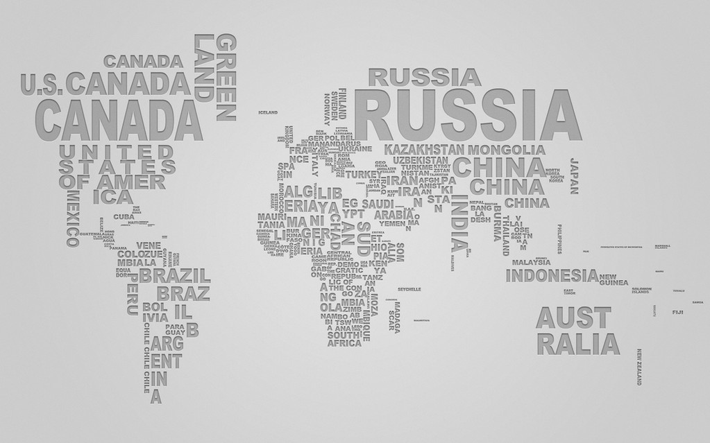
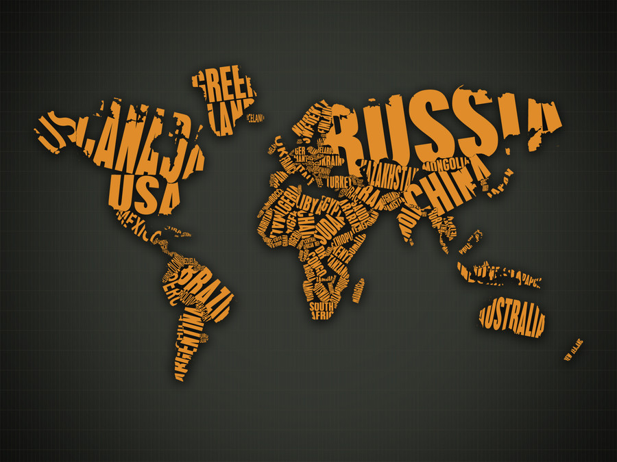
The redesign of a WikiLeaks logotype. The clarity of forms and more ya-catching color scheme was used. Took not so much time but was fun indeed! Hope you like it! Have fun.

© WikiLeaks, Stanislav Chernitskiy
Related content
Comments: 11

MetFis [2012-02-12 16:43:14 +0000 UTC]

i like it

👍: 0 ⏩: 1

ahillesus In reply to MetFis [2012-02-12 21:52:27 +0000 UTC]

Much thanks!

👍: 0 ⏩: 0

iNqDesign [2011-10-29 11:35:58 +0000 UTC]

It's great!

👍: 0 ⏩: 1

ahillesus In reply to iNqDesign [2012-02-12 21:52:33 +0000 UTC]

Thankie!

👍: 0 ⏩: 0

UnforutunateFortune [2011-10-20 23:37:18 +0000 UTC]

I love this concept. Maybe the only thing i would change is to flip the bottom continents and make them reflect but i wouldn't know because 1. Im not experienced and 2. I can't see it in my head right now but yes it is a really cool concept.

👍: 0 ⏩: 0

ahillesus [2011-10-19 15:18:30 +0000 UTC]

Thankee for supporting me!

👍: 0 ⏩: 0

nikki-ns [2011-10-19 15:16:38 +0000 UTC]

Awesome!

👍: 0 ⏩: 1

ahillesus In reply to nikki-ns [2011-10-19 15:18:39 +0000 UTC]

Thankee for supporting me!

👍: 0 ⏩: 0

tatapuiu [2011-02-18 12:28:43 +0000 UTC]

LOVE WIKI LEAKS TOO

👍: 0 ⏩: 0

graphstas [2011-02-18 11:36:53 +0000 UTC]

LOVE WIKI LEAKS

👍: 0 ⏩: 1

ahillesus In reply to graphstas [2011-02-18 11:38:23 +0000 UTC]

Thx bro!

👍: 0 ⏩: 0